How to Analyze Interview Data From Raw Notes to Real Insights
Turning a series of conversations into genuine, actionable insights is where the real work of interview analysis begins. It's a methodical process that moves from raw audio to clean text, and finally, to the patterns and themes that answer your most important research questions. My goal here is to share a practical, experience-based roadmap for how to analyze interview data effectively, so you can move from transcripts to confident conclusions.
Setting the Stage for a Successful Analysis

Before you can even think about finding meaningful patterns, you have to build a solid foundation. From my experience, this initial prep work is, without a doubt, the most critical phase of the entire analysis. It's what separates a rigorous, insightful study from a shallow summary of what people said.
Think of it this way: your raw interview recordings are like uncut gems. The value is there, but it’s hidden. Your first job is to clean them up and prepare them for inspection, and that starts with transcription.
Choosing Your Transcription Method
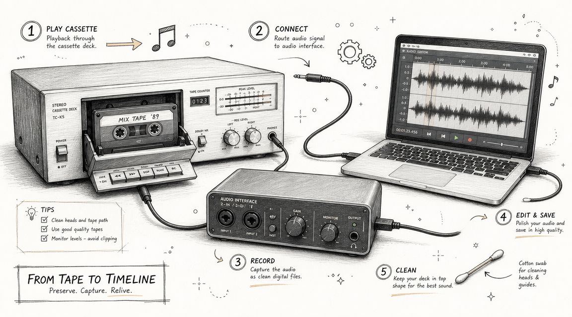
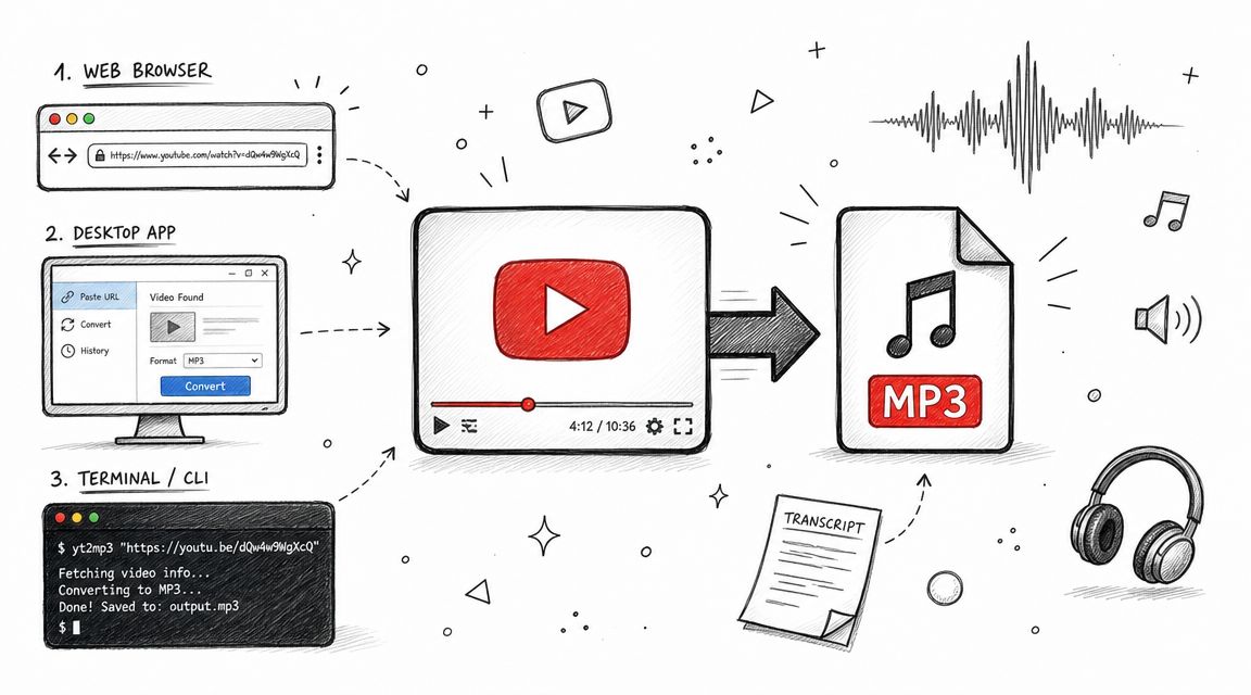
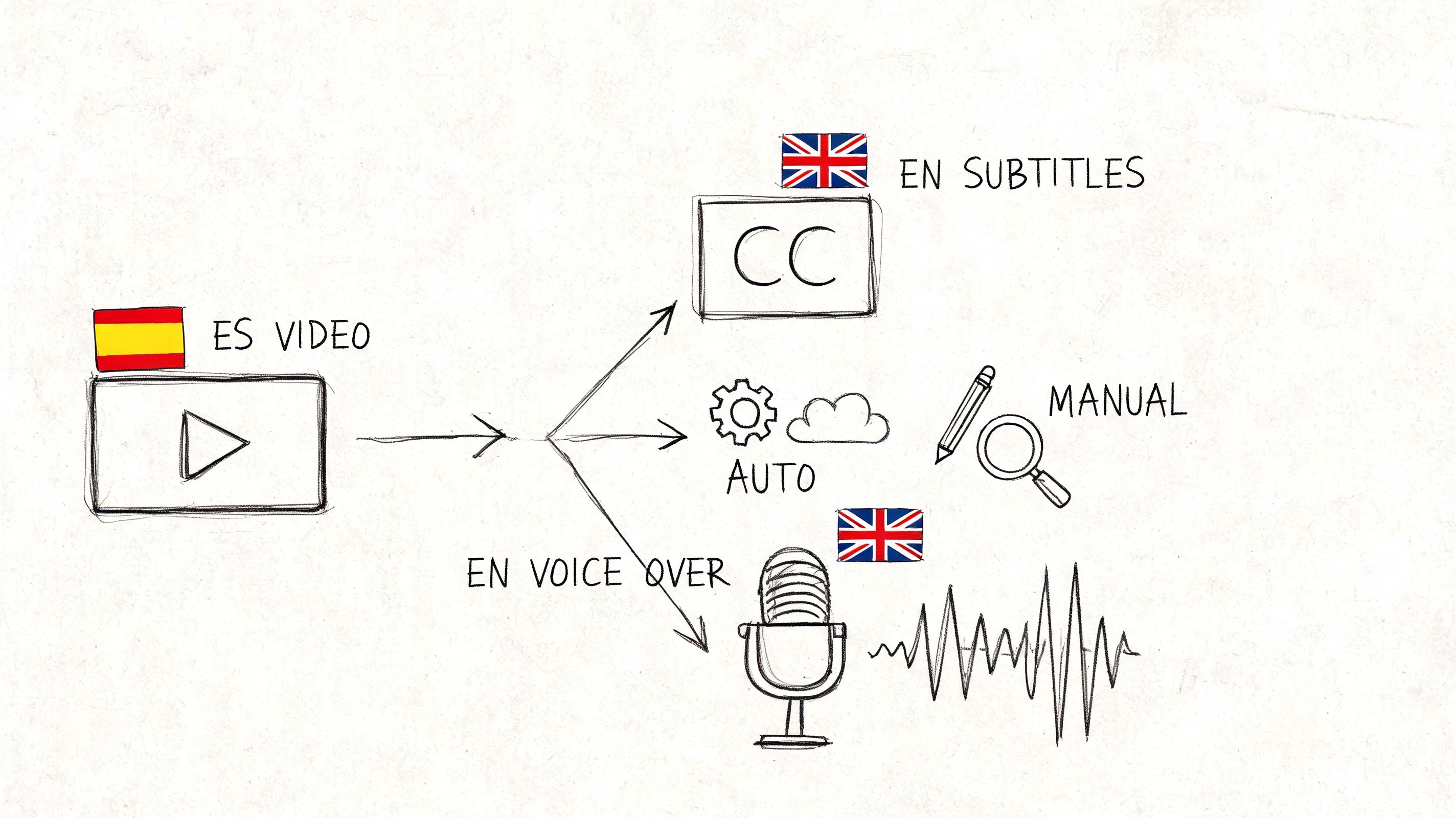
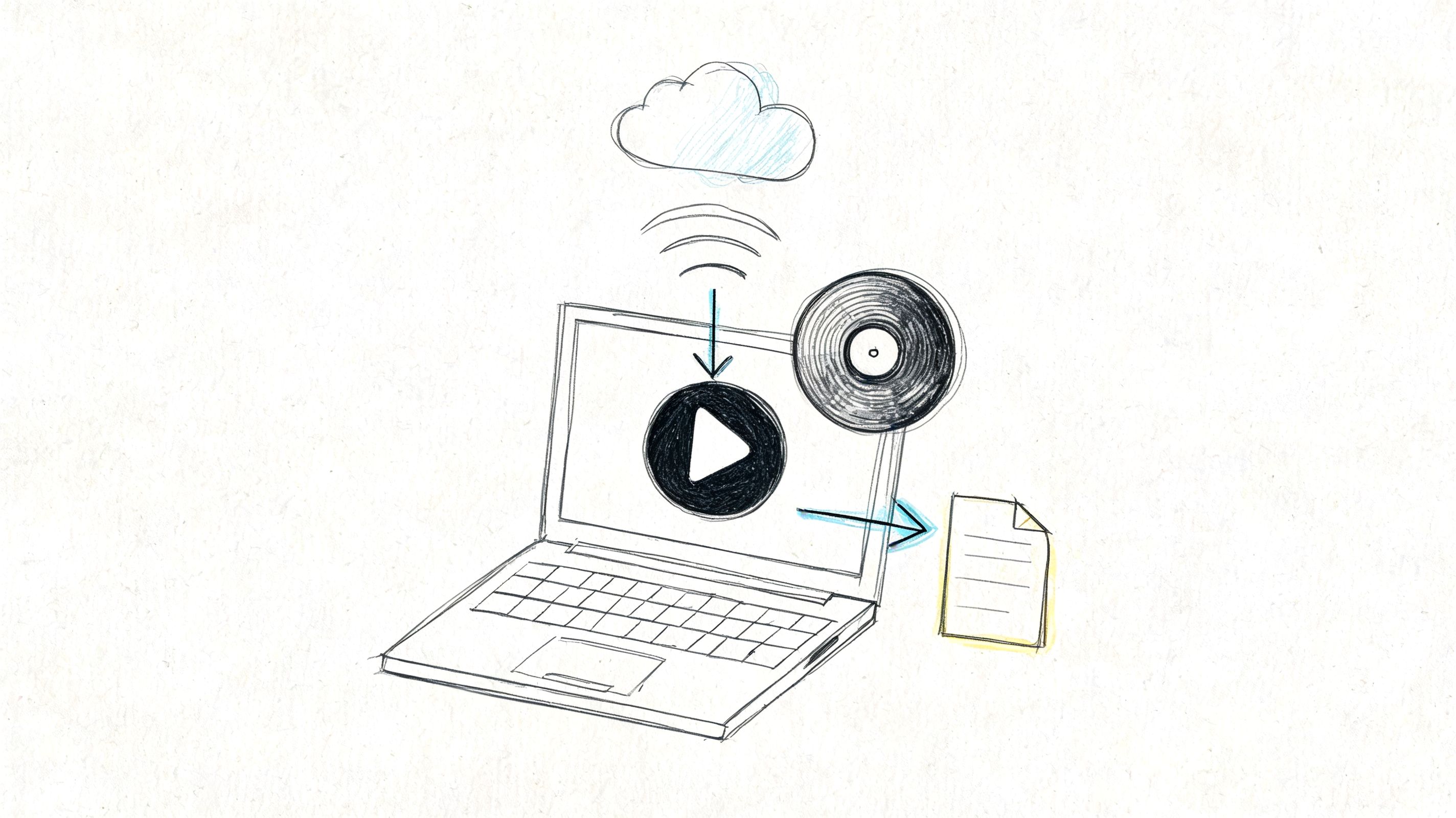
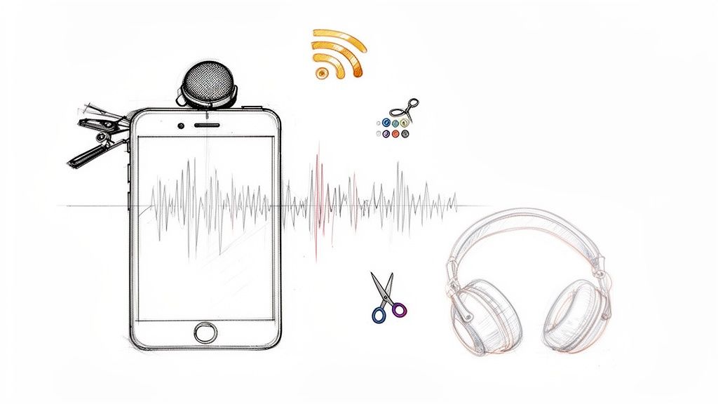
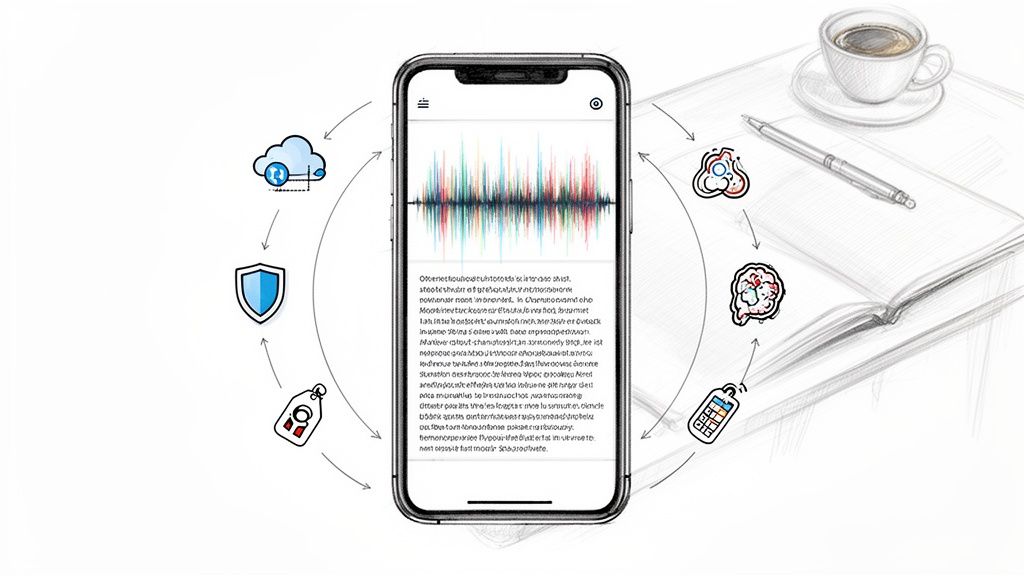
Your first big decision is how to turn those spoken words into text. Don't treat this as a simple admin task—the accuracy and detail of your transcripts will directly shape the quality of your analysis. You have a few options, each with its own pros and cons.
- Manual Transcription: This is the old-school method of listening and typing everything out yourself. It's slow and tedious, no doubt. But the upside is that you get an incredibly deep, firsthand feel for the data right from the start. You hear every pause and every laugh, which is valuable context.
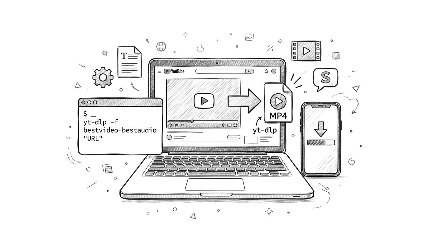
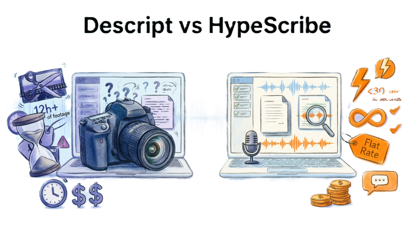
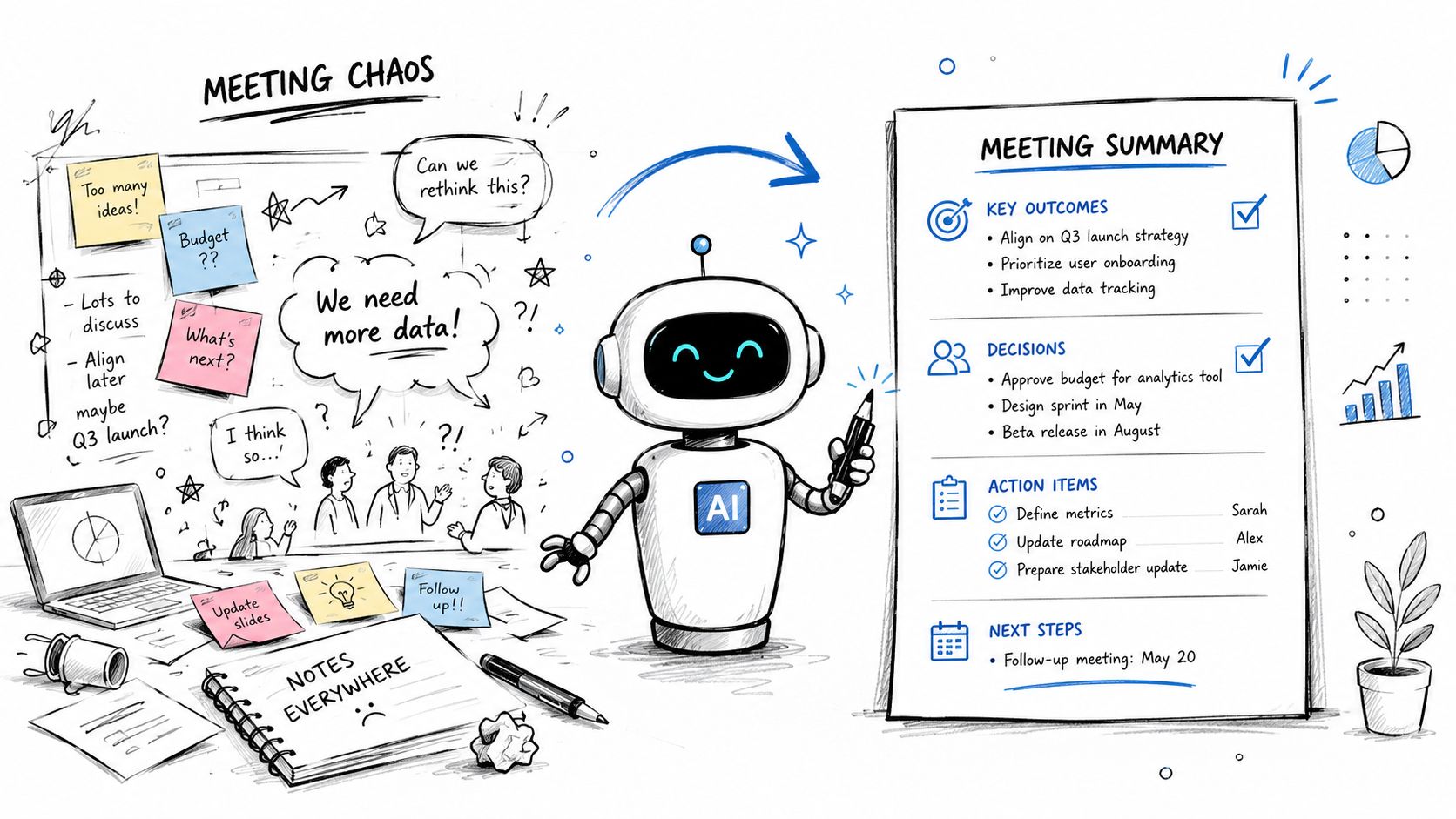
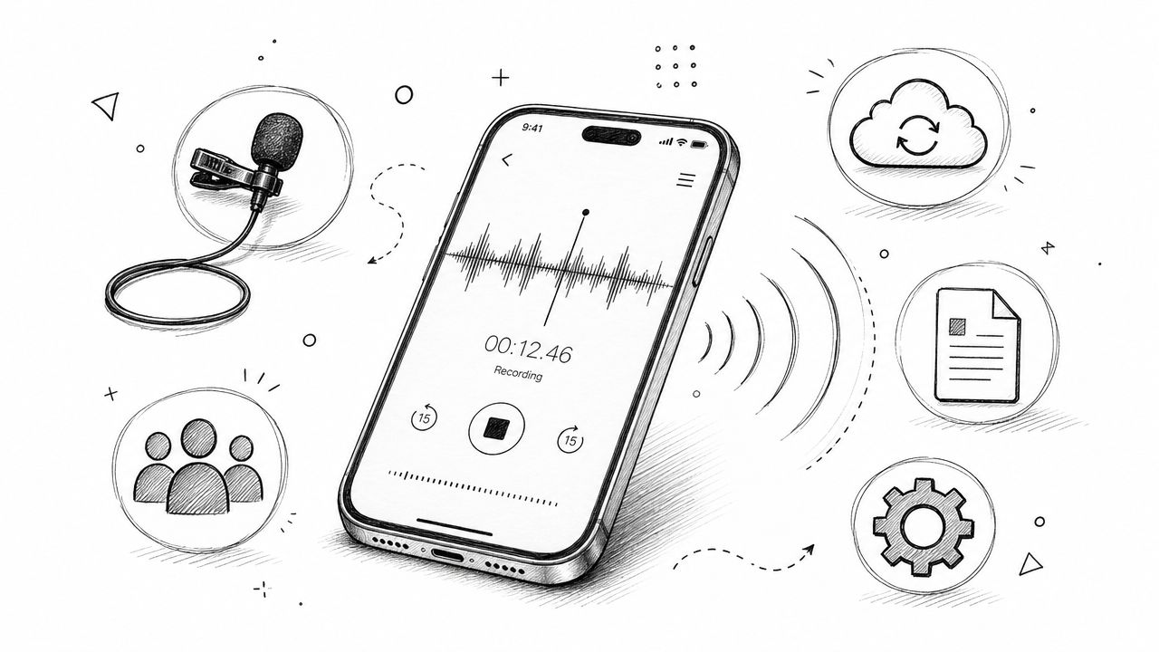
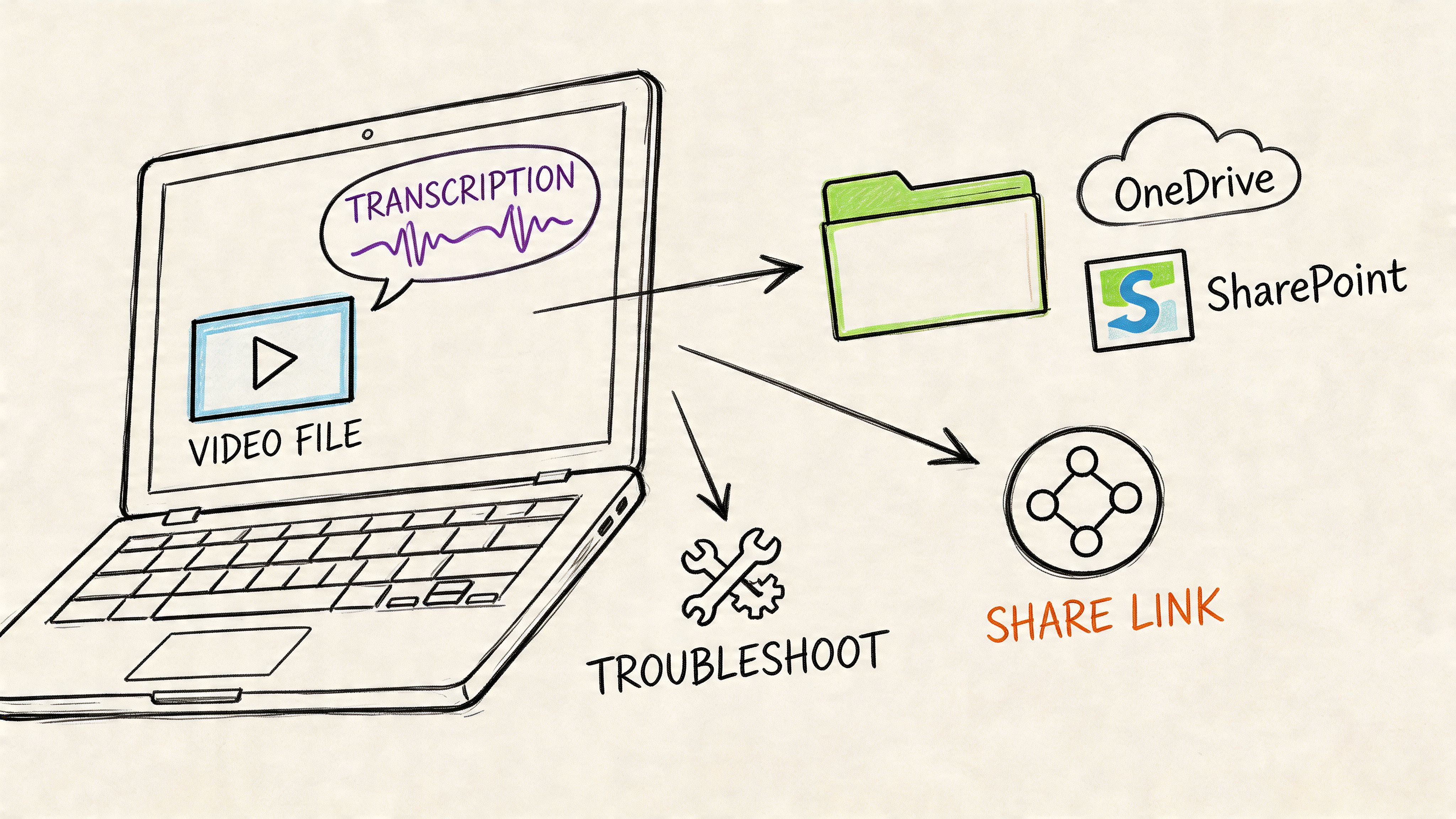
- AI-Powered Transcription Tools: Services like HypeScribe can turn hours of audio into text in just a few minutes, and the accuracy is often surprisingly good. This frees you up to focus on the analysis itself. Just remember to proofread the output, as AI can still stumble over thick accents, technical jargon, or poor audio quality.
- Hiring a Professional Service: If the budget allows, professional transcriptionists can deliver near-perfect, properly formatted transcripts. It’s the best way to guarantee quality without sinking your own time into it, but it's also the most expensive option.
Cleaning and Formatting for Clarity
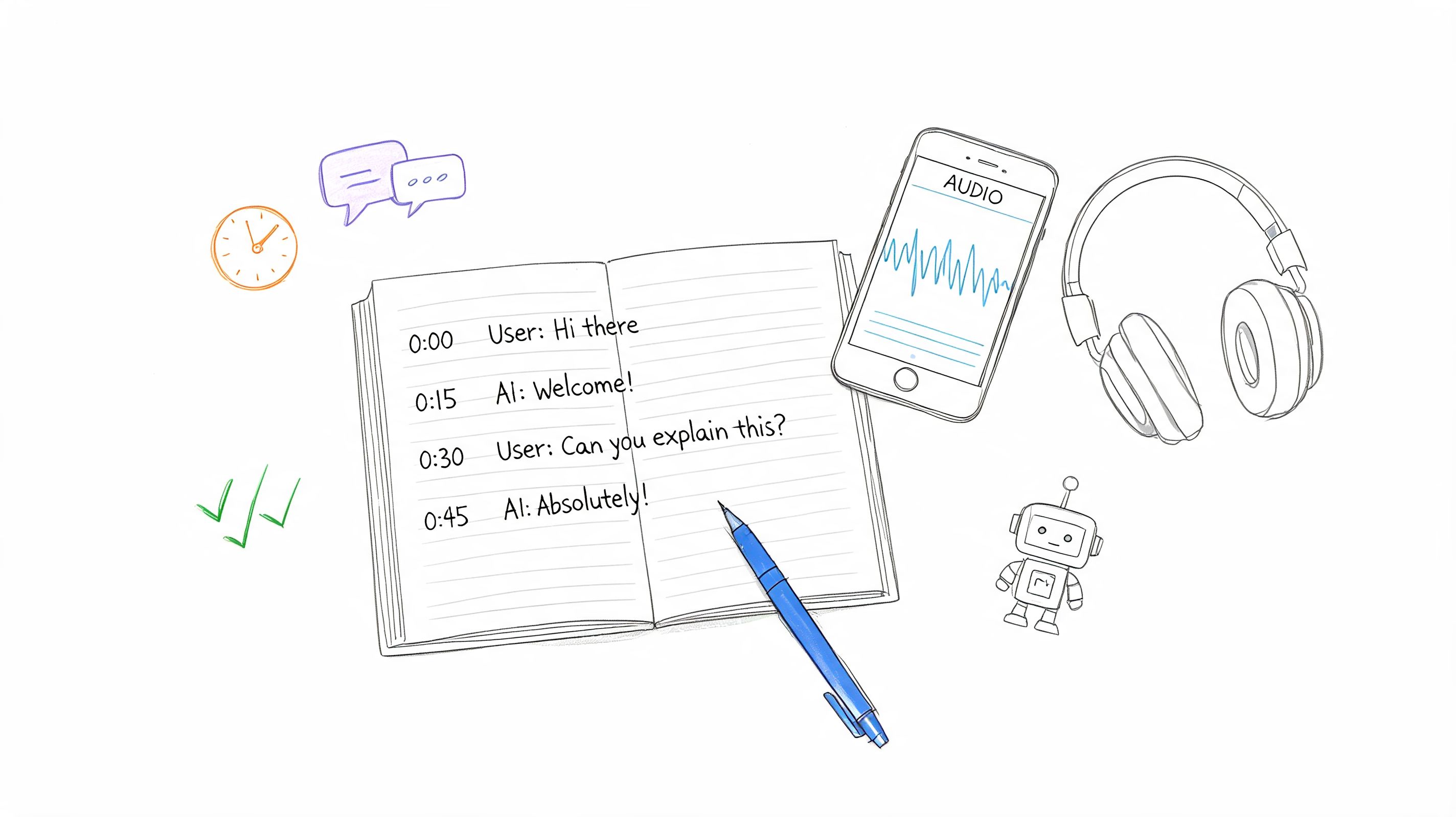
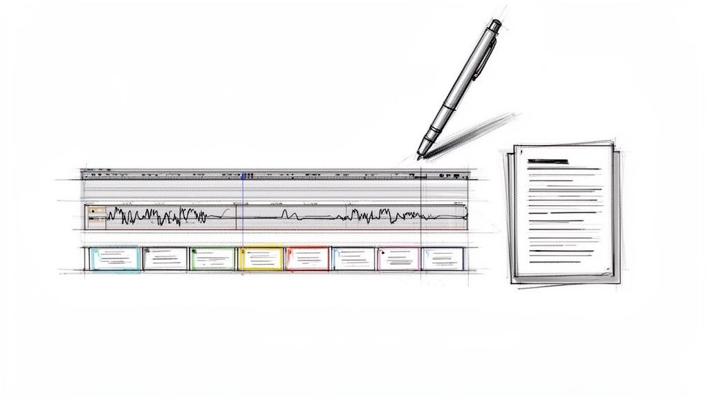
With transcripts in hand, it's time to clean them up. This means correcting typos, making sure speaker labels are consistent, and deciding what to do with filler words like "um" and "ah." I usually remove them unless they clearly signal hesitation or uncertainty, which can be important data in itself.
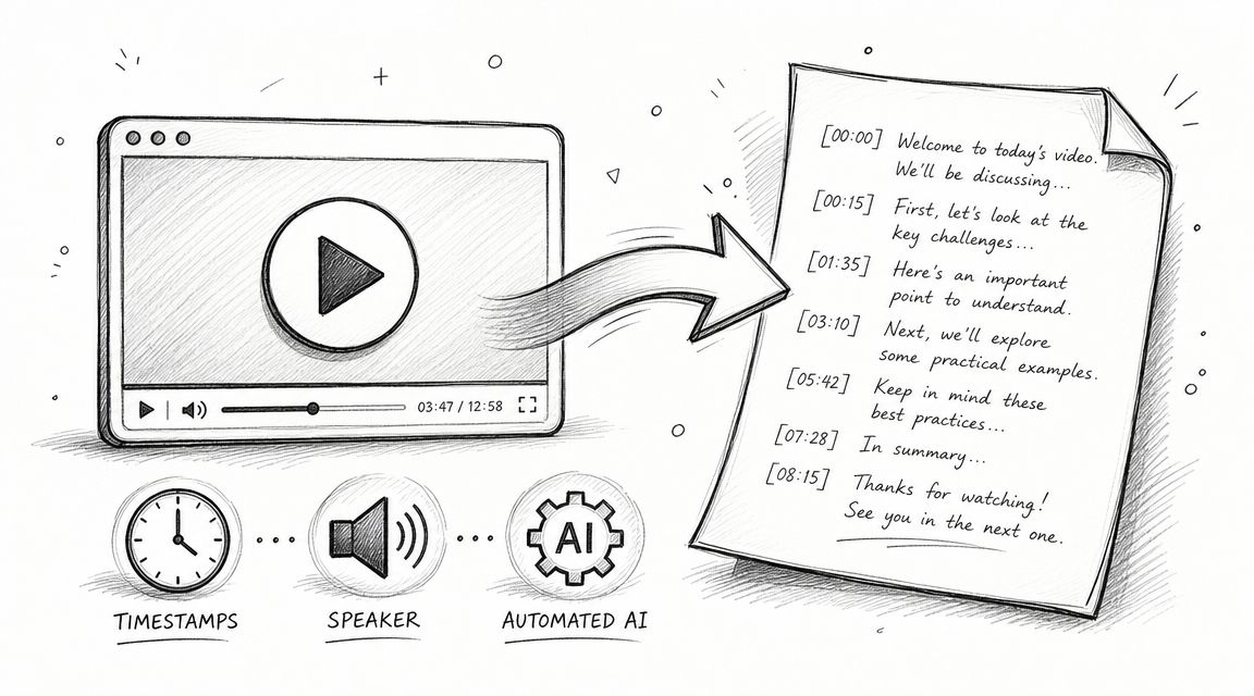
A clean, consistently formatted transcript is just plain easier to work with. I always add timestamps or line numbers to my documents; it makes pulling specific quotes for my final report so much faster. It's a small organizational habit that pays off big time later.
Pro Tip: Don't just read your transcripts—listen to the audio again while reading along at least once. Tone, pauses, and emotional emphasis are critical data points that text alone can't capture. This dual-sensory review often reveals nuances you would otherwise miss.
The Crucial Immersion Phase
Once your transcripts are sparkling clean, resist the temptation to jump straight into coding. The last—and most important—prep step is immersion. Take the time to read through everything at least once without trying to analyze anything. Just absorb the language, the perspectives, and the overall feel of the conversations.
As you read, keep a notebook or a separate document handy to jot down initial thoughts, interesting quotes, or early hunches. These notes become a kind of compass, guiding your formal analysis without locking you into preconceived notions. This groundwork is essential, whether you're working with a dozen interviews or exploring techniques for analyzing survey data with thousands of open-ended responses. When you finally begin coding, you'll be starting with a deep, intuitive understanding of the human stories you've collected.
Choosing Your Analytical Framework
Before you start coding, you have to decide on a game plan. Your analytical framework is the lens through which you’ll view all that rich interview data. Getting this right is crucial for pulling out clear, defensible insights. Otherwise, you could miss the whole story.
Think of it this way: are you heading into the city with a map to find a specific landmark, or are you wandering around to see what you discover?
Your choice really comes down to two classic paths in qualitative analysis: the inductive approach and the deductive approach. Neither is better than the other, but one will be a much better fit for your research goals. Deciding this upfront is probably one of the most critical moves you'll make in your entire analysis process.
The Deductive Approach: Starting with a Map
The deductive approach is your "top-down" strategy. You come to the data with a set of codes or theories already in your back pocket. This is your go-to method when you need to test a hypothesis or see if an existing model holds up with your new data.
For example, imagine you’re analyzing interviews with new software users. If you're using a known framework like Nielsen's Heuristics, you'd start with codes like "Error Prevention," "Consistency and Standards," and "Recognition rather than Recall." Then, you'd read through the transcripts specifically looking for quotes that slot into these buckets.
This method is incredibly structured and efficient. It's perfect for when you need to confirm something specific or compare your findings against an established benchmark. The trade-off? It can sometimes put blinders on, causing you to miss surprising themes you weren't looking for.
The Inductive Approach: Drawing the Map as You Go
On the flip side, the inductive approach is all about exploration. It's a "bottom-up" journey where you start with a completely open mind, no preconceived codes, no theories. You immerse yourself in the transcripts and let the themes bubble up organically from what your participants are actually saying.
Let's say you're digging into exit interviews to figure out why people are leaving. Instead of starting with a checklist like "salary" or "management," you’d just read and listen. You’d highlight raw phrases from your participants—things like "felt unheard in meetings," "frustrated with outdated tools," or "loved the team collaboration."
It’s only after you’ve collected these ground-level observations that you’d begin to see patterns and group them into bigger themes. Yes, it takes more time, but this is how you uncover the insights that no one saw coming.
Inductive vs Deductive Analysis at a Glance
This quick comparison should help you choose the right analytical approach for your research project.
Ultimately, picking your approach is about aligning your method with your mission.
Finding a Middle Ground with a Hybrid Model
Of course, you don’t have to be a purist. In my experience, some of the most powerful analysis happens when you blend the two. A hybrid approach often works wonders.
You could start deductively, with a few high-level codes based on your main research questions. But you also give yourself permission to create new, inductive codes whenever you stumble across an unexpected idea that doesn't fit your initial structure.
This blended method gives you the best of both worlds. You get the focus of a deductive framework without sacrificing the potential for discovery that makes inductive analysis so exciting. It’s a practical, balanced way to make sure you answer your core questions while leaving the door open for surprise.
Making Sense of It All: The Craft of Coding Your Interview Data
Once you’ve decided on your analytical approach, it’s time to roll up your sleeves and dive into the data. This is where coding begins—the hands-on process of turning raw transcripts into structured, meaningful insights. Think of it as creating a detailed index for your conversations, allowing you to instantly pull up every mention of a specific idea or feeling.
But coding is far more than just slapping labels on text. It’s an interpretive act that bridges the gap between what your participants said and the larger story you need to tell. It's part art, relying on your intuition to spot subtle connections, and part science, demanding a systematic method to ensure your conclusions are solid and trustworthy.
Your First Pass: Open Coding
The initial dive into your transcripts is all about open coding. The goal here is simple: read through your data line-by-line and break the text down into its smallest meaningful chunks. You're assigning short, descriptive labels to phrases, sentences, or even paragraphs that jump out at you.
At this stage, forget about perfection. Be generous and even a little messy with your codes. A single powerful sentence might touch on several distinct ideas, so it’s fine to assign multiple codes to it. For example, if a participant says, "The new software is so clunky it makes my job harder, but at least my manager is always there to help us figure it out," you might create two initial codes: "Software Frustration" and "Managerial Support."
The real value of open coding lies in its exploratory freedom. It forces you to stay close to the participant's actual words and keeps you from making premature assumptions. You're essentially building a rich, granular inventory of every concept that exists in your data.
A Pro Tip From the Trenches: Don't get paralyzed trying to invent the perfect code name. Use "in vivo" codes—short, direct quotes from the participant. A code like "felt unheard" is often more powerful and context-rich than a more generic label like "Communication Issues." It keeps you grounded in their reality.
From Chaos to Clarity: Grouping Codes into Categories
After your first pass, you'll probably have a long, sprawling list of codes. It might look a little chaotic, and that's completely normal. Your next move is to start bringing order to that chaos by grouping related codes into broader, more conceptual categories. This is where you begin to zoom out from the nitty-gritty details to see the emerging patterns.
For example, you might notice that codes like "Clunky Software," "Outdated Tools," and "Frequent System Glitches" are all telling a similar story. You can bundle these under a more abstract category called Technology Barriers. In the same way, codes like "Supportive Manager," "Helpful Teammates," and "Positive Peer Feedback" could all be consolidated into a category you name Support Systems.
This step isn't a one-and-done task; it's iterative. You'll likely move codes around, rename your categories, and merge or split them as your understanding of the data deepens. You’re no longer just labeling what was said—you're actively interpreting what it means by connecting the dots.
The infographic below shows how the analytical framework you chose earlier—inductive or deductive—shapes this entire process right from the start.
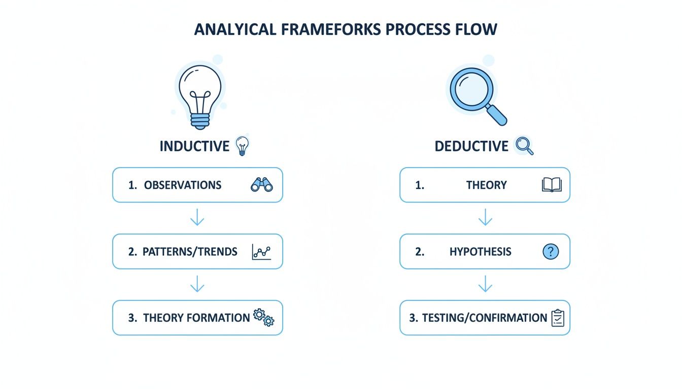
As the visual suggests, a deductive approach starts with predefined categories (the magnifying glass), whereas an inductive approach lets those categories emerge organically from the data itself (the lightbulb).
The Big Picture: Synthesizing Categories into Major Themes
The final layer of analysis is where the real magic happens. Here, you synthesize your categories into a handful of major, overarching themes. These themes are the core findings of your research—the central pillars that will support the entire story you're telling. A theme isn't just a summary; it’s a powerful insight that directly addresses your research question.
To get from categories to themes, you need to step back and ask some critical questions:
- What's the underlying narrative that connects these different categories?
- How do these patterns answer my "so what?" question?
- What are the most significant, high-level takeaways here?
For instance, your categories of "Technology Barriers," "Lack of Training," and "Unclear Communication" might all point to a single, powerful theme: "Systemic Inefficiencies Sabotage Employee Productivity." That’s a complete, defensible argument grounded in your data. It’s the headline, not just a collection of facts.
The Analyst's Bible: Building and Maintaining a Codebook
As you define your codes and categories, you absolutely must document everything in a codebook. This document is your central reference guide, the single source of truth for your analysis. A well-maintained codebook is non-negotiable for ensuring consistency, especially if you're collaborating with a team.
A solid codebook should contain:
- Code Name: The short, descriptive label (e.g., "Managerial Support").
- Definition: A clear, crisp explanation of what this code means.
- Application Rules: Specific criteria on when to use (and when not to use) the code.
- Example Quote: A perfect, illustrative quote from a transcript.
This is a living document that will evolve as you work. Keeping it updated is critical for making sure you apply codes the same way from the first interview to the last. This disciplined documentation is much like using one of the different types of note-taking methods, where structure and consistency are what make the information truly useful later on.
Ultimately, coding is a cycle: you read, you label, you group, and you refine. It’s this rigorous, iterative process that transforms hours of conversation into a clear, insightful, and compelling analysis.
How to Find Quantifiable Trends in Qualitative Data
After hours of coding, you’re sitting on a goldmine of insights, stories, and perspectives from your interviews. But when you’re dealing with a large dataset, a few powerful quotes might not be enough. How do you go from "a few people mentioned this" to confidently stating that "32% of participants raised this specific concern"?
This is where you bring a quantitative lens to your qualitative work. By blending the depth of stories with the rigor of numbers, your analysis gains a whole new level of power. It helps you spot trends, back up your claims with data, and present findings that resonate in environments where numbers talk. You’re not just telling stories anymore; you’re building a structured, defensible argument.
Turning Codes into Numbers
The first move is to convert your qualitative codes into simple, countable data points. It sounds more technical than it really is. For each key theme you’ve identified, you just need to track whether a participant brought it up.
A simple spreadsheet is often the best tool for this. Make each row a participant and each column a code. Then, you can use a binary system to log mentions:
- 1 (Mentioned): The participant touched on this theme.
- 0 (Not Mentioned): The theme didn't come up in their interview.
If you want to go a step further, you can do a frequency count. This involves tallying exactly how many times each person mentioned a specific topic. It takes more time, but it can be a great way to gauge the intensity or importance of a theme for different individuals.
Running Comparisons Across Different Groups
With your codes quantified, the real fun begins. Now you can start slicing the data to see if certain themes pop up more for specific groups within your sample. This is where you connect your findings back to the demographic or role-based information you collected.
Let’s say you’re analyzing exit interviews for a company. You could compare the frequency of themes like "Lack of Growth Opportunities" or "Poor Management" across different segments:
- Newer employees (under a year) vs. tenured staff (5+ years)
- Engineers vs. marketers
- Team members from the New York office vs. the San Francisco office
Discovering that 65% of tenured employees cited "Lack of Growth" while only 20% of new hires did is a far more potent insight than just a general observation. It points you directly to a specific problem area that needs attention.
Key Takeaway: This approach doesn't water down your qualitative data—it strengthens it. Use the numbers to highlight a trend, then bring in the perfect quote to explain the why behind it. That's how you build a persuasive narrative.
Why This Method Adds Credibility
Adding numbers to your qualitative findings makes your analysis incredibly robust. This mixed-methods approach is what allows qualitative research to scale. When organizations turn interview transcripts into data they can count, they can spot statistically significant trends across huge samples. It's a method HR analytics teams have been leaning on heavily since around 2018.
By coding and counting frequencies, teams have seen a 45–60% reduction in manual review time, all while making theme identification measurable. This allows them to present findings with real confidence, using proportions and hard numbers instead of just summaries. You can learn more about how to identify trends in large datasets on insight7.io.
This technique also acts as a safeguard against bias. With dozens of interviews, it’s only natural for the most memorable or articulate voices to color your perception. Quantifying your codes gives you an objective check. Understanding these patterns is a cornerstone of conversation intelligence. To dig deeper, you can explore more about the principles of conversation intelligence in our detailed guide. By showing how often themes appear and how they vary across groups, you build an evidence-based case that’s hard to ignore.
How to Make Sure Your Research Findings Are Rock-Solid
Great analysis isn't just about finding interesting patterns; it's about proving those patterns are real and trustworthy. After you've spent hours coding your interview data, you need to step back and add some checks and balances. This is how you make sure your findings can hold up under a microscope.
Think of it as the quality control step for your research. It’s about building a case so strong that no one can question whether your conclusions are grounded in the data. You’ll move from saying, "I think I see a theme here," to "The data clearly demonstrates this theme."
Get a Second Opinion with Inter-Coder Reliability
One of the best ways to shore up your analysis is by using inter-coder reliability (ICR). The idea is simple: have another person take a sample of your transcripts and code them using your codebook, without looking at your work. Then, you compare notes.
The point isn't to find out who's "right." It's to see if your codebook is clear enough for two people to use it the same way. If you and a colleague can consistently apply the same codes to the same pieces of text, it’s a great sign that your analytical framework is solid and not just a reflection of your own personal biases.
Even small disagreements are incredibly useful. Let's say you coded a participant's quote as "Lack of Resources," but your colleague tagged it as "Process Inefficiency." That’s a signal. It tells you the definitions for those two codes might be too fuzzy or overlapping. Sorting out that ambiguity makes your entire analysis sharper.
Put a Number on It: Measuring Agreement
To take this a step further, you can use a few common metrics to get an actual score for how much you and your fellow coder agree. This gives you a hard number to point to, showing just how consistent your coding really is.
- Cohen’s kappa and Krippendorff’s alpha are two of the most common metrics for this.
- Generally, a Kappa score ≥ 0.60 is considered decent, but you're really aiming for ≥ 0.80 to show strong agreement.
- For many projects, teams shoot for a Krippendorff’s alpha somewhere between 0.67 and 0.80 before they consider the codebook final.
Don't be surprised if the first pass reveals some issues. It’s pretty standard for these initial audits to show that 10–25% of codes need to be tweaked for clarity. If you want to dive deeper, there's a great breakdown of these qualitative reliability benchmarks and practices available online.
A Quick Tip from the Field: Don't obsess over getting a perfect 1.0 score. If your agreement is too perfect, it might mean your codes are overly simplistic. The real goal is to show strong, thoughtful consistency while still respecting the natural complexity of human conversation.
When Is Enough, Enough? Reaching Thematic Saturation
The other big question you need to answer is: when do I stop? The answer is when you hit thematic saturation. This is the point where doing more interviews doesn't uncover any new ideas or major themes. You're just hearing the same concepts over and over, maybe phrased a little differently.
Imagine you're interviewing people about a new software feature. The first five interviews bring up "confusing navigation," "slow loading times," and "helpful tutorials." The next ten interviews repeat those same core issues. By the time you get to your sixteenth interview and hear nothing new, you’ve likely hit saturation.
Reaching this point is huge. It gives you a solid, defensible reason for the number of interviews you conducted. You can confidently say that you've explored the topic thoroughly and that more interviews would just be redundant. Make sure to document when and how you reached this point—it’s a cornerstone of credible qualitative research.
Crafting a Compelling Narrative with Your Data
Alright, you've done the heavy lifting of coding and identifying themes. Now comes the most important part: turning all that hard work into a story that actually means something. Because let’s be honest, raw data doesn't persuade anyone. A compelling narrative does.
Your job is to translate those patterns you've uncovered into a clear, memorable, and actionable report. The key is to lead with your most impactful findings. Don't bury the headline. State your main takeaways upfront and then use your data to back them up.
Bring Your Themes to Life
A powerful story needs a human element. This is where your interview transcripts become gold. Sprinkle in direct, illustrative quotes from your participants to give your themes weight and personality.
Look for those short, punchy statements that perfectly capture the spirit of a theme. A well-chosen quote transforms an abstract concept into something tangible. It’s the difference between saying "employees feel disconnected" and quoting someone who said, "I feel like I'm on an island here." The second one hits you on an emotional level that a simple summary can't.
Expert Insight: Think of yourself as a storyteller. Your role is to weave the themes together into a coherent plot that answers your original research questions. Don't just list what you found—explain why it matters and show how the different pieces of the puzzle connect.
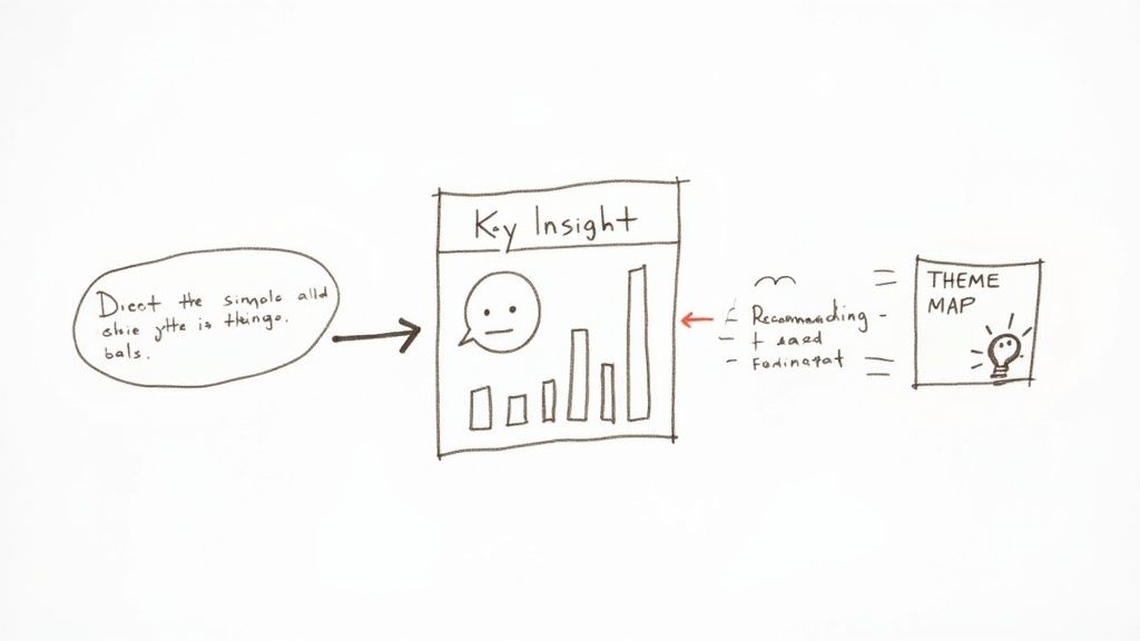
Visualize the Connections in Your Data
Sometimes, a picture really is worth a thousand words. Visual aids can make complex relationships click for your audience in an instant. Instead of just describing your themes, show how they relate to each other.
You don't need fancy software for this. Simple tools often work best.
- Theme Maps: A mind map or a basic flowchart is a fantastic way to show how smaller ideas feed into larger themes or how one finding directly influences another.
- Simple Charts: A bar chart showing how often a theme appeared across different groups of participants can add a powerful quantitative punch to your qualitative story.
These visuals do more than just break up walls of text; they help your audience see the big picture at a glance. It turns a flat list of findings into an interconnected web of insights.
For example, I once saw an HR team connect candidate interview themes about "unclear feedback" to their internal hiring data. They discovered that candidates who raised this concern took 12–18% longer to get an offer. That single insight gave them a rock-solid case for changing their process, which ultimately cut their hiring time by 7–10% in just six months. That’s the kind of impact you can have when you know how to use data analytics trends to drive business decisions.
Common Questions from the Field
Even the most well-laid-out plan hits a few bumps when the real work begins. When you're staring at a stack of transcripts, a few practical questions almost always surface. Let's tackle some of the most common ones I hear from researchers.
How Many Interviews Do I Actually Need?
This is the classic "how long is a piece of string?" question. There isn't a magic number, but the guiding principle is thematic saturation.
You've hit saturation when new interviews stop yielding new insights or themes. You're essentially hearing the same stories and ideas, just from a different person. For many research projects, this sweet spot often lands somewhere between 12 and 15 interviews.
Of course, if your participant group is very niche and homogenous, you might get there faster. The important thing isn't hitting an arbitrary number; it's being able to confidently say you’ve explored the topic from all relevant angles.
What’s the Best Software for This?
The right tool really depends on the scale of your project and your budget. Don't assume you need to buy expensive, specialized software right out of the gate.
- For smaller projects: Don't underestimate the power of everyday tools. You can get a lot done with the comment and highlight features in Microsoft Word or Google Docs. Spreadsheets are also fantastic for creating a simple codebook and tracking how often codes appear.
- For larger, more complex projects: This is where dedicated Qualitative Data Analysis Software (QDAS) really shines. Tools like NVivo or ATLAS.ti are built to handle massive datasets, make team collaboration easier, and run complex queries on your codes.
My advice? Start with what you know. If your analysis becomes too unwieldy for a spreadsheet, then upgrade to a more powerful tool. Don't let the software dictate or overcomplicate your research process.
Can AI Just Do This for Me?
Yes and no. AI can be an incredibly helpful assistant, but it’s not ready to take over as the lead researcher. Think of it as a way to handle the grunt work.
Generative AI is brilliant at summarizing a two-hour interview into a few paragraphs, spotting obvious patterns, or even suggesting a list of potential codes to get you started. It saves a ton of time.
Where it falls short is in understanding the uniquely human elements—sarcasm, cultural context, a hesitant pause before an answer. Your critical judgment is still the most important tool you have. Use AI to accelerate the initial steps, but always bring your own expertise to the final interpretation.
Ready to speed up your analysis without sacrificing accuracy? HypeScribe uses AI to transcribe your interviews with up to 99% accuracy in minutes, providing you with clean, searchable text so you can focus on finding insights, not typing. Try it today and see how much faster you can get to the story in your data. Learn more about HypeScribe.