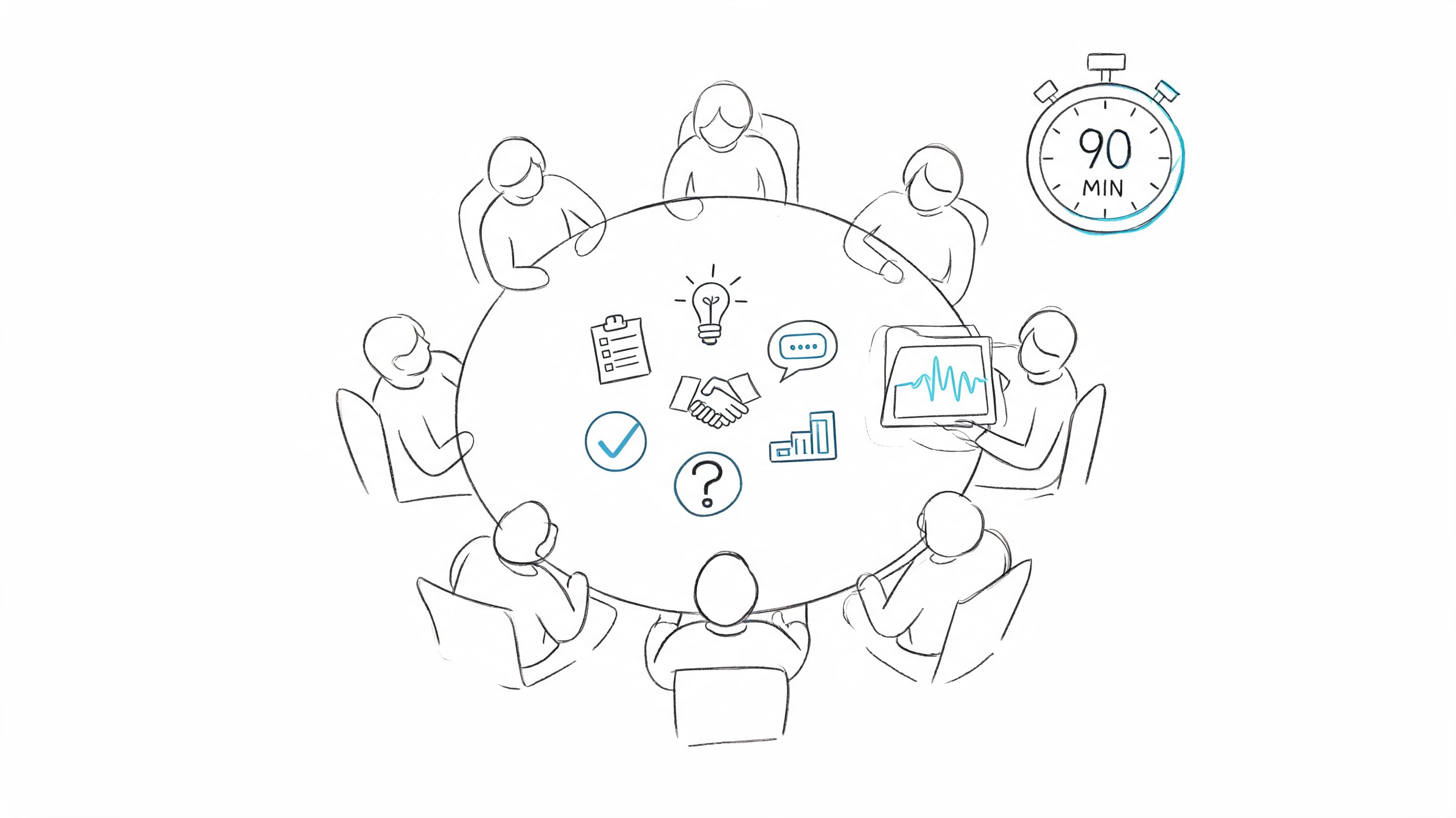
How to Analyze Qualitative Data: A Practical Guide
You've done the hard work of gathering interviews, focus group notes, or open-ended survey responses. Now what? The real magic happens during the analysis—the process of turning all that raw, non-numerical data into clear, compelling insights that can actually drive decisions.
The Journey from Raw Data to Actionable Insight
Analyzing qualitative data is less about crunching numbers and more about uncovering the stories, motivations, and meanings hiding in your text. I like to think of it as being a detective, sifting through clues—interview transcripts, field notes, video recordings—to piece together a coherent narrative that answers your biggest research questions. It's a craft that blends a structured methodology with a healthy dose of intuition.
This guide is your practical map for that journey. I’ll skip the dense academic theory and focus on a real-world workflow I've honed over years of research. The goal isn't just to report what people said, but to dig deeper and explain why it truly matters.
A High-Level View of the Process
Before we dive into the nitty-gritty, it helps to have a mental picture of the entire process. At its core, you're moving from a jumble of raw information to a deep, organized understanding through several deliberate stages.
This simple flowchart breaks it down: you start with your collected data, put it under the microscope during analysis, and emerge with valuable insights.
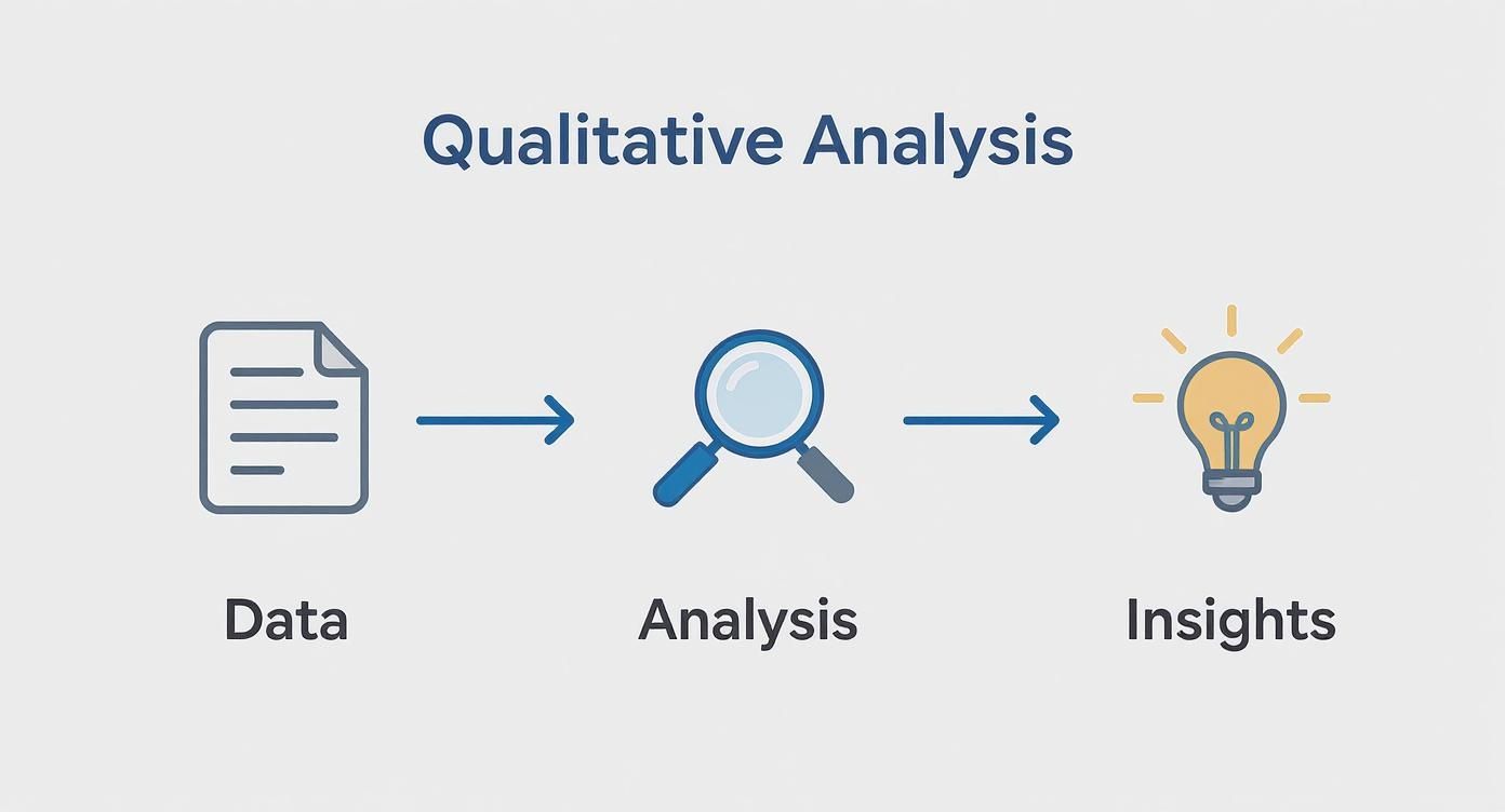
Each step logically builds on the one before it, transforming chaos into clarity. This isn't just a niche academic exercise; it's a critical research process used globally. In fact, a systematic review of large-scale qualitative studies found that 64.6% came from high-income countries like the USA, UK, and Australia, showing just how embedded this work is in major research hubs. You can dive into the global landscape of qualitative data analysis in the full study.
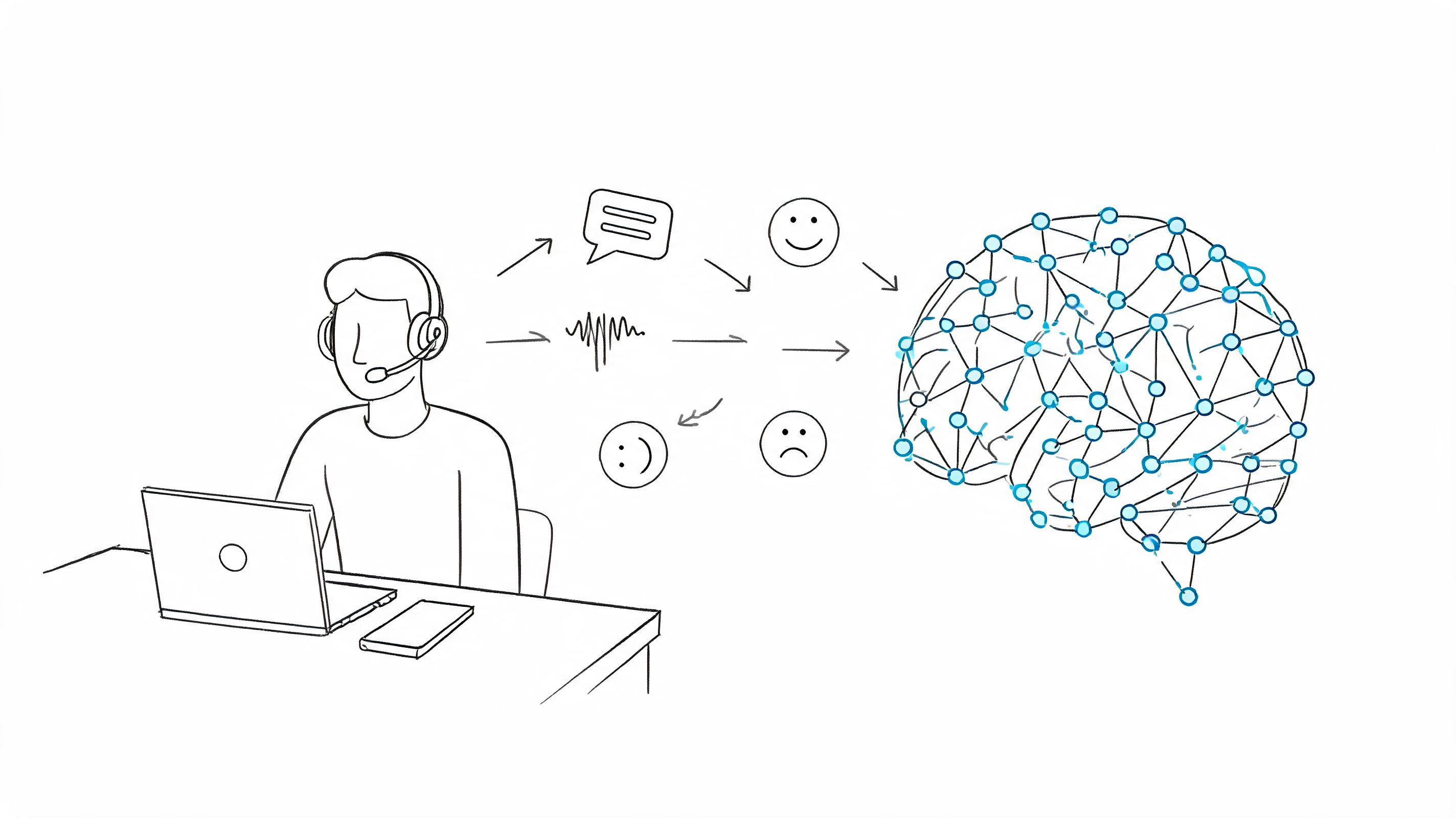
Qualitative data analysis gives you the "why" behind the numbers. It’s where you find the context, emotion, and human experience that quantitative data alone can't provide.
The Power of a Good System
Why bother with a structured approach? Because without one, you'll quickly find yourself drowning in a sea of text. A solid framework keeps you organized, ensures your findings are credible, and makes the whole endeavor feel less overwhelming.
It's your reliable path for finding the signal in the noise. To give you a bird's-eye view, here's a quick summary of the workflow we'll be breaking down.
The Qualitative Analysis Workflow at a Glance
This table outlines the key stages you'll go through, from getting your files in order to sharing your story with the world.
Think of this table as your roadmap. In the following sections, we'll unpack each of these stages with actionable advice and practical examples to guide you every step of the way.
Setting Your Data Up for Success
Before you can pull the rich stories out of your data, you’ve got to get it organized. In the rush to find those "aha!" moments, this foundational step gets skipped all too often, but trust me—getting it right now will save you from a world of frustration later. A solid preparation strategy is what separates a smooth analysis from a chaotic mess.
Think of it like prepping a complex meal. You wouldn't just toss all your ingredients in a pot and hope for the best. You'd chop your vegetables, measure your spices, and get your station in order first. The same discipline applies to qualitative data analysis.
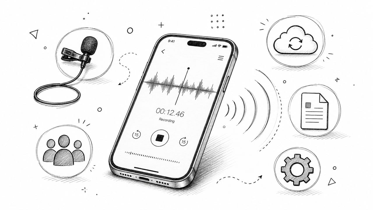
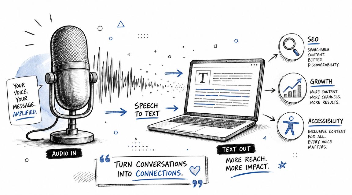
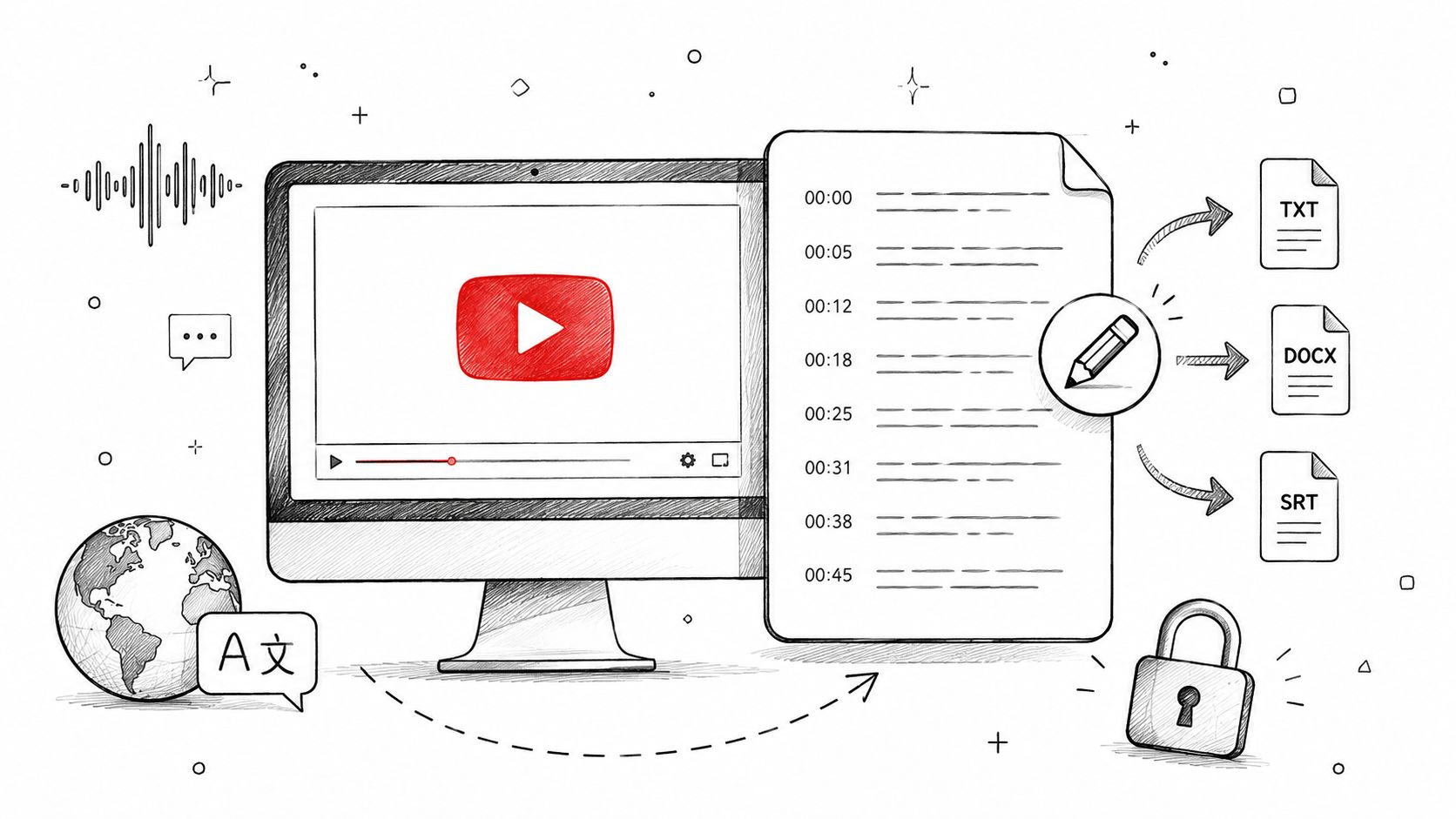
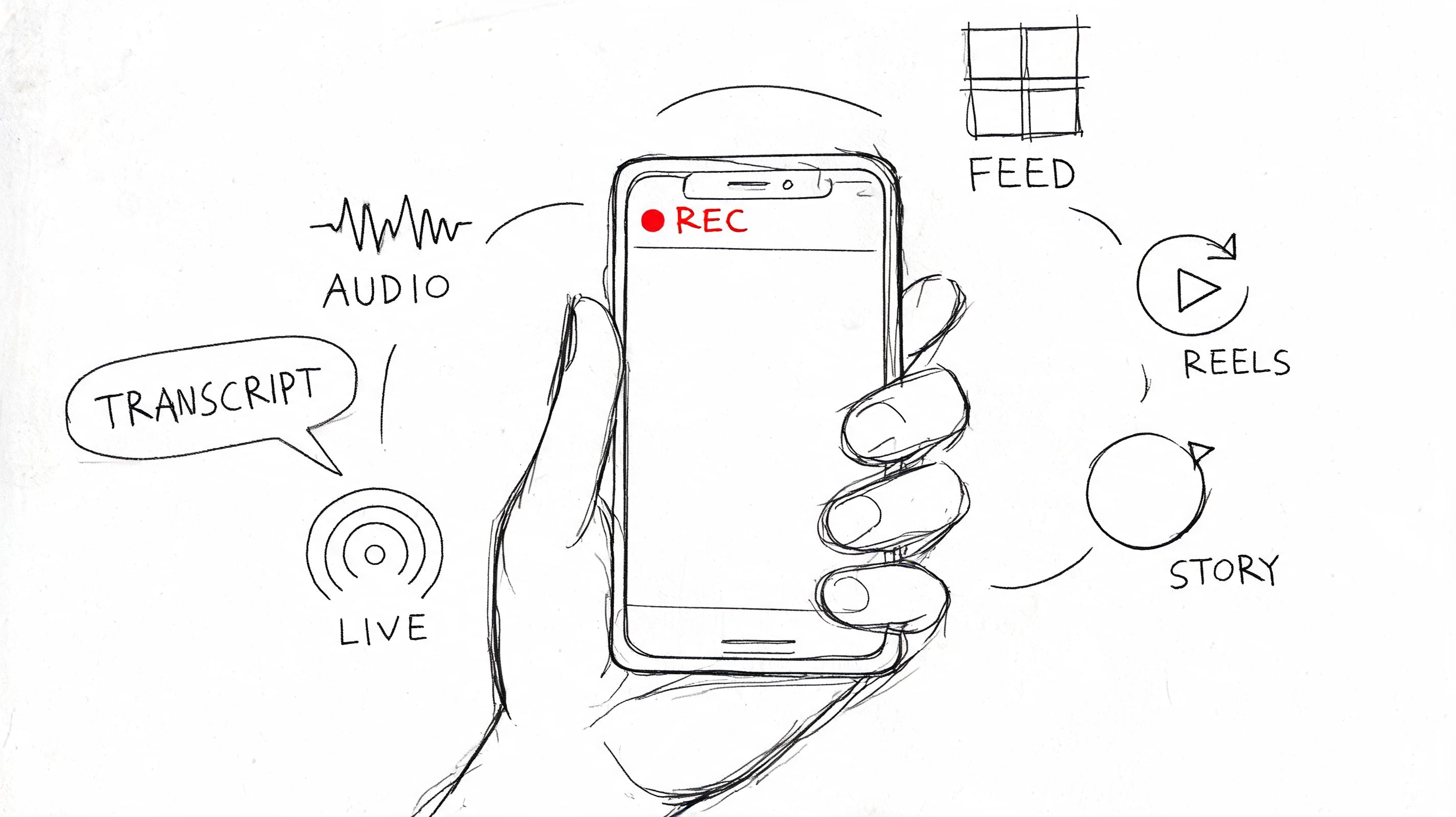
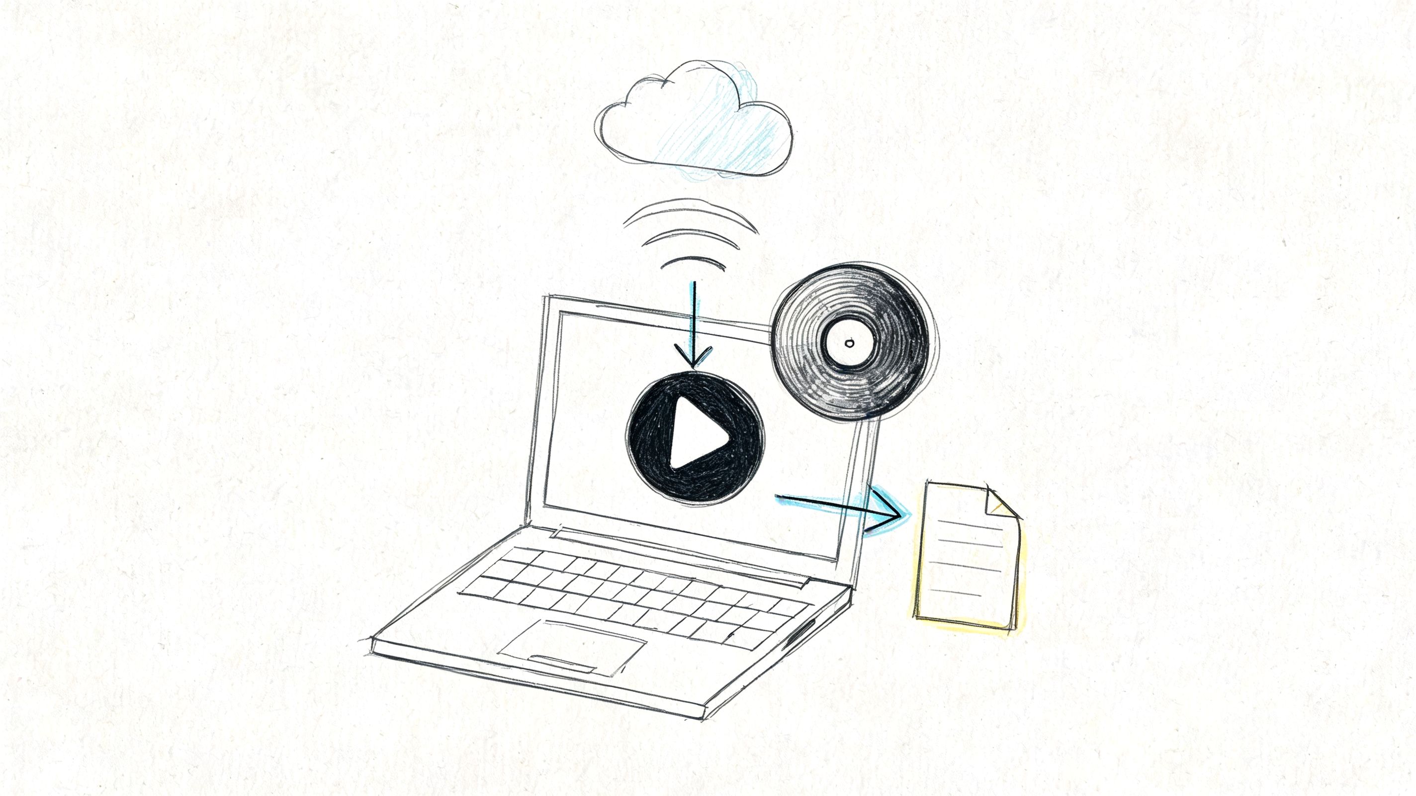
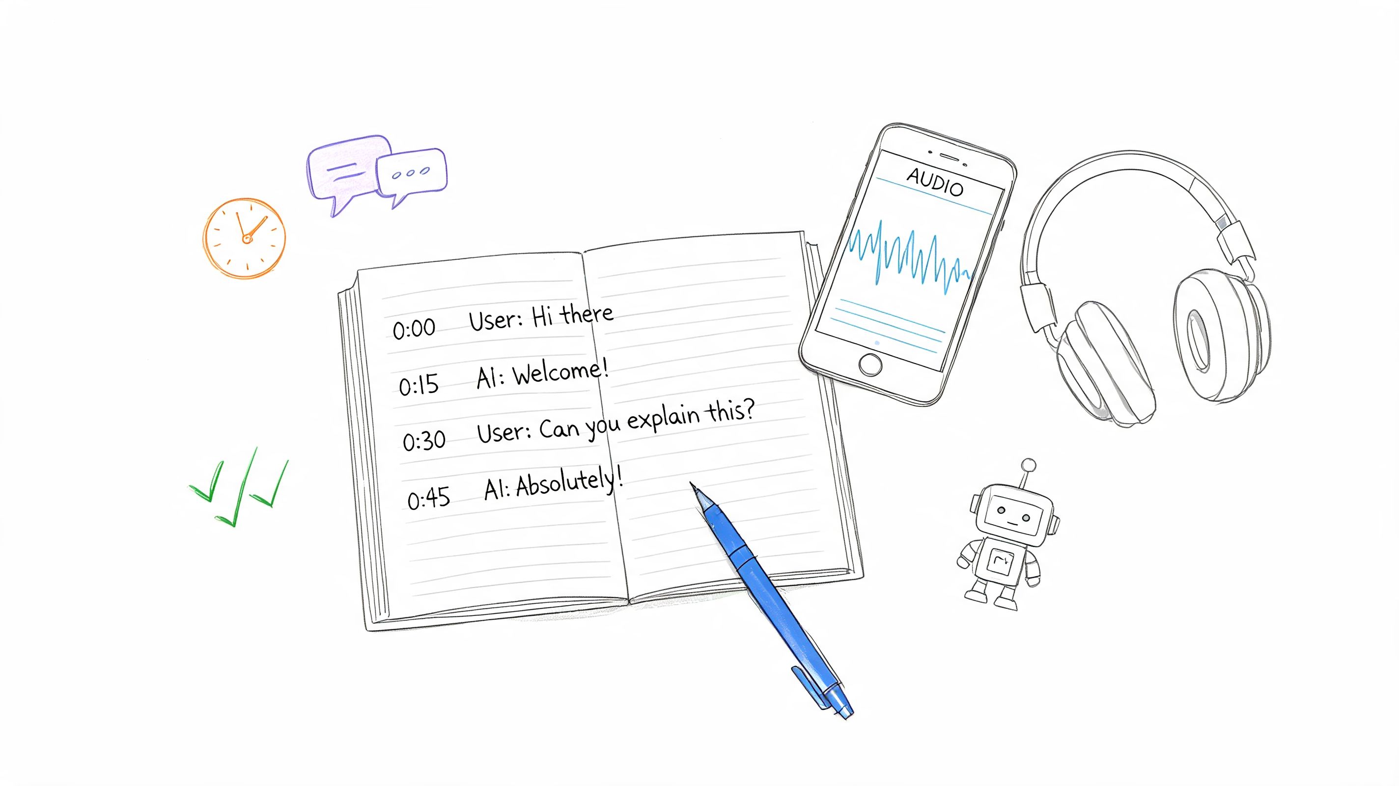
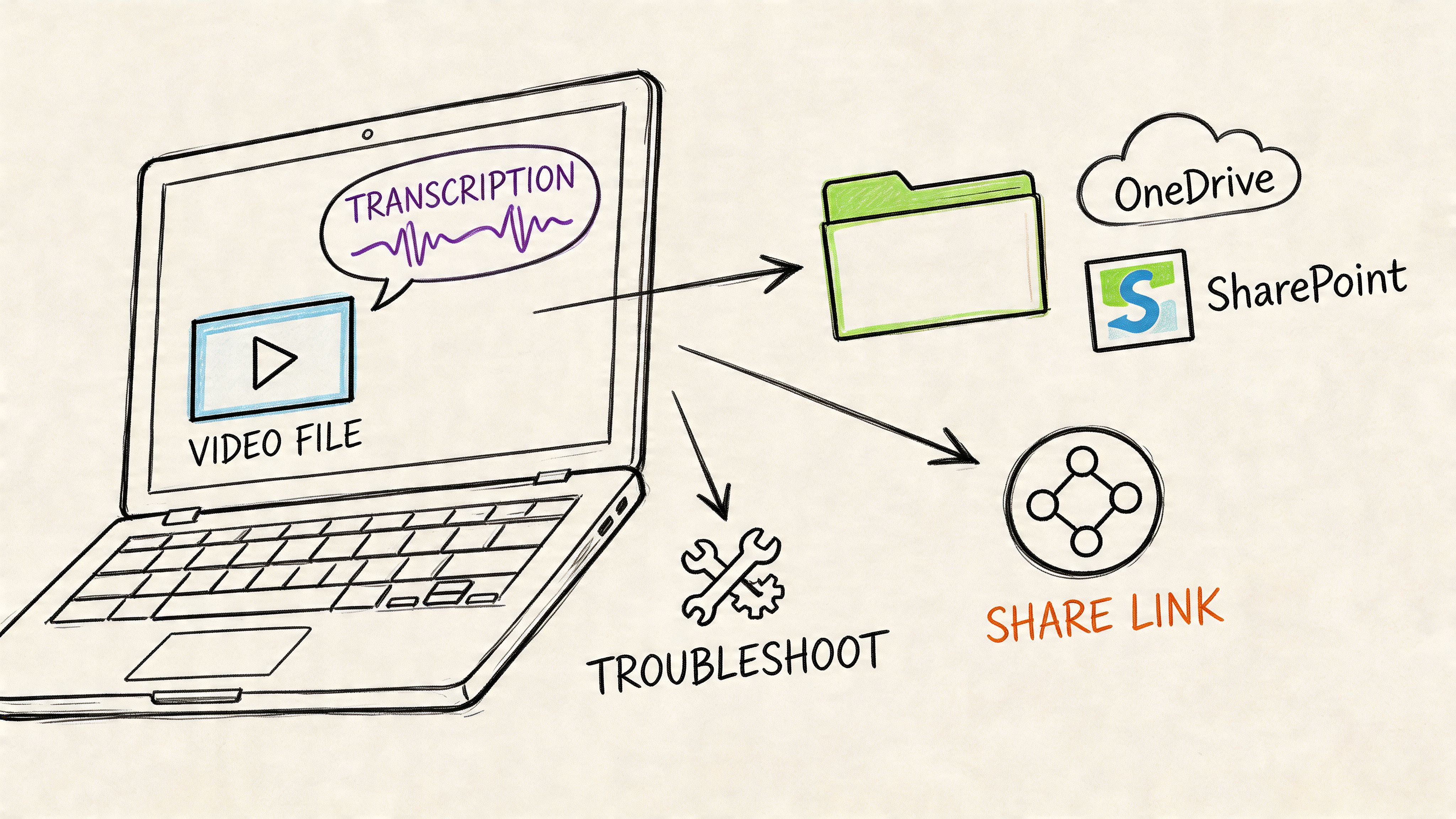
From Raw Recordings to Ready Text
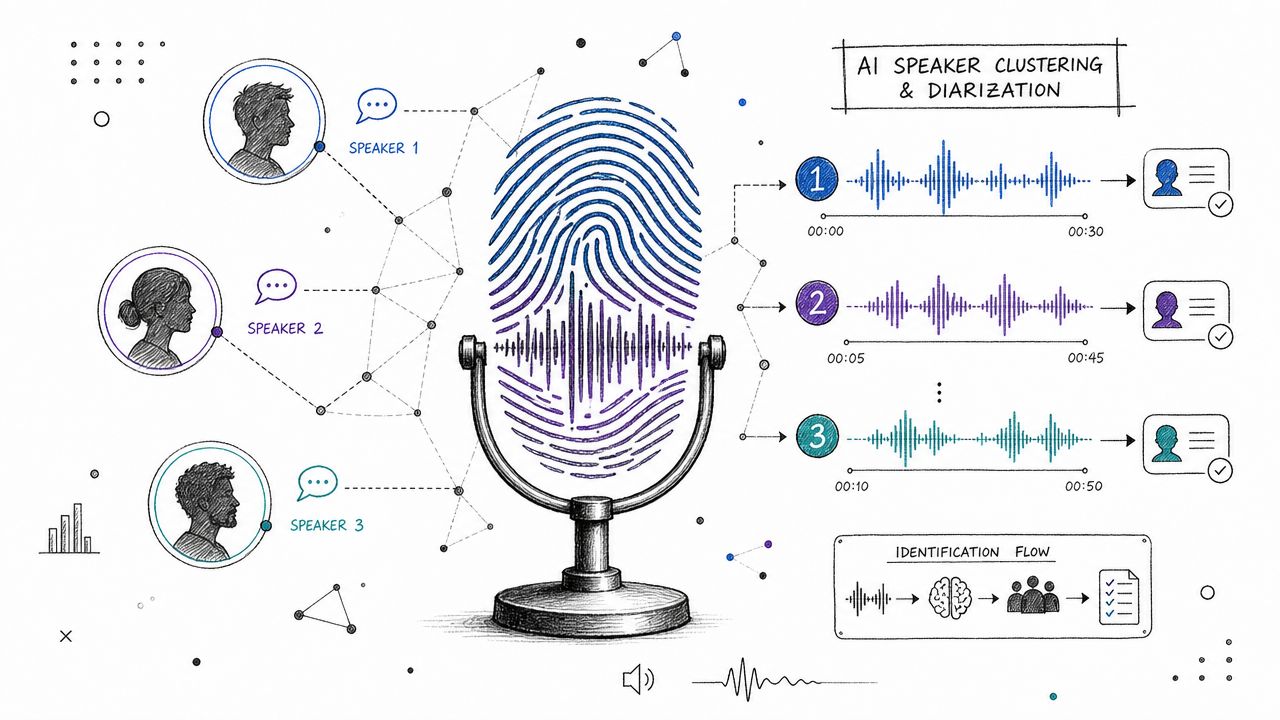
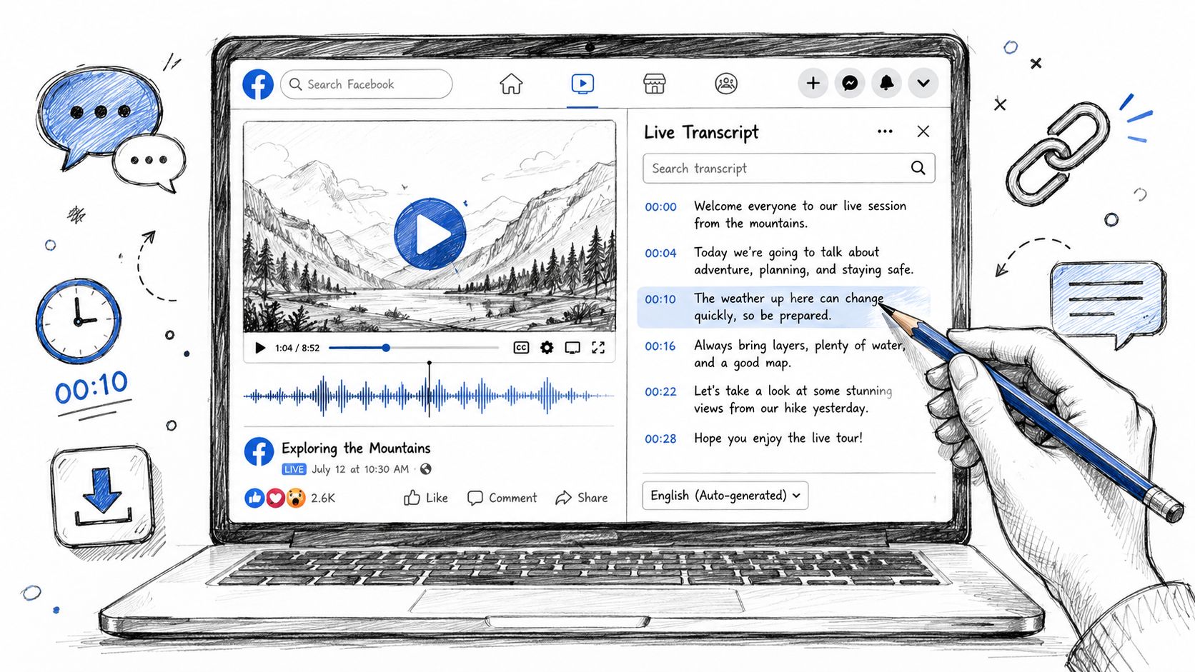
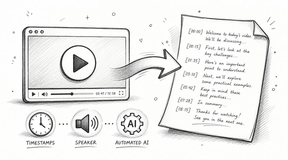
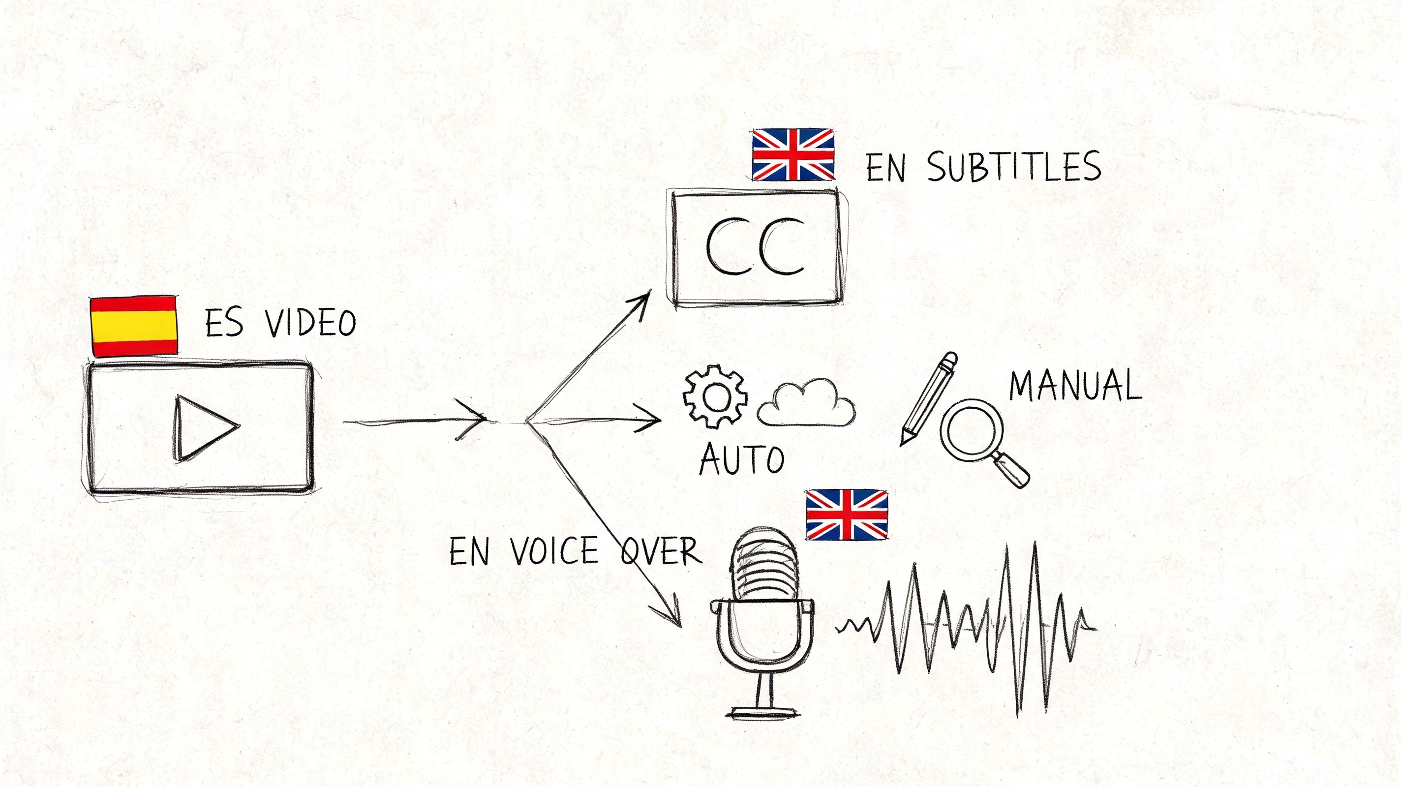
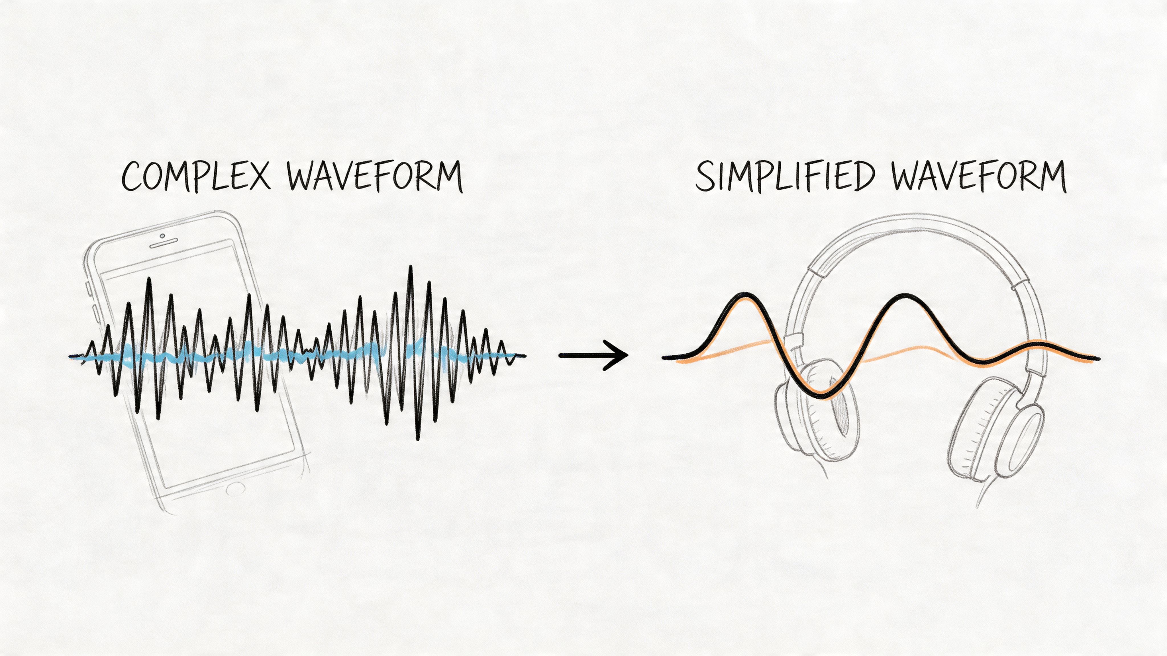
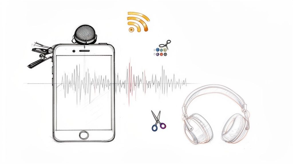
Most of our raw material starts out as audio or video—think interviews, focus groups, or field recordings. To actually work with this stuff, you have to turn it into text. This is your first major decision point: transcription. You have two main paths, and they come with very different trade-offs.
- Doing It Yourself (Manual Transcription): This is the classic approach—you listen, you type, you repeat. It’s slow, no doubt about it. But the upside is huge: you get deeply immersed in your data from the get-go. You’ll start picking up on tone, hesitation, and other nuances long before you even start the official coding process.
- Using AI Transcription Services: On the other hand, automated tools can crank out a transcript in minutes, not hours. The accuracy of these services has gotten incredibly good, with some hitting up to 99% accuracy. This frees you from the drudgery of typing and lets you jump straight into the analysis.
If you’re on a tight deadline or sitting on a mountain of recordings, an AI service is almost always the way to go. Just remember, even the best AI isn't perfect. It can stumble over jargon, thick accents, or a noisy coffee shop in the background. You absolutely have to proofread and clean up any automated transcript before you start. If you're trying to decide which route to take, our guide on how to transcribe an interview breaks down the practical side of both methods.
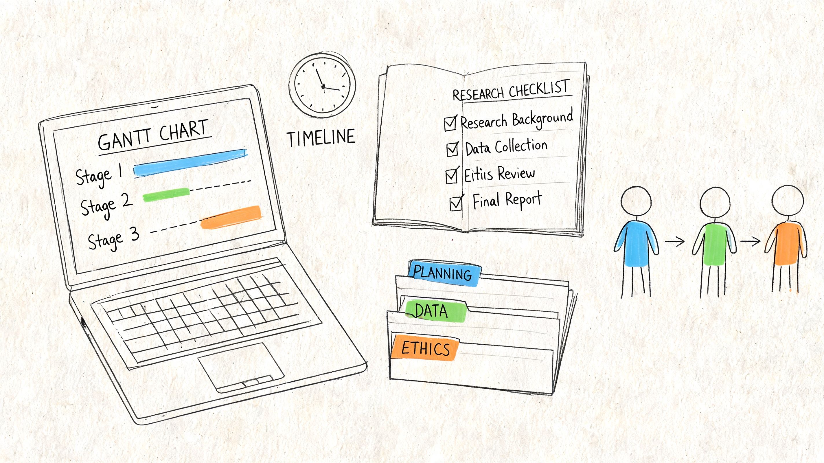
Organizing Your Digital Workspace
Once you have your transcripts and notes, you need a system. A messy desktop or a jumble of randomly named files can derail a project faster than you'd think. The best defense against this kind of chaos is a simple, logical folder structure.
I always create a master project folder and then break it down with clear subfolders. This keeps everything tidy and makes it easy to find what I need when I need it.
Here’s a structure that I’ve found works for just about any project:
- /01_Raw_Data/ (The original, untouched audio/video files go here)
- /02_Transcripts/ (All your cleaned-up and formatted text files)
- /03_Field_Notes/ (Your memos, reflections, and observation notes)
- /04_Analysis/ (This is for your codebook, coded files, and theme maps)
- /05_Reports/ (Where you keep drafts and final write-ups)
This setup also ensures your raw data files remain pristine, which is crucial for preserving the integrity of your original sources.
Good organization isn't just about being neat. It's about creating a clear, auditable trail from your raw data to your final conclusions. This builds credibility and makes it easier for others (or your future self) to retrace your steps.
Protecting Participant Privacy
Our ethical responsibility is the bedrock of good research. People trust us with their stories, and protecting their identity is non-negotiable. This is where anonymization comes in—the process of stripping out all personally identifiable information (PII) from your transcripts and notes.
This means you need to go through and replace real names, specific locations, and company names with pseudonyms or general descriptions. For instance, "Sarah from Acme Corp" might become "Participant A from a mid-sized tech company."
My advice? Create a separate, password-protected "key" file that links the pseudonyms back to the real identities. Keep this file locked down and stored completely separately from your analysis files. Doing this early on isn't just a box-ticking exercise; it’s about upholding your ethical duties and maintaining the trust you've built with your participants.
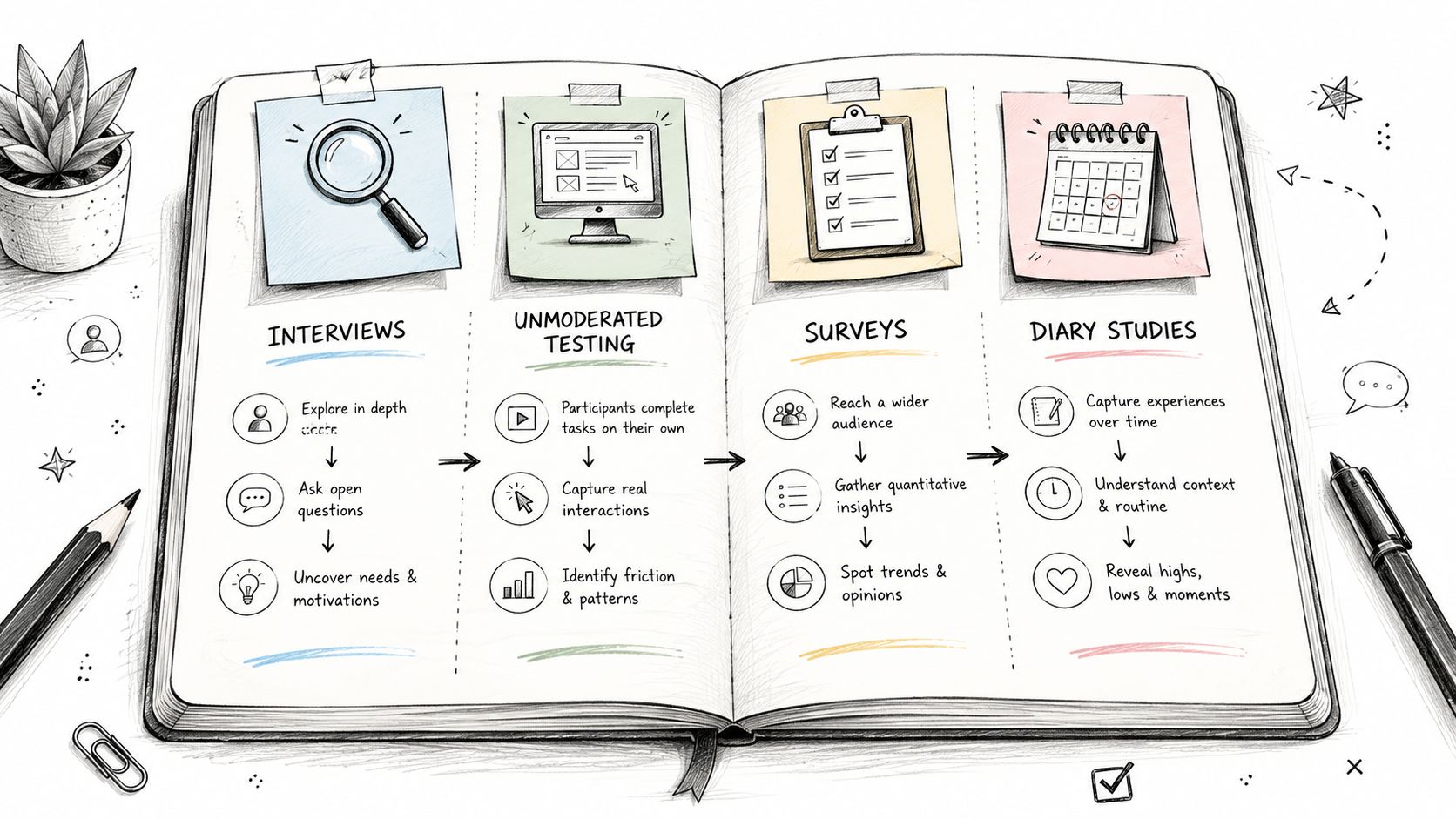
Choosing The Right Analytic Approach
Alright, your data is organized and ready to go. Now comes the big decision: how are you actually going to make sense of it all? There's no single "best way" to analyze qualitative data. The right method is the one that lines up perfectly with your research goals and the questions you're trying to answer.
Think of it like choosing the right tool for a job. You wouldn't use a hammer to saw a piece of wood, right? In the same way, the analytical framework you pick will shape what you find and how you find it. Let's walk through three of the most common and practical approaches you’ll encounter.
Thematic Analysis For Finding Patterns
Thematic Analysis is probably the most flexible and widely used approach out there, and for good reason. The main goal is to identify, analyze, and report patterns—or themes—that pop up across your data. If you're just getting started with qualitative analysis, this is an excellent place to begin.
This method is incredibly practical when you just need to know what people are talking about most often. It’s perfect for answering the question, "What are the common threads running through all these interviews?" It doesn’t force you into a rigid theoretical box, giving you the freedom to let the data itself guide your discoveries.
Real-World Scenario: Imagine a UX team just finished a dozen user interviews about a new app feature. They’ve got pages of transcripts. Using Thematic Analysis, they can start coding feedback into buckets like "confusing navigation," "wants customization," and "positive feedback on speed." These codes then get grouped into bigger themes, like "Usability Hurdles" and "Performance Wins," giving the product team clear, actionable insights to improve the app.
The real power of thematic analysis is its ability to provide a rich, detailed story. It's the perfect partner for quantitative data, which often tells you the "what" but not the "why." While a survey might tell you how many users dropped off, qualitative analysis uncovers why they left. In fact, a full 70% of organizations now blend qualitative and quantitative data to get the full picture. You can get more great tips on integrating qualitative data analysis and see its impact in action.
Grounded Theory For Building New Ideas
So, what if you don't have a hypothesis and want to build a new theory from scratch, based purely on your data? That’s where Grounded Theory comes in. It’s a more intensive, systematic process where the goal is to develop a theory that is literally "grounded" in the real-world experiences of your participants.
You start with a clean slate—no preconceived notions. Instead of testing a theory, you're building one. This makes it perfect for exploring new phenomena or areas where there isn't much existing research. It's a true bottom-up journey of discovery.
- When to Use It: Choose Grounded Theory when you want to understand a process or experience from the participants' point of view, without your own biases getting in the way.
- What You Produce: The final output is often a theoretical model that explains the core phenomenon you studied, sometimes with diagrams showing how different concepts connect.
For example, a researcher studying how remote teams build culture might use Grounded Theory. Through interviews, they’d let themes emerge organically—like "digital watercoolers" or "asynchronous trust-building"—and then construct a new theory explaining how social bonds form in a virtual workplace.
Content Analysis For Quantifying Text
Sometimes your goal is more straightforward: you need to systematically count and categorize words, concepts, or themes. For that job, you want Content Analysis. This method can be both qualitative (interpreting meaning) and quantitative (counting how often things appear).
This approach is highly structured and relies on clear, pre-defined categories. It’s fantastic for making sense of huge volumes of text, like social media posts, news articles, or open-ended survey responses.
Example in Action: A marketing team wants to know how their brand is perceived on Twitter. They can use Content Analysis to scan thousands of tweets mentioning their brand. They might create categories like "Positive Sentiment," "Negative Sentiment," "Customer Service Complaint," and "Feature Request," then tally how many tweets fall into each. This gives them a clear, data-backed snapshot of public opinion and specific areas that need attention.
Comparing Common Qualitative Analysis Methods
Choosing your analytic approach is a critical decision that directs your entire project. It's really about matching your method to your mission. The table below gives a quick side-by-side look to help you decide.
By understanding the unique strengths of each of these frameworks, you can confidently pick the one that will turn your raw data into the meaningful insights you’re looking for.
Getting Your Hands Dirty: The Craft of Coding
Alright, this is where the real work—and the real discovery—begins. Coding is the interpretive heart of qualitative analysis. It’s less about running numbers and more about rolling up your sleeves to make sense of a mountain of text. You're systematically sifting through your data, assigning short labels (or codes) to chunks of text to start organizing the chaos.
Think of yourself as a detective with a box full of unsorted evidence. You wouldn’t just stare at the pile. You’d start tagging each item—this is a receipt, that’s a witness statement, here’s a photo. Coding does exactly that for your interview transcripts, survey responses, or observation notes. It’s the first step in turning raw information into a coherent story.
From Tiny Labels to Big Ideas
One of the first things to get straight is the difference between a code and a theme. They’re related, but they're not the same, and mixing them up can cause a lot of confusion.
- A code is a short, descriptive label you attach to a small piece of data—a single phrase, a sentence, maybe a short paragraph. It’s the micro-level tag.
- A theme is the bigger picture. It’s the major pattern or insight you uncover after you’ve collected and grouped a bunch of related codes.
For example, you might be analyzing feedback on a new software feature. You could apply the code "confusing button labels" to several user comments. After finding this and other codes like "unclear workflow" and "hidden settings," you might group them all under the broader theme of "Poor Feature Usability." You have to find the little clues (codes) before you can solve the bigger mystery (themes).
Practical Coding Techniques in Action
Coding isn't a one-and-done task; it's an iterative process of exploration and refinement. Most researchers I know start with a very broad approach and then narrow their focus as patterns start to surface. Two classic techniques to get you started are open and axial coding.
Get Started With Open Coding
This is your first pass, your initial dive into the data. In open coding, you read through everything—line by line, if you have to—and apply codes freely. Don't worry about having a perfect system yet. The whole point is to stay open to whatever the data throws at you. Just break it down and label anything that catches your eye.
Imagine you're reviewing a transcript from an interview about remote work challenges. A participant might say:
"I love the flexibility of working from home, but sometimes the isolation is really tough. I miss the random chats we used to have in the kitchen, and it’s hard to feel connected to the team when you only see them on scheduled calls."
From that single statement, you could pull out several open codes:
- Value of flexibility
- Feeling of isolation
- Missing informal interaction
- Difficulty with team connection
You’re not judging or organizing yet, just tagging what’s there.
Make Connections With Axial Coding
Once you've done your open coding, you'll have a long, messy list of codes. That’s perfectly fine. Now it's time for axial coding, which is all about making connections. You'll review that long list and start grouping related codes into more structured categories.
Looking at our remote work example, you might notice that codes like feeling of isolation, missing informal interaction, and difficulty with team connection all point to a similar underlying issue. You could bundle them under a more conceptual category like "Social Disconnection." This is the moment where you begin to see the forest for the trees, moving from dozens of small labels toward a handful of powerful concepts.
Should You Code Manually or Use Software?
The next big decision is how you'll physically do the coding. You can absolutely go old-school, or you can use one of the many specialized software tools out there. There's no single right answer; it really depends on your project's scale and your personal workflow.
Manual Coding: Don't knock it 'til you try it. This can be as simple as printing out your transcripts and going to town with highlighters and sticky notes. Or you could use a spreadsheet, with one column for the data snippet and another for your codes. It's cheap, simple, and forces you to engage very deeply with the text.
Software-Assisted Coding (CAQDAS): On the other hand, tools like NVivo, ATLAS.ti, or MAXQDA are game-changers for larger projects. These platforms (often called CAQDAS, for Computer-Assisted Qualitative Data Analysis Software) let you highlight and code text digitally, then search, sort, and visualize your work in ways that are impossible to do manually.
The efficiency gains are hard to ignore. In one survey of over 1,000 researchers, a whopping 68% said that using CAQDAS improved their speed and accuracy. And as AI gets better, these tools are starting to offer features that can suggest initial themes and sentiments. To get a better sense of what's out there, you can dive deeper into the current landscape of qualitative data analysis software.
Don't Skip the Codebook
Whether you're working solo or with a team of ten, you need a codebook. I can't stress this enough. A codebook is your central reference guide—a document that lists every code, provides a clear definition for it, and gives a concrete example of what it looks like in the data.
Think of it as the rulebook for your analysis. It ensures you apply codes consistently from the first transcript to the last. For team projects, it’s absolutely essential. Without a shared codebook, you can’t be sure that "user frustration" means the same thing to you as it does to your colleague. It's the bedrock of a credible and rigorous analysis.
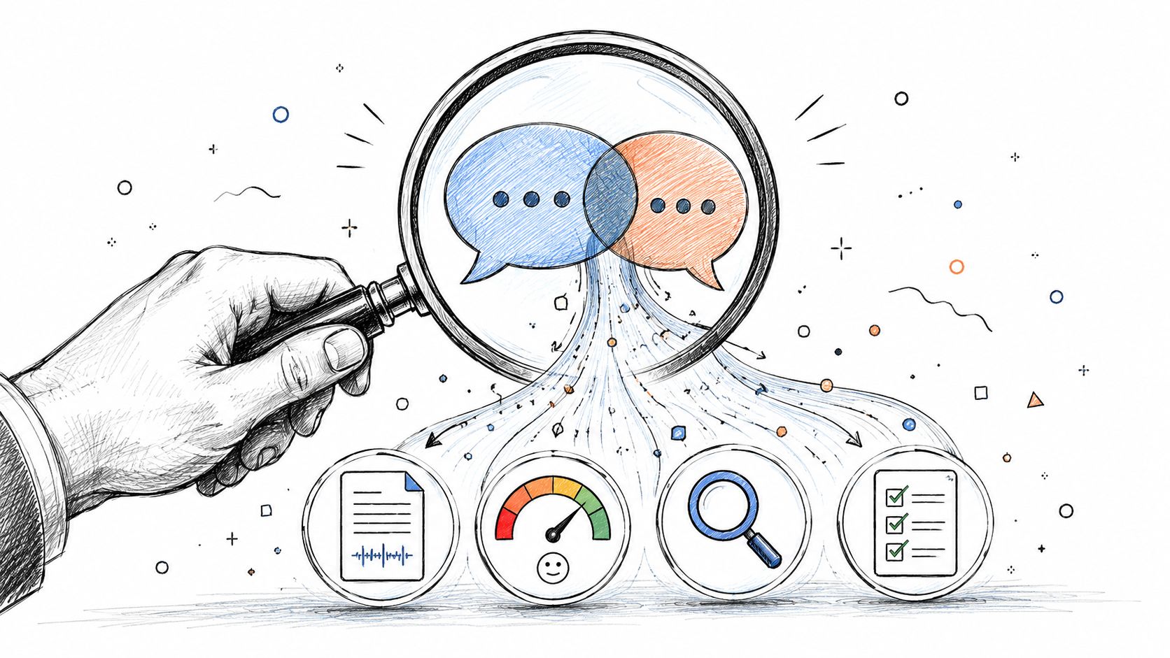
From Codes to Conclusions: Finding the Story in Your Data
You've done the hard work of coding and organizing your data. Now what? This is where the real magic happens. It’s the point where you shift from simply sorting information to actually interpreting it. You’re moving beyond what people said and digging into what it all means.
Think of it this way: interpretation isn't just a summary of your codes. It's about stepping back and seeing the whole forest, not just the individual trees. You're hunting for the patterns, the connections, and even the contradictions between your themes. The goal is to piece together a compelling story that’s insightful, credible, and truly represents your participants' world.

Building a Narrative You Can Trust
Let’s be honest: your conclusions are only as strong as the evidence you have to back them up. To make sure your findings are solid and believable, you need to actively challenge and validate your own interpretations. This isn’t a sign of weakness—it’s the hallmark of rigorous research that earns trust.
Here are a few classic strategies I always come back to for building that credibility.
- Triangulation: Don't rely on a single source of truth. Compare what you heard in interviews with what you saw in field notes or read in internal documents. When different data sources all point to the same conclusion, your argument becomes exponentially stronger.
- Member Checking: This is one of the most powerful tools in your kit. Simply take your early interpretations back to the people you interviewed. Ask them, "Does this ring true to your experience?" It’s a gut check that keeps your analysis grounded in their reality, not just your own head.
- Peer Debriefing: Sometimes you’re just too deep in the weeds to see clearly. Grab a trusted colleague—someone who gets qualitative analysis—and walk them through your findings. A fresh set of eyes can spot biases you’ve missed or suggest alternative angles you hadn't even considered.
By systematically cross-checking your interpretations, you transform a subjective analysis into a defensible argument. This rigor is what gives qualitative insights their power and influence.
Keeping the Team on the Same Page
If you’re not flying solo on a project, making sure everyone is interpreting the data consistently is non-negotiable. This is where inter-coder reliability becomes so important. It’s essentially a fancy term for measuring how consistently different people on your team apply the same codes to the same pieces of data.
When reliability is low, it’s a red flag. It usually means your codebook is too vague or your team members are seeing things differently. High reliability, on the other hand, gives you confidence that the process is systematic and not just one person’s pet theory.
Regular check-ins and a crystal-clear codebook are your best friends here. This collaborative grind ensures the final story is built on a shared understanding, not just one person’s bias. In fact, a solid grasp of what is conversation intelligence can really help, as it provides a shared language for analyzing dialogue and aligning team interpretations.
Turning Your Analysis Into a Story
The final piece of the puzzle is weaving your validated themes into a narrative that makes sense. You have to explain how the themes connect to answer your big research question. Two simple tools can make this process a lot less intimidating.
Use Memos to Think on Paper
I swear by analytic memos. Think of them as your private research journal. They’re just informal notes to yourself where you can work through your thoughts, connect disparate ideas, and explore hunches as they come up. Memos are where you ask yourself the tough questions:
- What’s the real story emerging here?
- How is Theme A actually causing Theme B?
- Why was I so surprised by this particular finding?
These little reflections are what bridge the gap between a boring list of themes and a truly insightful conclusion.
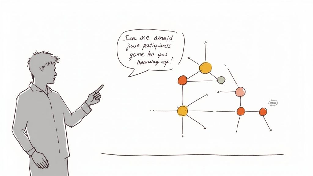
Map It Out Visually
If you’re a visual thinker, get up and grab a whiteboard. Draw your main themes in circles and start connecting them with arrows. Does one theme lead to another? Are two of them in tension with each other? This kind of concept mapping can reveal complex relationships that are nearly impossible to spot in a spreadsheet.
This simple exercise helps you build a logical flow for your final report or presentation, ensuring your story hangs together in a way that’s not just smart, but also easy for others to follow.
Presenting Your Findings for Maximum Impact
All the deep work of qualitative analysis comes down to this moment: sharing what you've discovered. But even the most brilliant insights will fall flat if they aren't understood or, worse, get ignored entirely. Presenting your findings isn't just a data dump; it's about telling a compelling story that sticks with your audience and sparks real change.
The trick is to ditch the dry, academic list of themes. Your real job is to build a narrative that feels credible, is easy to remember, and directly answers the questions that kickstarted your research in the first place.
Weave a Story with Participant Voices
Direct quotes are, without a doubt, the most powerful tool in your qualitative toolkit. They're what make your data breathe. Quotes transform abstract concepts into real, human experiences, adding a layer of emotion and authenticity that no summary can ever match.
Don't just state a theme and move on. Let a participant's own words introduce it.
For instance, instead of just writing:
Theme: Customers found the new checkout process confusing.
Bring it to life like this:
"I felt like I was going in circles. I added the item to my cart, and then suddenly I was back on the homepage. I tried three times before I just gave up." - Participant B
See the difference? The first version is a fact. The second is a story of frustration that led directly to a lost sale. When choosing quotes, look for the ones that are concise, clear, and pack an emotional punch. They're the evidence that makes your conclusions undeniable.
Create Clarity with Visual Storytelling
Let's be honest, not everyone wants to read a dense report. Visuals are your best friend for making complex findings digestible at a glance, turning a tangled web of data into a clear picture. And you don't need to be a design wizard to do it well.
Often, the simplest visuals are the most effective.
- Thematic Maps: Think of these as a mind map for your research. Draw a bubble for each main theme and connect them with lines to show how they relate. It’s a fantastic way to give your audience a bird's-eye view of your analysis.
- Customer Journey Maps: These are perfect for UX research. Map out the user's experience step-by-step, flagging pain points and moments of delight with a killer quote at each stage.
- Simple Charts: If you've done any light counting (like how often a specific code appeared), a simple bar chart can illustrate the frequency of certain themes and add a quantitative anchor to your qualitative story.
Your presentation is the bridge between your analysis and action. A well-told story, supported by strong evidence and clear visuals, ensures your hard-won insights don't just sit in a report—they inspire change.
Tailor Your Message to the Room
The way you talk about your findings should absolutely change depending on your audience. The super-detailed report you write for fellow researchers is not the same as the quick-hitting brief you prepare for stakeholders.
For a C-suite or executive audience, get straight to the point. Focus on the biggest takeaways and what needs to happen next. Our guide on how to write a meeting summary has some great pointers for distilling information effectively. For a team of developers or designers, you can dive much deeper into the methodology and specific data points that affect their work.
When you want to see your findings turn into action, using something like Voice of the Customer software can help teams organize and act on the very feedback you've just uncovered.
Before you build a single slide, always ask yourself: What does this group need to know, and what do I want them to do with this information? By tailoring your message, you make sure your analysis actually leads to something meaningful.
Common Questions About Qualitative Analysis
Even with the best-laid plans, a few questions always seem to pop up once you're deep in the weeds of qualitative data. Let's tackle some of the most common ones I hear from researchers to help you keep your project moving forward.
How Much Data Is Enough?
This is probably the number one anxiety for anyone doing this kind of work. Unlike a quantitative study, there's no magic number. Your goal isn't volume; it's reaching what we call thematic saturation.
Saturation is that point where you're not really learning anything new. New interviews or focus groups start to echo what you've already heard, and fresh themes stop emerging.
As a general rule of thumb, many projects hit this point somewhere between 12 to 20 interviews. But don't get hung up on that number—focus on the richness and depth of your data instead.
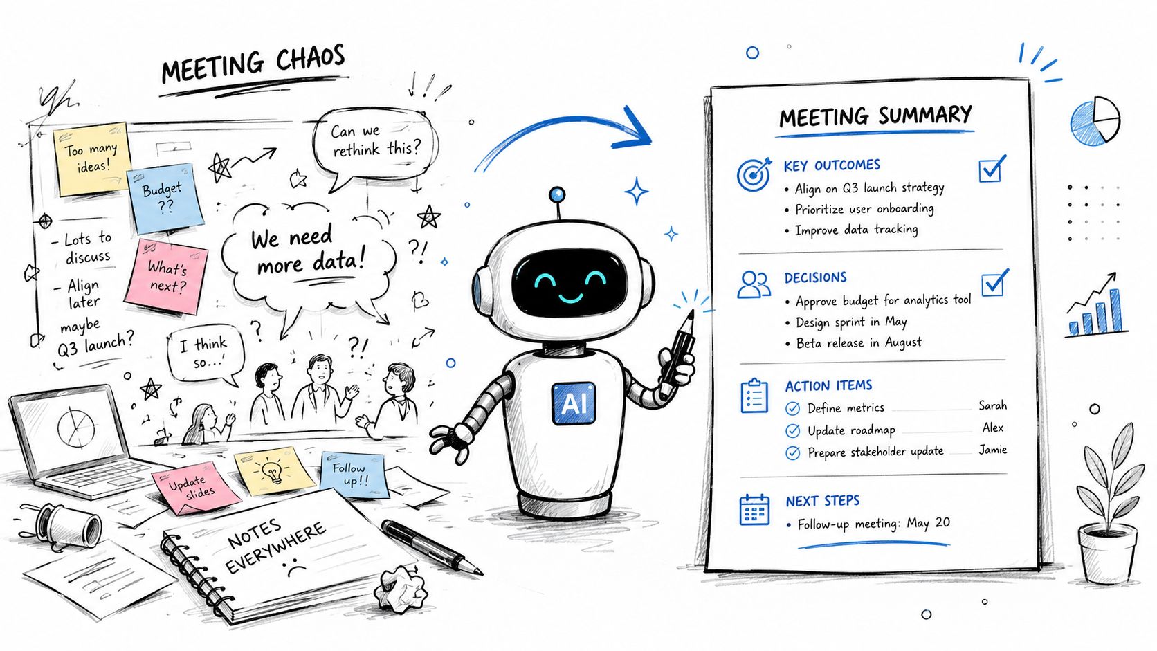
What’s the Role of AI in Qualitative Analysis?
Artificial intelligence is quickly becoming an indispensable partner in the analysis process. AI-powered tools can be a lifesaver, dramatically cutting down the time you spend on tedious tasks like transcription and even initial coding.
Imagine you're staring down 170 hours of interview data. An AI tool can handle the initial pass, pulling out keywords and suggesting potential themes, which is a massive head start.
Think of AI as your research assistant, not your replacement. It excels at spotting patterns and boosting efficiency, but the deep, nuanced interpretation—the part where you figure out what it all means—that still requires your expertise.
Ultimately, AI helps you manage larger datasets more effectively, but the critical thinking and contextual understanding that make an analysis truly insightful? That's all you.
Can I Combine Qualitative and Quantitative Data?
Not only can you, but you absolutely should whenever possible. This is known as a mixed-methods approach, and it's incredibly powerful. Quantitative data gives you the "what," while qualitative data explains the "why."
Here's how it plays out in the real world:
- Quantitative Finding: Your analytics show a 30% drop-off rate on the final step of your app's checkout process. You know what is happening.
- Qualitative Insight: You conduct a few user interviews and discover the "secure payment" button is causing confusion and mistrust. Now you know why it's happening and how to fix it.
When you bring both types of data together, you get a story that’s not just complete but also far more persuasive. If you're looking for more on this, you can find additional guidance on how to analyze qualitative data.
Ready to turn your team’s conversations into clear, actionable insights? HypeScribe uses AI to transcribe your meetings, interviews, and audio files with up to 99% accuracy, generating smart summaries and key takeaways in seconds. Stop drowning in notes and start driving results. Try HypeScribe for free and transform your workflow today!