Adding Text in Final Cut Pro: A Practical Guide for 2026
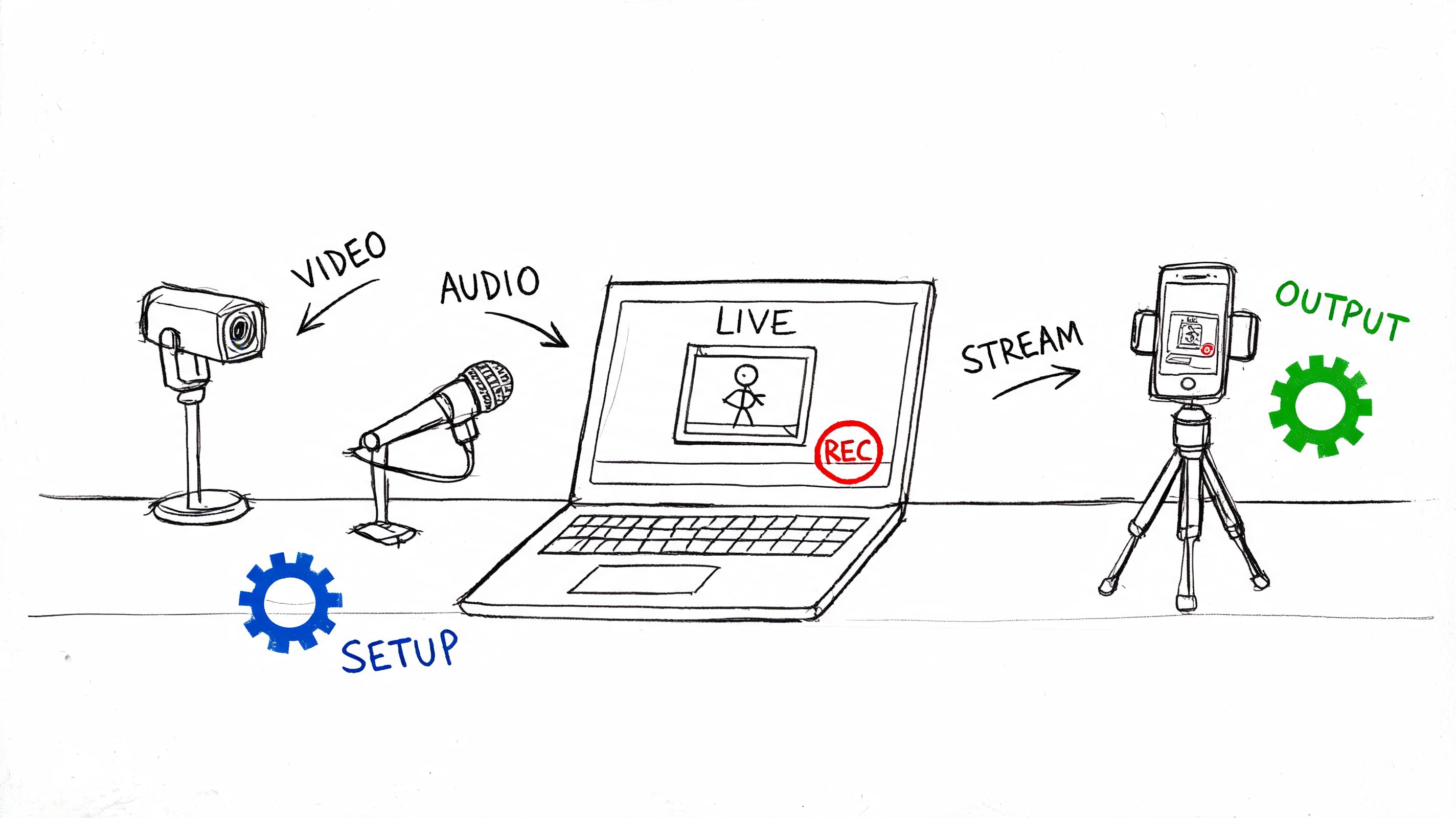
You've got the edit locked. The pacing works. The cuts are clean. Then you hit the last mile and realize the video still needs text. An opener. A name tag. Maybe a quote on screen. Maybe captions people can read on a phone.
That's the moment when adding text in Final Cut Pro can feel either simple or strangely clumsy.
The good news is that Final Cut Pro is built for this. The part that trips people up is that text in FCP isn't treated like a floating document layer. It behaves like a clip on the timeline. Once that clicks, the rest starts making sense. You stop fighting the app and start using it the way it wants to be used.
I'll walk through the practical workflow I use when I need text to look clean, stay organized, and do more than decorate the frame.
Getting Started with Titles and Lower Thirds
You finish an interview edit, hit play, and realize the story is missing two simple things: a clear opening title and a lower third that tells viewers who is speaking. That is usually where text work begins in Final Cut Pro. Not as decoration, but as information. It helps the audience follow the story, and it helps people watching without sound or in another language stay with you.
Final Cut Pro handles both jobs through the Titles and Generators browser or a keyboard shortcut. Use the browser when you want to see built-in styles. Use the shortcut when you already know you need a plain text layer and want to keep cutting.
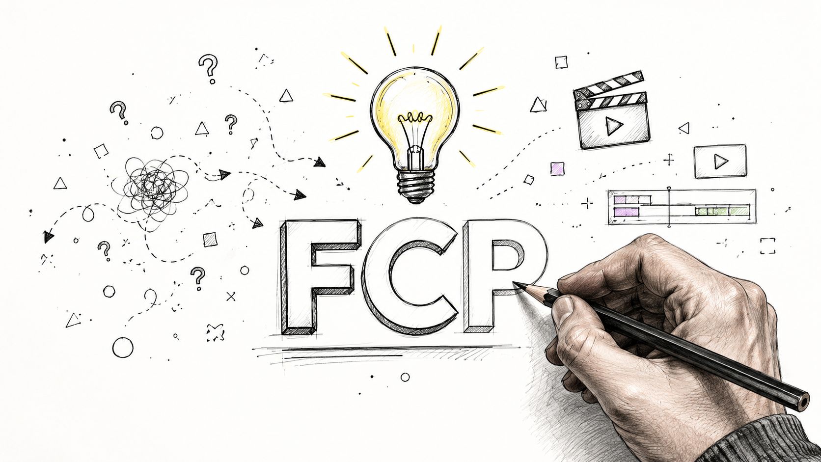
Start with a basic title
Open the Titles and Generators sidebar, choose a simple preset such as Basic Title, then drag it onto the timeline at the playhead. You can also double-click a title to place it at the playhead.
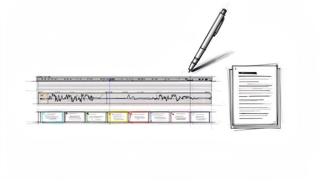
If you are new to Final Cut Pro, here is the part that clears up a lot of confusion early. A title is a clip. It is not a separate text box floating above your edit like in a slide app. Once you place it on the timeline, you trim it, move it, and stack it the same way you handle B-roll or music.
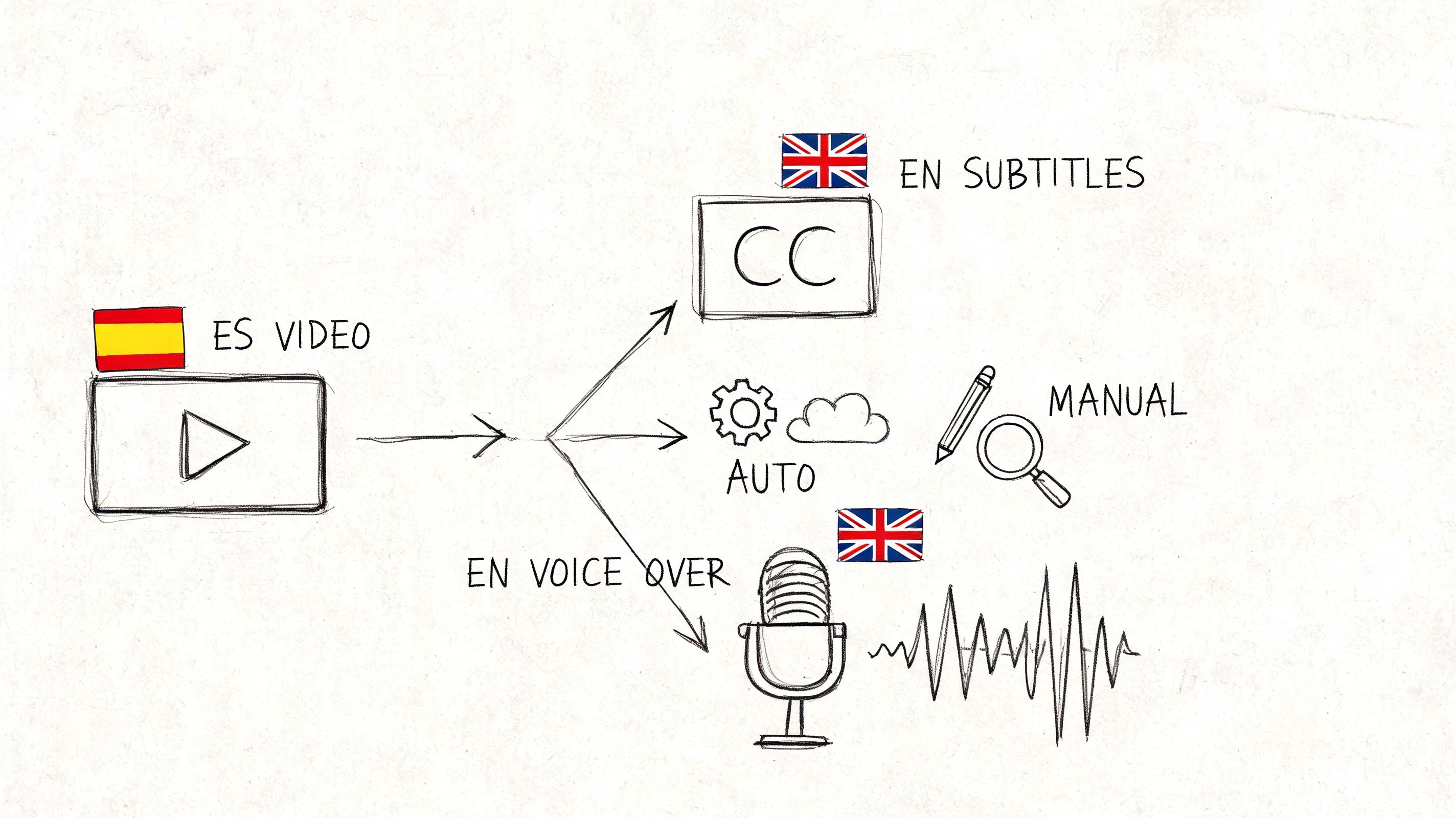
That clip model is more useful than it first appears. It lets you line up a lower third with the exact moment a speaker begins, hold a quote on screen for one sentence, or build visible captions that match pacing instead of drifting out of sync. For multilingual work, that same structure makes it easier to duplicate, swap, and organize on-screen text by language.
The fastest way to get text down
Press Ctrl+T to insert a basic title at the playhead.
I wish I had used this more when I first started. New editors often browse title templates too early, then spend time picking a look before they know whether the text even belongs in that shot. A faster habit is to place a plain title first, get the timing right, and style it later. It is the editing version of using a pencil sketch before paint.
A practical rule helps here:
- Place first. Put the title where the story needs information.
- Trim second. Match the duration to the spoken line, beat, or pause.
- Style third. Adjust the appearance after the timing feels settled.
That order keeps you from doing cosmetic work twice.
Lower thirds are small, but they carry a lot of story weight
A lower third usually looks simple. Name. Role. Maybe company. But it does three jobs at once. It identifies the speaker, gives context fast, and reduces friction for viewers who joined mid-video.
In Final Cut Pro, the mechanics are straightforward. Add the title clip, place it where the person first appears or starts speaking, and trim it so it does not overstay its welcome. In interviews, I usually keep the first lower third on screen long enough for a phone viewer to read it comfortably, then get it out of the way. Clean and readable beats clever.
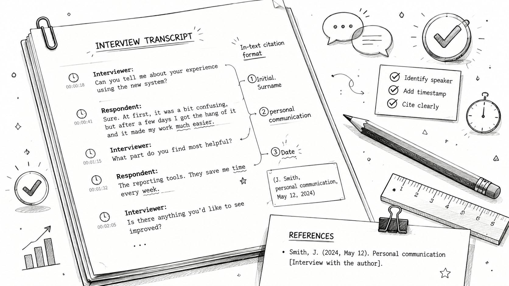
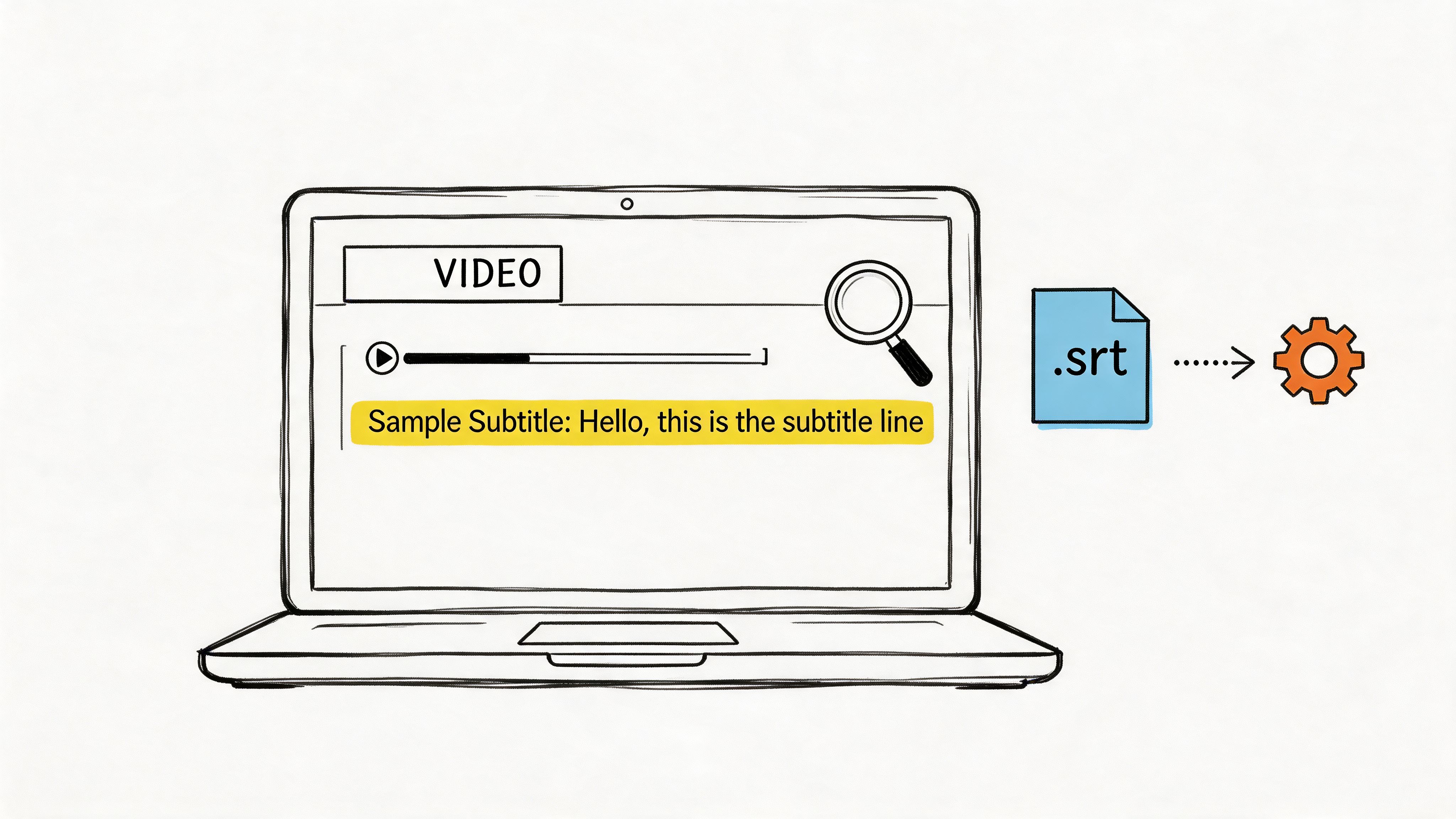
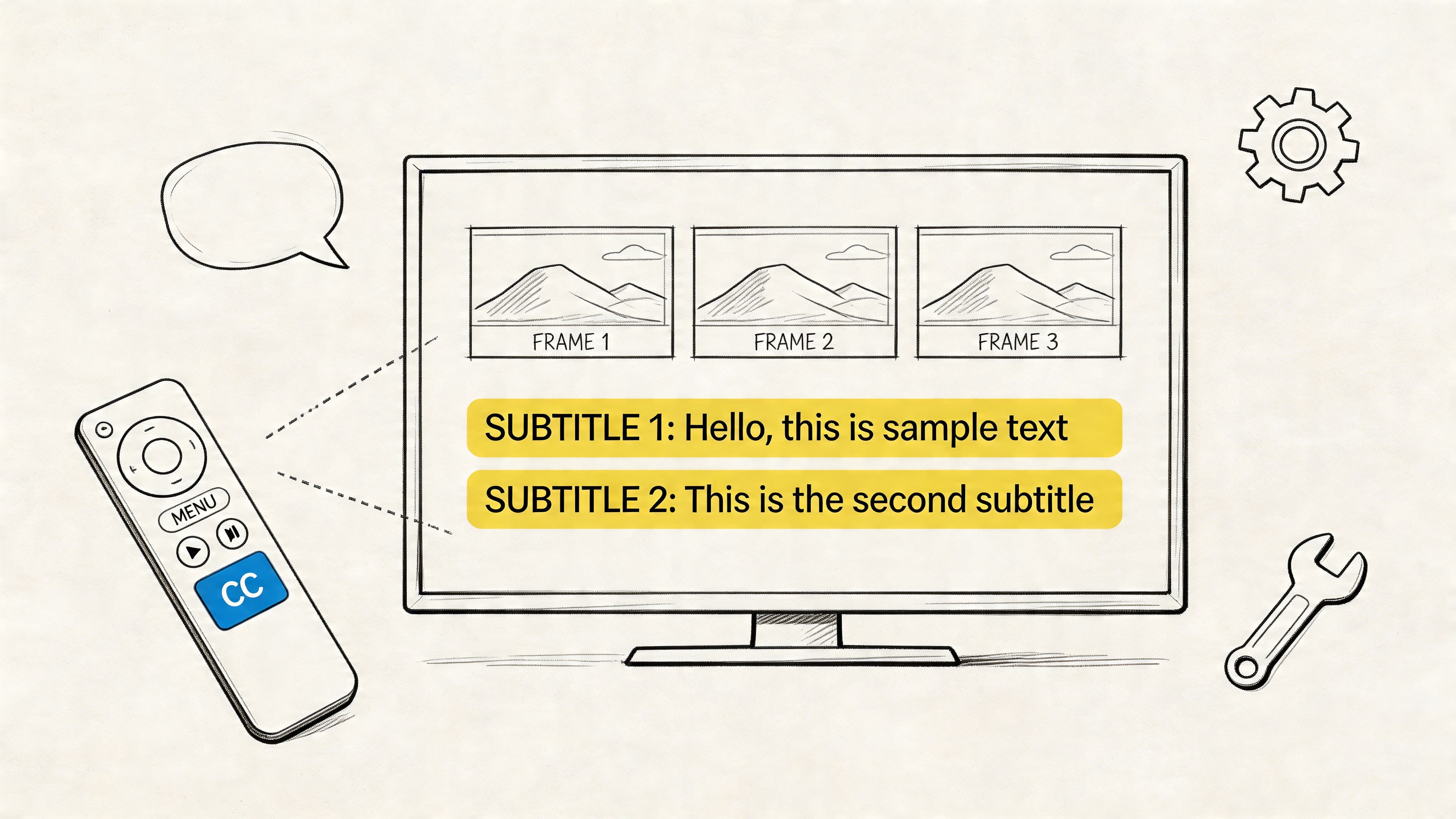
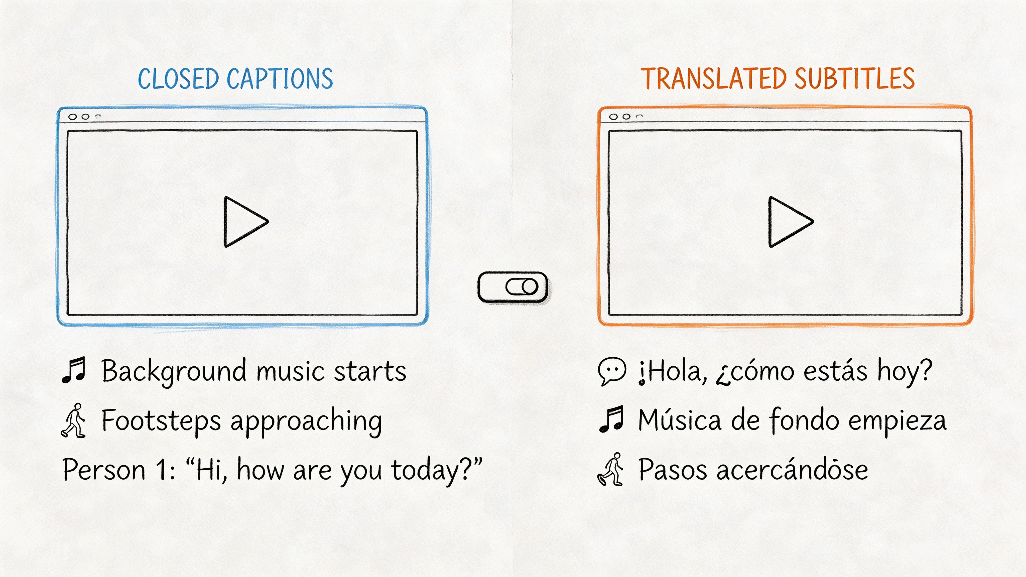
The same mindset applies if your project needs visible dialogue text. Titles, subtitles, and captions can look similar on screen, but they serve different purposes. If you are deciding what belongs as a styled title versus accessibility text, this guide to closed captions vs subtitle helps clarify the difference.
One more tip I wish I knew sooner. Name your text clips as you go, especially if you will have many lower thirds or multiple languages in one timeline. “Title 12” tells you nothing later. “Maria lower third EN” does. That tiny habit saves real time once the project grows.
Mastering the Text Inspector for Customization
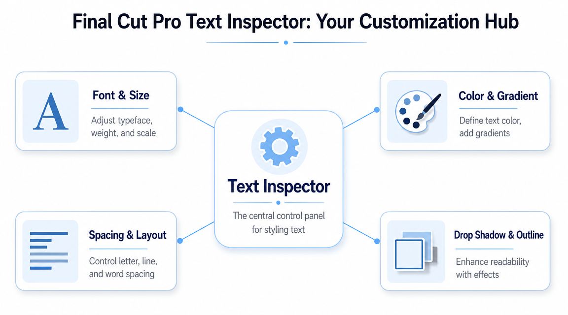
The default title in Final Cut Pro is rarely the final title. It's a placeholder. The actual work happens after you select the title clip and open the Text Inspector.
Apple's documentation makes this very clear. You select the title in the timeline, then use the Text Inspector to edit size, alignment, font style, color, and related controls. That setup reflects Final Cut Pro's core design, where text is a clip rather than a separate document layer, as shown in Apple's Text Inspector controls documentation.
Start with readability
When I style text, I don't begin with personality. I begin with legibility.
Ask three questions:
- Can people read it quickly
- Does it contrast with the background
- Is the size appropriate for the screen people will use
For an interview lower third, I usually want the name to read instantly. That means a clean font, enough size to survive mobile viewing, and spacing that doesn't feel cramped.
The controls that matter most
You don't need every setting on day one. You need the few that change the look fastest.
| Control | What it changes | Why you'd touch it |
|---|---|---|
| Font | Typeface and style | Match the brand or tone of the project |
| Size | Scale of the text | Improve readability or hierarchy |
| Alignment | Left, center, right | Fit the composition and layout |
| Color | Fill color of text | Separate text from the image |
| Shadow | Depth behind text | Help text stand out on busy footage |
A common beginner mistake is using size to solve every design problem. Sometimes the issue is alignment or spacing. If the title feels awkward, don't just make it bigger. Check whether the text block sits in the wrong part of the frame.
Spacing is what makes text feel polished
This is the stuff people often skip.
- Tracking affects overall letter spacing across a word or line.
- Kerning affects spacing between specific letters.
- Leading affects the space between lines.
You don't need to become a typography nerd, but you do need to notice when lines feel jammed together or when a bold title looks too tight. Small spacing adjustments can make basic text look much more intentional.
Text that reads well usually looks simple. Text that looks “designed” but reads poorly often has too much styling and not enough restraint.
Effects that help instead of distract
Drop shadows, outlines, and glow can help. They can also make text look dated fast.
Use them to solve a problem. If white text disappears over a bright background, a shadow or outline can restore clarity. If the footage already has a lot going on, keep the effect subtle. The goal is separation from the background, not visual noise.
A good test is to pause on the busiest frame under the text. If the words still read cleanly there, you're in good shape.
Animating Your Text with Effects and Keyframes
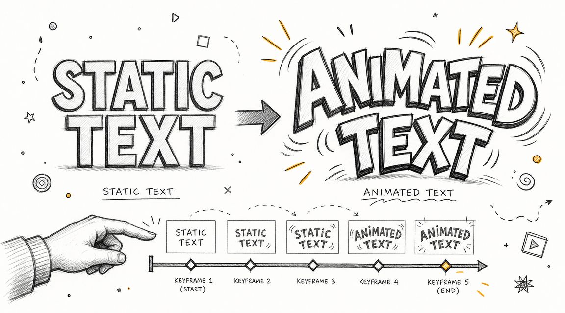
Static text does the job. Animated text adds rhythm, emphasis, and a sense that the text belongs inside the edit instead of being pasted on top of it.
Final Cut Pro gives you two broad approaches. You can use built-in title behaviors and presets for speed, or you can keyframe individual properties for control.
Start with built-in motion
If you need a simple entrance or exit, don't overcomplicate it. Apply a title style that already has movement, or use a transition after placing the title. This is often enough for intros, lower thirds, and social clips where the text only needs a clean fade or slide.
Built-in motion is useful when your deadline is tight and the rest of the edit already carries enough energy. Viewers usually notice whether text feels smooth and well-timed, not whether you built every move from scratch.
Keyframes give you the real control
For custom animation, keyframes are where Final Cut Pro becomes much more flexible. Modern Final Cut Pro workflows let editors animate text directly in the timeline by setting keyframes for properties such as opacity, scale, position, and rotation, which turns simple titles into motion graphics elements, as outlined in this guide to title animation in Final Cut Pro.
If you've never used keyframes, think of them as markers that tell Final Cut Pro where a property should be at a specific point in time. You set a starting value, move forward, set a new value, and FCP creates the motion between those points.
A simple fade in and fade out
Here's a starter animation I use all the time for quote cards and speaker names:
- Place the title clip where it should appear.
- Set the first opacity keyframe near the start at a low or invisible value.
- Move forward a little and set another opacity keyframe at full visibility.
- Let the text hold.
- Near the end, add another keyframe at full visibility.
- Move to the last part of the clip and lower opacity again.
That gives you a clean fade in, a readable hold, and a fade out.
The same logic works for scale and position. If you want a title to ease upward as it appears, set an initial lower position, then a later higher position. If you want a subtle “pop,” animate scale gently instead of making it jump too far.
Keep the movement motivated
Text animation works best when it follows the energy of the scene.
- For interviews: use restrained fades or small upward moves.
- For promos: a faster slide or scale move can feel right.
- For tutorials: prioritize clarity over flair so the text doesn't compete with the instruction.
One of my early mistakes was adding motion just because I could. The better question is whether the animation helps the viewer notice, understand, or remember the text.
This walkthrough is useful if you want to see text animation in action before building your own version.
Two things that save headaches
I wish I knew this sooner: Most text animation problems aren't design problems. They're timing problems. Adjust when the text starts and ends before tweaking fancy settings.
And one more practical habit:
- Animate fewer properties at once. If opacity, scale, position, and rotation all move together, the title can feel chaotic.
- Use the timeline as your reference. Watch where dialogue begins, where music hits, and where the eye should land.
- Preview on the actual footage. Animation that looks great over black can fall apart over a busy shot.
Advanced Text Techniques and Third-Party Plugins
Once basic titles feel easy, text becomes more than a label. It turns into structure. You can use it to present information, build recurring graphic systems, and make your videos easier to follow for more people.
That includes things like date stamps, episode labels, quote cards, persistent identifiers, and open captions that are always visible on screen.
Built-in tools versus plugin help
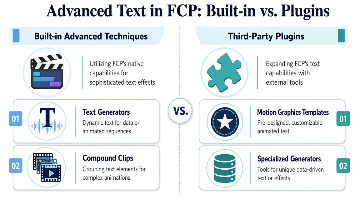
There's a practical dividing line here. If you need straightforward text styling and timeline-based animation, Final Cut Pro already covers a lot. If you need very specific looks, advanced templates, or text behaviors that would take too long to build manually, plugins can save time.
A simple comparison helps:
| Approach | Best for | Tradeoff |
|---|---|---|
| Built-in title tools | Lower thirds, quote cards, clean motion, open captions | More manual setup for custom looks |
| Third-party plugins | Template-heavy workflows, stylized motion graphics, specialty effects | Less original control if you rely on presets too much |
Editors often turn to plugin makers such as MotionVFX or Boris FX when the project needs a polished package quickly. That doesn't mean plugins are required. It means they can act like production shortcuts.
Text for accessibility and multilingual work
Many “how to add text” guides stop too early.
Apple distinguishes titles from captions, but many real projects blur the line in practice. Social videos often use open captions made with title tools because the text must always be visible. That matters for accessibility and for viewers watching with sound off. It also matters globally. The World Health Organization estimates that over 1.5 billion people live with some degree of hearing loss, a figure highlighted in the accessibility context around Apple's guidance on adding titles in Final Cut Pro.
That number is a strong reminder that on-screen text isn't decorative. It can be part of whether people can follow the video at all.
A practical leveling-up path
If you want to move beyond simple titles, I'd build the workflow like this:
- Use title clips for open captions when the words must remain visible in every export.
- Duplicate and swap language versions for multilingual deliverables instead of rebuilding from scratch.
- Group related text elements in compound clips when several parts need to animate together.
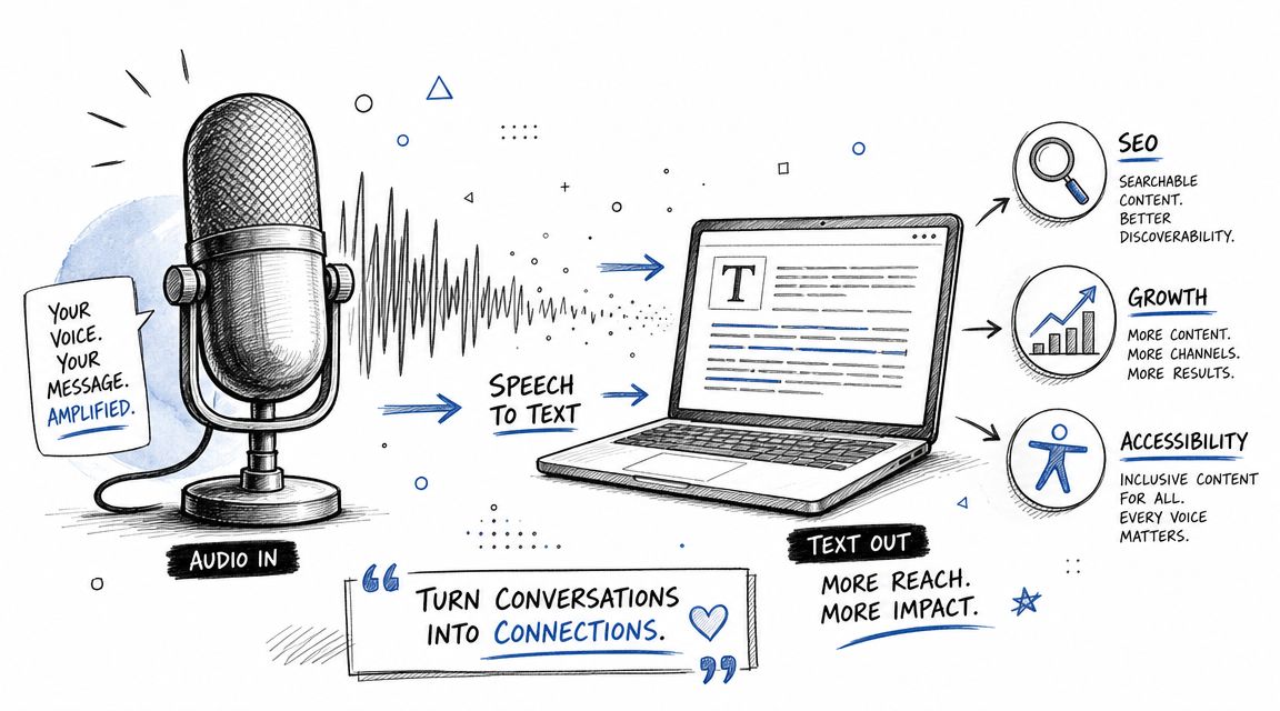
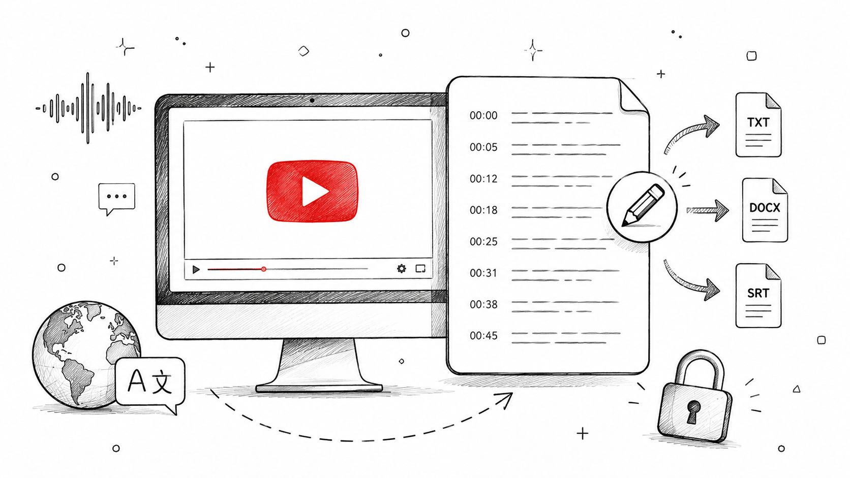
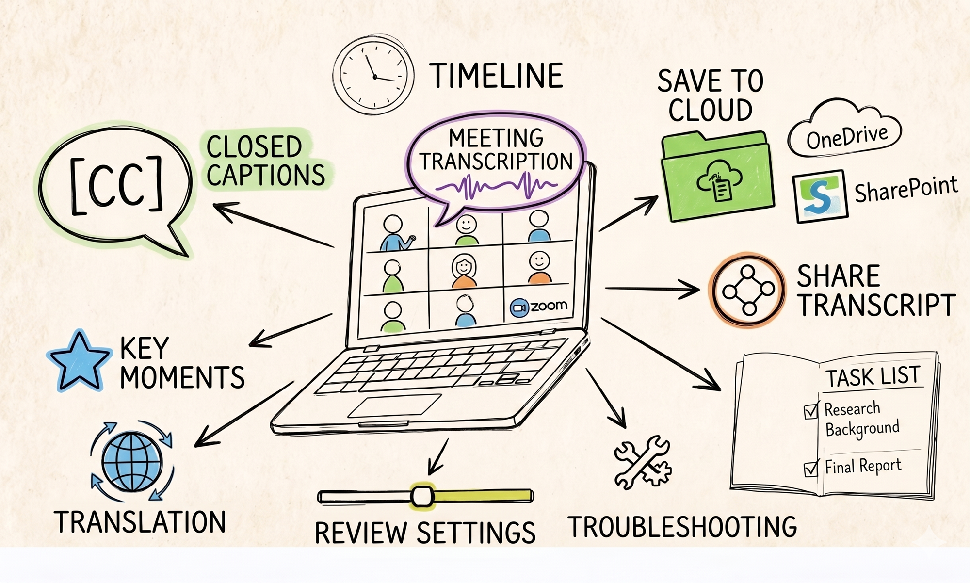
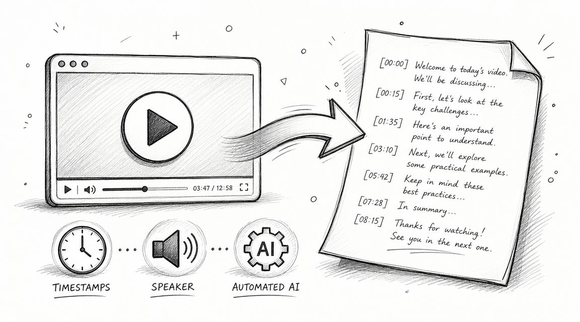
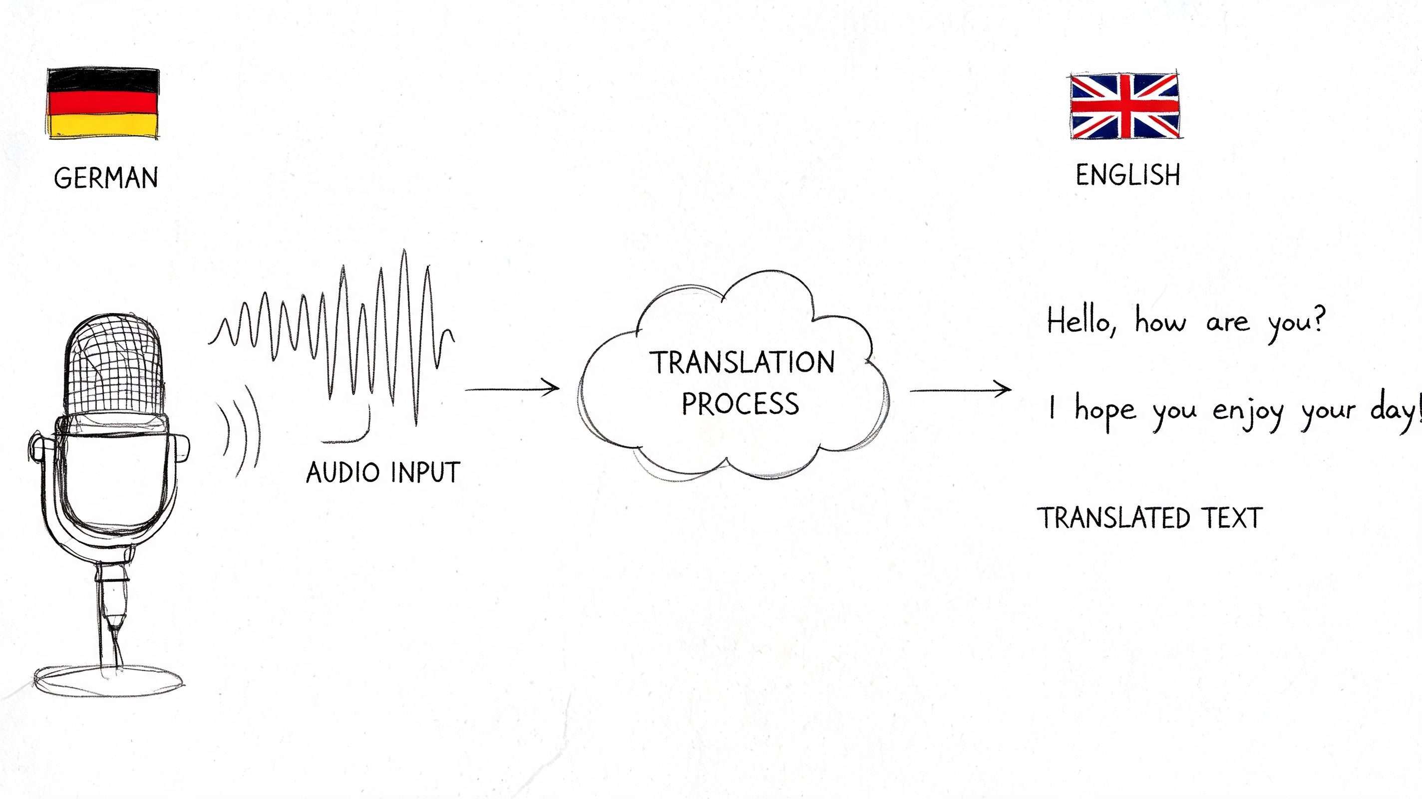
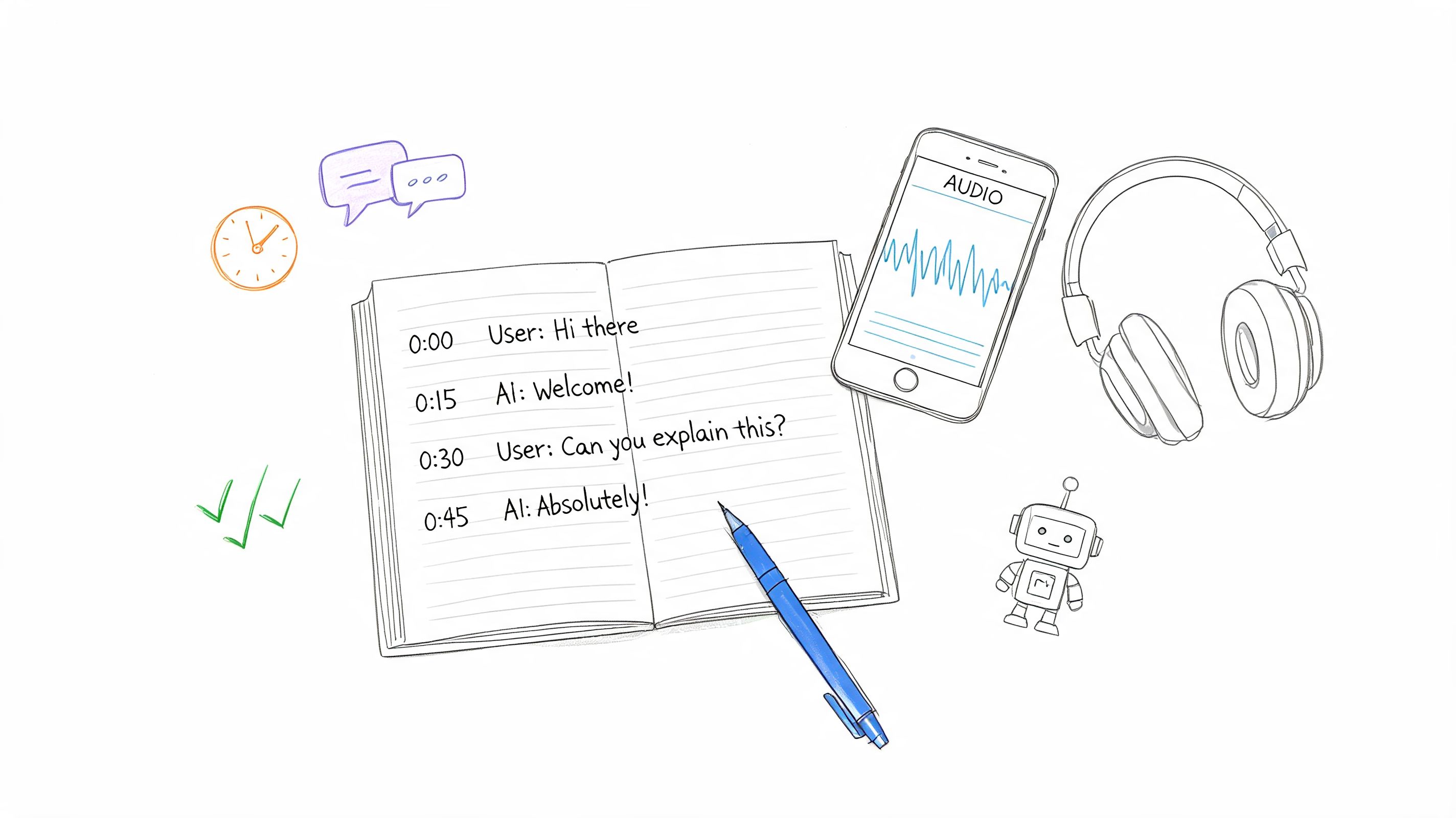
- Use external tools for transcript prep before you bring final lines into the edit. For example, tools for content creators often include transcription workflows, and HypeScribe is one option that converts audio or video into searchable text you can use while preparing caption or subtitle drafts.
Plugins help when the visual system is complex. Built-in tools help when clarity, speed, and editability matter most. Most working editors end up using both.
Pro Tips for an Efficient Text Workflow
Text work gets slow when every title is a fresh start. It gets fast when you treat styles and timing choices as reusable parts.
Save your look once
If you build a lower third that fits your brand, don't rebuild it every time. Save the style or duplicate the finished title clip and update the wording. That keeps font, placement, and spacing consistent across the project.
Copy attributes, not just words
A lot of editors copy and paste text clips but forget that consistency often lives in formatting. If one title finally looks right, reuse its visual settings on other titles instead of eyeballing the match.
Clean workflow beats clever workflow. The faster route is usually the one with fewer manual adjustments.
Group text when it belongs together
If a title has multiple parts, such as a name line and a role line, group them once the layout is approved. That makes it easier to move or animate them as a single unit without knocking one element out of place.
Check safe placement before export
Text can look centered in the viewer and still feel poorly placed on smaller screens. Do a final pass just for readability and edge spacing. Short words near the frame edge can feel more cramped than you expect.
Add protection when the video leaves the edit
If you're sending cuts for review, posting teasers, or sharing drafts publicly, it can also make sense to protect your video content with a watermark workflow that doesn't interfere with titles or captions.
Small habits like these don't feel dramatic. They save a lot of time over a full project.
Common Text Problems and How to Fix Them
Text problems in Final Cut Pro usually come from a small mismatch between what the title clip is doing and what the viewer is showing you. The good news is that the fix is often mechanical. You just need to check the right thing first.
Why did my title disappear
Start with the simplest check. Is the title clip still present above your video at the moment you expect to see it?
A title can disappear because its clip is too short, because it was trimmed by accident, or because it sits under another layer in a more complex timeline. If the clip is there, open the Inspector and look at Opacity, Position, and any keyframes you added. One stray keyframe can send text off screen or fade it out without making the mistake obvious.
I wish I knew this sooner. Skimming the timeline is not enough. Park the playhead on the exact frame where the text goes missing, then inspect the title clip at that frame. Final Cut Pro often reveals the problem once you stop treating it like a playback issue and start treating it like a clip-state issue.
Why does my text look blurry
Blurry text usually points to scaling. Titles stay cleaner when you set their size in the Text Inspector instead of enlarging them with transform controls after the fact. Enlarging rasterized elements or pushing a title too far beyond its intended size can soften edges fast.
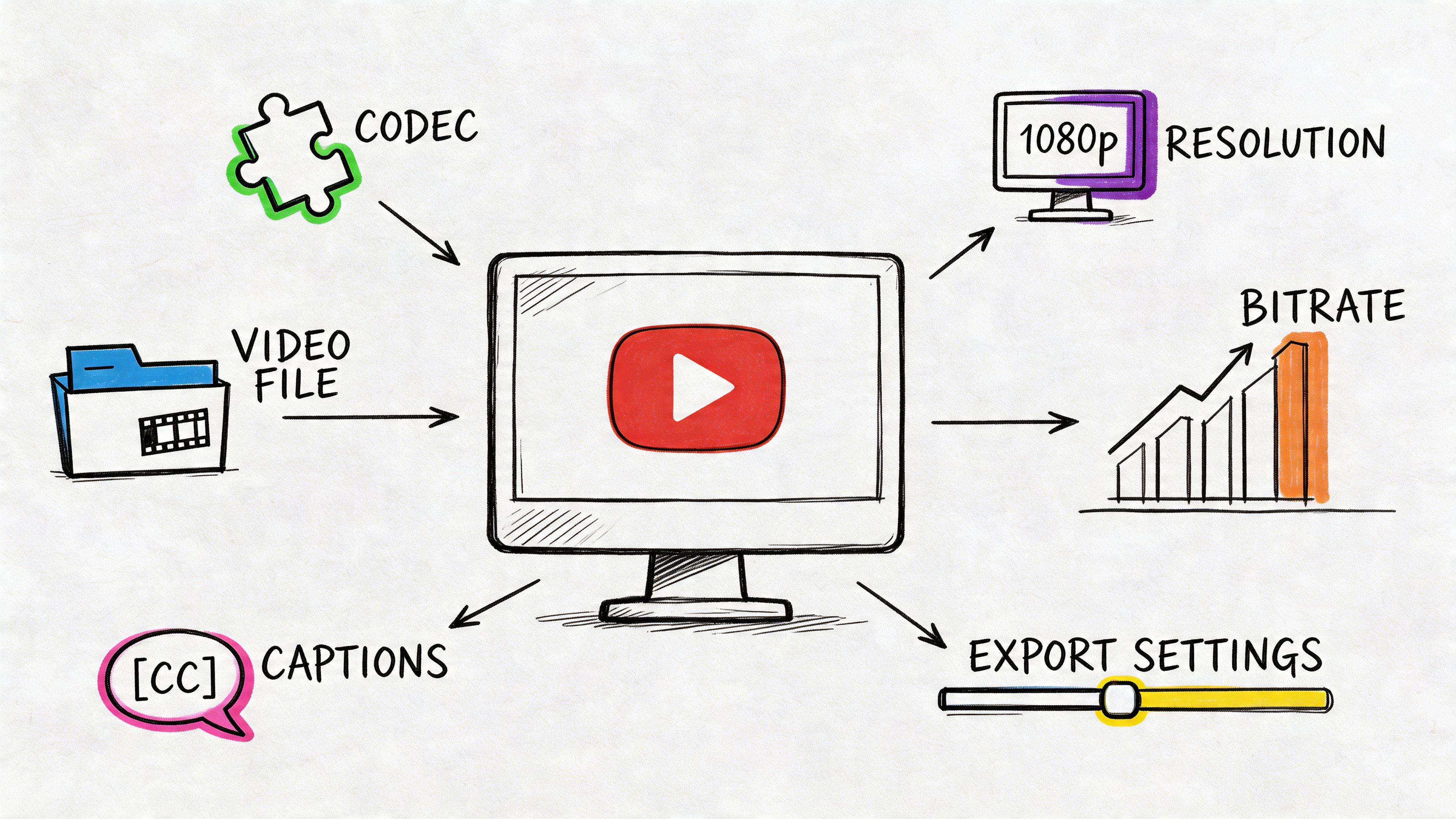
Check the project resolution too. A title that looks acceptable in a smaller preview can fall apart on export, especially if the timeline settings do not match the delivery target. If export settings are part of the problem, it helps to review how resolution, codec, and container affect delivery in this guide to the best video format for different publishing needs.
Another practical check. View the title at 100% if possible. Fit-to-window previews are useful for editing, but they are not the best judge of text sharpness.
How do I make text follow a curve
Final Cut Pro handles standard titles well, but curved text and custom paths are usually easier in Motion or with a plugin built for that job. Final Cut Pro is like a fast assembly bench for text. Motion is the workshop where you shape unusual pieces.
If you only need the look of curved text, not fully editable path behavior, test a simpler workaround first. Stack short text elements, adjust rotation slightly, and build the curve by hand. It is not elegant, but for quick storytelling moments, social edits, or stylized callouts, it can save time.
Why does the text feel off even when I can read it
Readable text is only the first bar. Good text also has to feel placed with intention.
The usual problem is spacing, contrast, or context. A lower third may be technically legible but still compete with a bright shirt, a busy background, or a face near the same part of the frame. Captions can have the same issue. They may be easy to read in isolation and still feel intrusive if they block body language or visual cues. That matters even more in multilingual projects, where subtitle length changes from language to language.
When text feels wrong, check these four areas first:
- Timing. Does it appear early enough to read and leave late enough to process?
- Placement. Is it fighting with faces, graphics, or edge spacing?
- Contrast. Does it separate clearly from the background?
- Motion. Does the animation support the story, or pull attention away from it?
Fix those before you swap templates. Most of the time, the issue is not the font. It is the relationship between the text and the shot.
If you're turning interviews, meetings, or recorded presentations into caption-ready text, HypeScribe gives you a practical starting point. You can upload audio or video, generate searchable transcripts, and use that text as working material for captions, subtitles, or on-screen pull quotes before you finish the edit in Final Cut Pro.