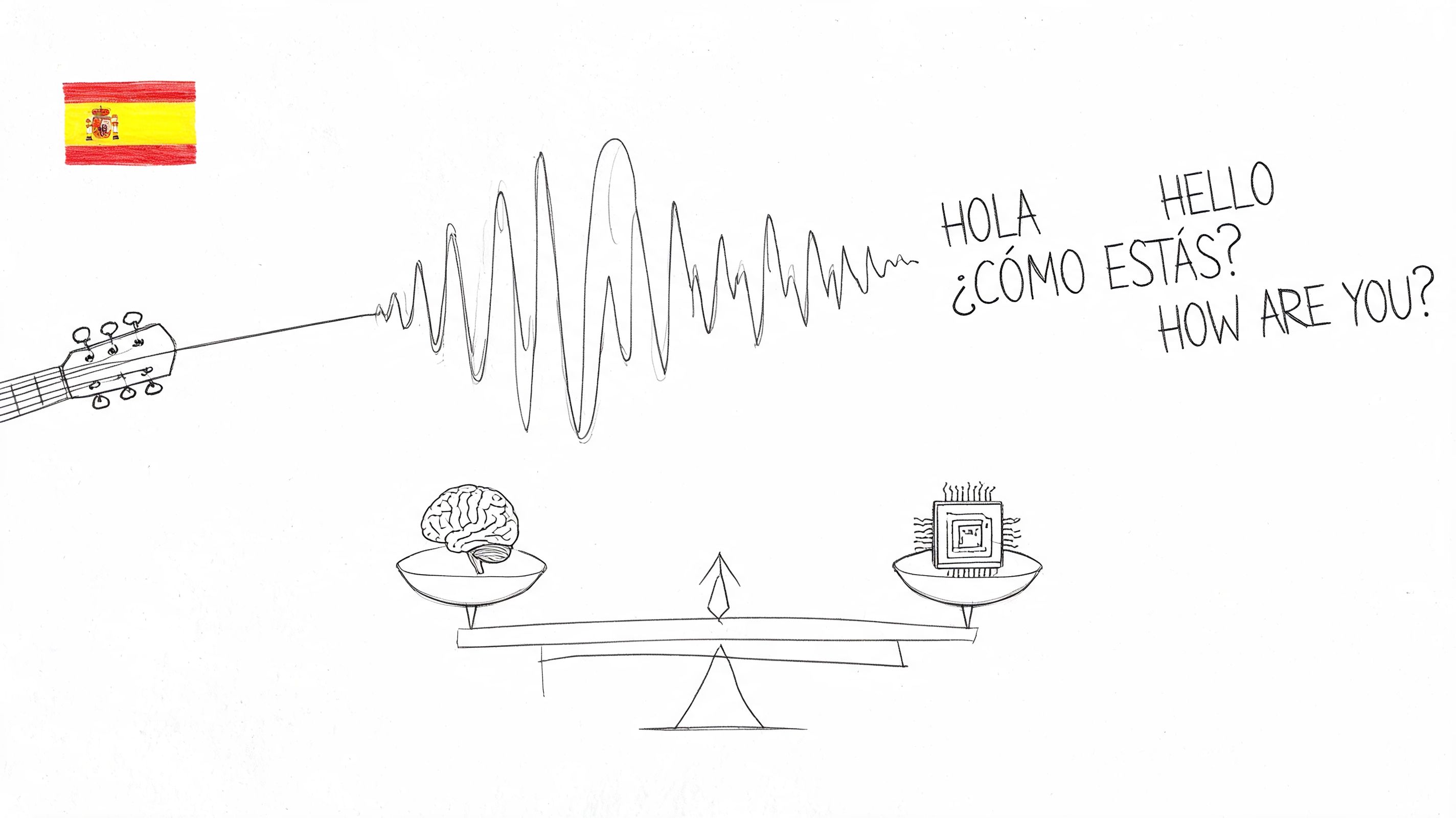
10 Usability Research Questions to Ask in 2026

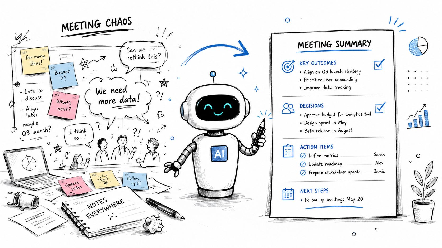
You shipped a feature that looked strong in design review. The flow made sense in Figma, the edge cases seemed covered, and the analytics team already had the dashboard ready. Then launch week arrives and users start dropping out halfway through the experience. You can see the drop-off. You can't yet see the reason.
That gap is where usability research questions matter. Bad questions produce polite, vague feedback. Good ones expose where people hesitate, what they misunderstood, what they expected to happen, and what nearly made them quit. If you ask, “Do you like it?” you'll get opinions. If you ask the right task-based questions, you'll get evidence you can act on.
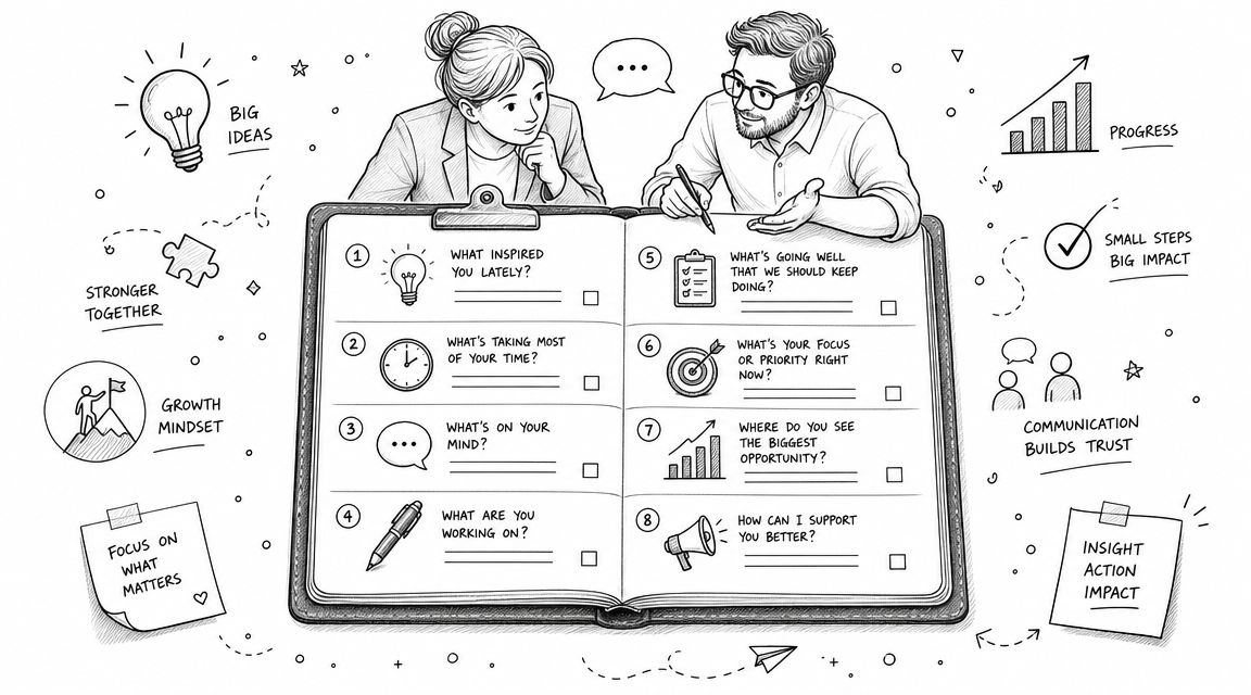
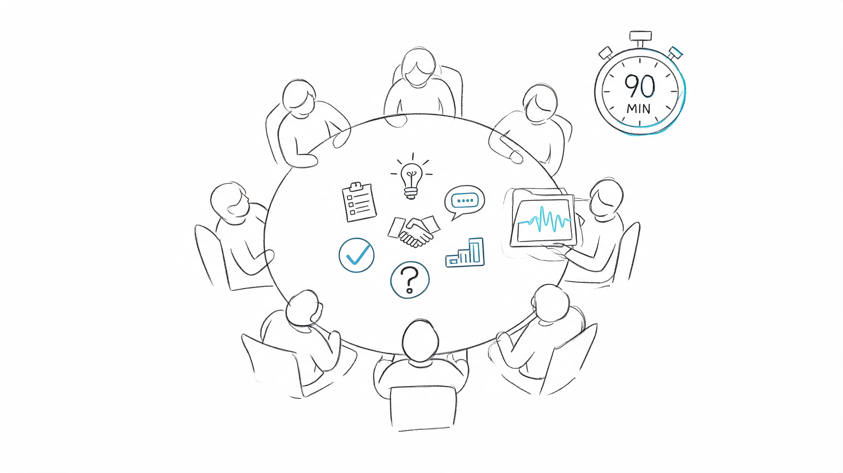
That shift has deep roots in UX practice. Jakob Nielsen and Rolf Molich's 1990 work on heuristic evaluation helped establish the modern habit of framing usability around focused questions like discoverability, navigation, and error recovery, rather than broad opinion gathering. Contemporary UX guidance still pushes teams toward short, focused sessions grounded in what users did, and one industry guide notes that 45- to 60-minute interviews can cover only about 5 to 8 core questions well. That constraint is useful. It forces sharper research.
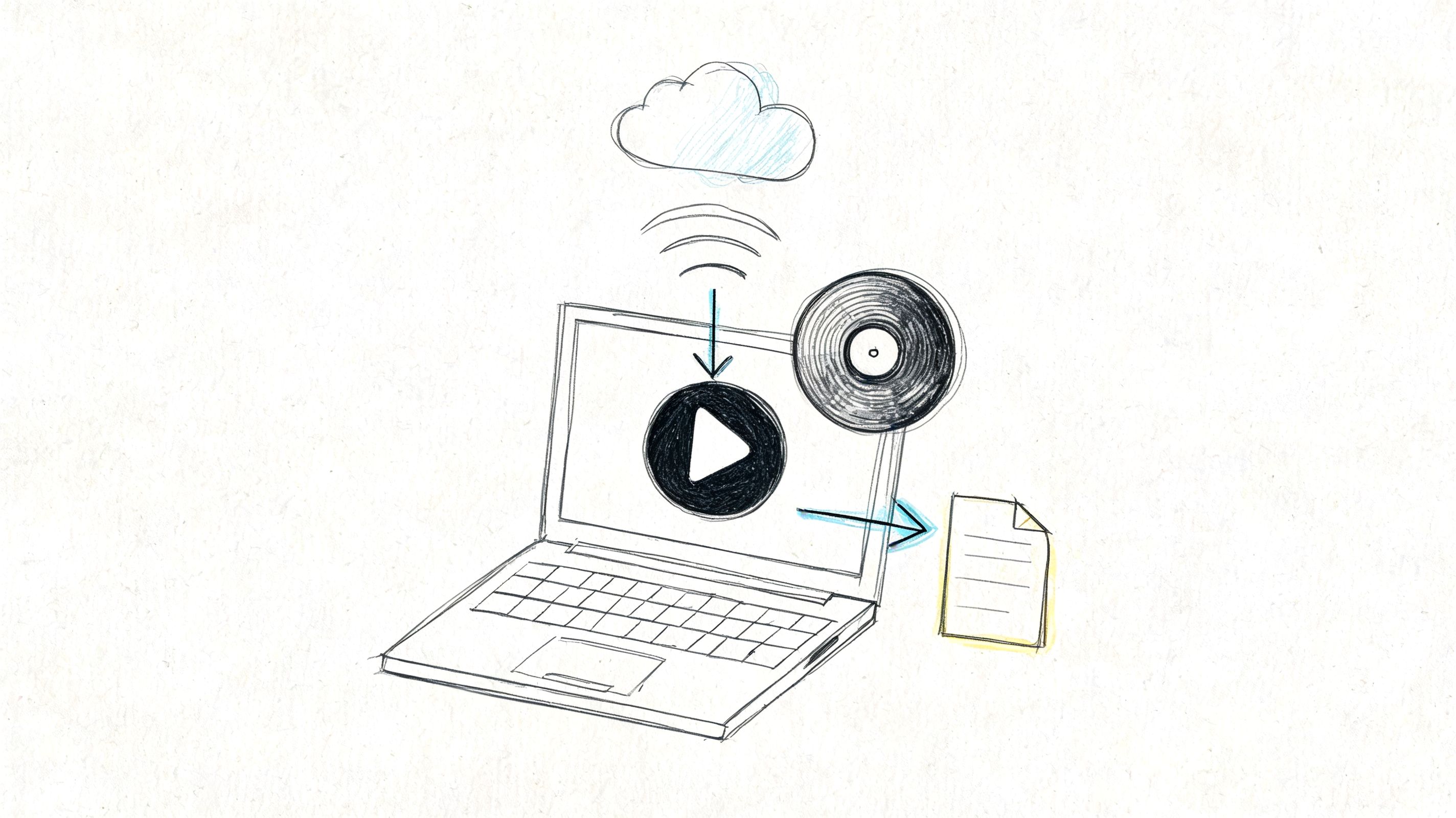
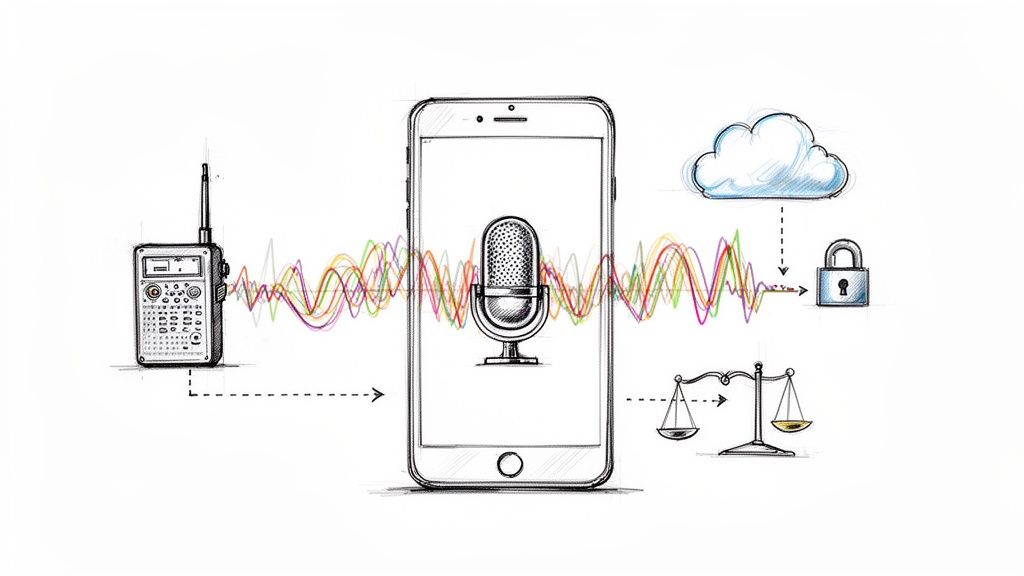
The playbook below gives you ten types of usability research questions that consistently lead to better product decisions. Each one includes what to ask, what to avoid, how to follow up, and how to analyze what you hear. The examples use HypeScribe, but the method works for any product where users need to find value fast and without friction.
1. Task Completion & Success Rate Questions
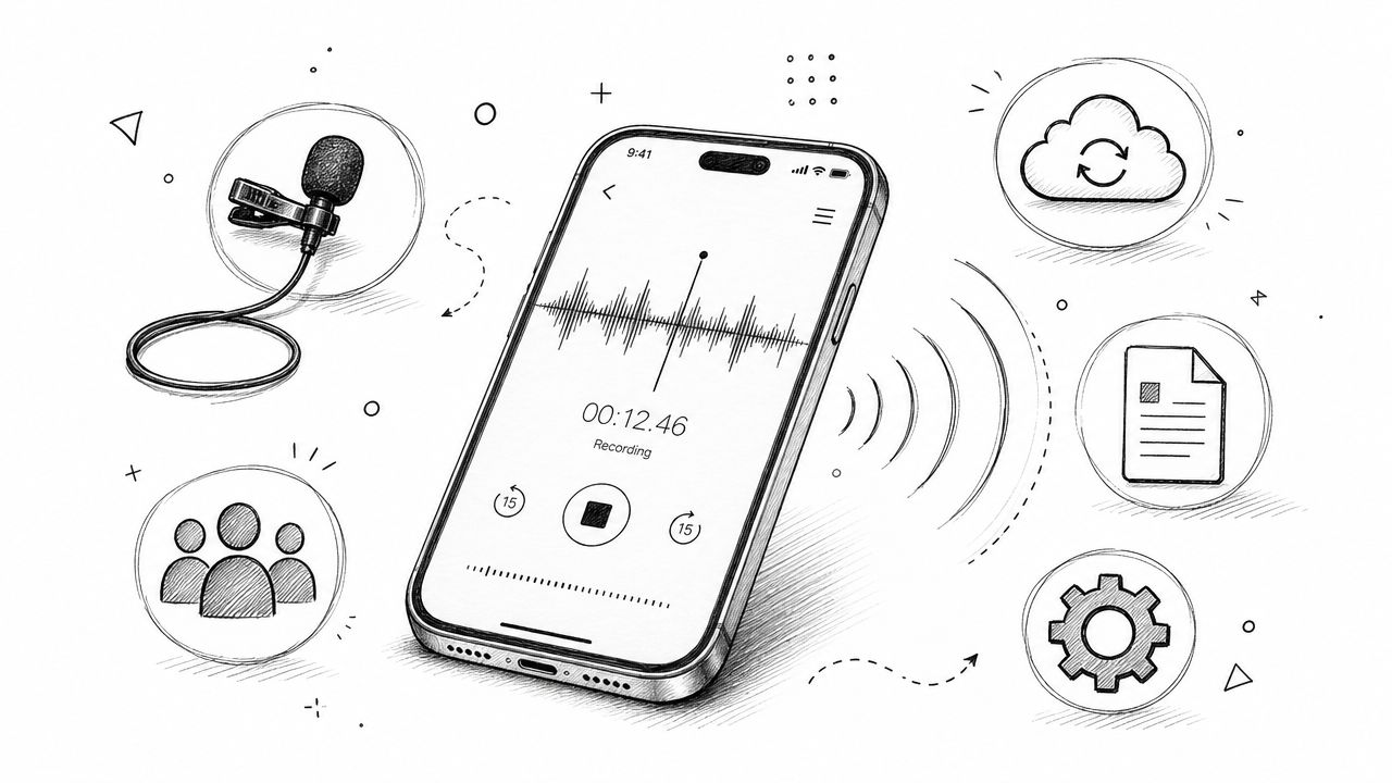
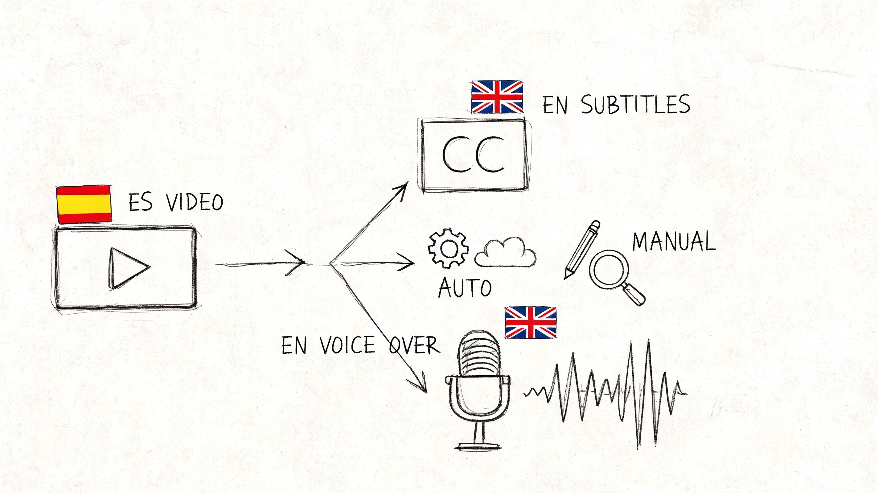
If a user can't complete the core job, nothing else matters. For HypeScribe, that usually means tasks like uploading an audio file, generating a transcript, reviewing the summary, and exporting the output to Google Docs, Word, PDF, TXT, or Markdown.
A task completion question sounds simple, but the wording matters. Don't ask, “Was it easy to upload your file?” Ask the user to do it. Then probe what happened during the attempt.
What to ask during the task
Use prompts like these:
- Primary task prompt: “Please upload this Zoom meeting recording and generate a transcript.”
- Behavioral follow-up: “What were you looking for on this screen?”
- Expectation check: “What did you expect to happen after you clicked that?”
- Recovery probe: “What would you do next if you were on your own?”
The strongest studies define success before the session starts. For example, a remote team member uploads a meeting recording, reviews the summary, and exports the transcript without moderator intervention. A student might upload a lecture recording and send the result to Google Docs. A journalist might upload an interview, check action items, and save the transcript for later editing.
What works and what fails
What works is specificity. “Show me how you'd turn this customer interview into a transcript and summary you can share” is far better than “Try the product and tell me what you think.”
What fails is hidden scoring. Teams often run these sessions without agreeing on what counts as success, whether assisted completion should count, or whether a wrong turn that the user later corrects is a usability issue. Decide that upfront.
Practical rule: Score both first-attempt success and eventual success after help. They answer different product questions.
I also recommend comparing input methods. Some users will upload a file. Others will paste a YouTube link or use the voice recorder. If one route repeatedly causes hesitation, the problem is often not user skill. It's usually labeling, hierarchy, or missing reassurance.
2. System Usability Scale Questions
The System Usability Scale, usually shortened to SUS, is useful when you need a fast, standardized read on perceived usability after a task session. It doesn't tell you why users struggled. It tells you how the experience felt in aggregate.
That distinction matters. Teams often misuse SUS by treating it as diagnosis. It isn't. It works best after users attempt realistic tasks, not in isolation.
How to use SUS without overreading it
SUS consists of ten statements answered on a five-point scale, and the final score ranges from 0 to 100. A practical guide on SUS notes that 68 is considered average. That makes SUS useful for benchmarking one version of a product against another, or comparing user segments such as students, journalists, and remote teams.
For HypeScribe, I'd use SUS after participants complete a realistic workflow. A free trial user might upload an interview, review the transcript, and export a file. Then they answer the SUS items. If their score drops, you know the redesign hurt perceived usability. If the score rises, you know the experience likely improved. You still need the session notes to understand why.
Good practice with follow-ups
Don't stop at the score. After the SUS survey, ask short prompts like:
- Low-confidence probe: “Which part of the experience made you feel least confident?”
- Complexity probe: “What felt more complicated than it needed to?”
- Frequency probe: “In real work, would you use this often or only occasionally?”
A common mistake is changing the SUS wording to match your product's tone. Don't. Standardization is the whole point. Use the instrument as written, then add your own follow-up questions afterward.
Another mistake is collecting a score from users who never touched the product. If they didn't complete a task, the number is thin. The comments might still be useful, but the benchmark isn't.
3. Information Architecture & Navigation Questions
Navigation problems rarely sound dramatic in a session. Users don't announce, “Your information architecture is broken.” They say things like, “I thought that would be somewhere else,” or they click in circles for thirty seconds and then pause.
For HypeScribe, this often shows up around summary views, export options, integrations, and labels. If a student expects lecture transcripts under one area and finds them buried elsewhere, the issue isn't attention span. It's structural mismatch.
Questions that reveal findability
The most useful prompts here are short:
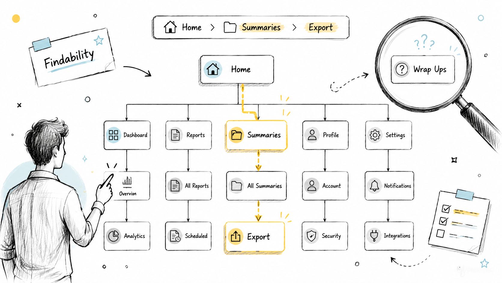
- Findability prompt: “Where would you go to export this transcript to Google Docs?”
- Mental model probe: “If you had to group these features, what belongs together?”
- Label test: “What would you expect to find under ‘Summaries'?”
- Navigation reflection: “Was there any point where you weren't sure where to go next?”
Open card sorting helps when the structure is still flexible. Tree testing helps when the hierarchy exists but you don't know if people can traverse it. Both methods surface the gap between your product map and the user's mental model.
Teams building AI products often blur retrieval, storage, transcription, and summarization into one navigation layer. That's where labels become dangerous. If you want a grounding concept for how people seek and retrieve content, HypeScribe's overview of an information retrieval system is a useful reference point.
What to analyze afterward
Look for repeated path divergence. If remote teams consistently hunt for action items in one place and journalists expect them in another, that's a signal to change hierarchy or duplicate access points.
Don't ask users to approve your sitemap. Ask them to find something they need right now. Navigation research gets sharper when it stays anchored in a concrete task rather than a conceptual debate about labels.
4. First-Time User Experience (Onboarding) Questions
Onboarding research has one job. Find the point where a new user either understands the product's value or starts drifting.
For HypeScribe, the key moment is usually the first successful transcript plus a clear sense of what happens next. If users can upload content, get a transcript, and see a useful summary quickly, the product starts making sense. If they're still figuring out what the tool does after a few screens, the onboarding is too abstract.
A published UX workflow for product adoption recommends mapping the path from awareness to activation and validating fixes with micro-surveys and A/B tests, while tracking metrics such as Time to First Value, Product Activation Rate, Customer Lifetime Value, and Feature Adoption Rate through the process. See the guidance on acting on UX research to improve product adoption. That's the right frame for onboarding questions. Tie them to activation, not just sentiment.
Early-session prompts that uncover confusion
Start before the guided experience begins:
- Value proposition check: “What do you think this product does?”
- Confidence probe: “What would you try first?”
- Post-step check: “What do you think will happen after this?”
- Aha-moment probe: “At what point did this become useful to you, if it did?”
This video gives a helpful visual reference for onboarding thinking in practice.
Where teams usually get onboarding wrong
They explain too much before the user experiences any value. Tooltips pile up, product tours block the interface, and by the time the user reaches the upload step, they've forgotten half of what they were told.
A better pattern is progressive disclosure. Let the user do the first meaningful action, then support the next one. For example, a first-time journalist probably doesn't need a full tutorial on every export format before uploading an interview. They need reassurance that the file can be transcribed, reviewed, and saved in a usable way.
The best onboarding question isn't “Did you understand the tour?” It's “What would you do next if nobody was here?”
5. User Satisfaction & Net Promoter Score Questions
Satisfaction questions are useful, but only when they're attached to experience and context. On their own, they drift toward brand sentiment. That's fine for tracking. It's weak for product decisions.
The standard Net Promoter Score question is familiar: how likely are you to recommend the product to someone else? The value comes from the follow-up, not the number by itself.
Asking for reasons, not just ratings
After the rating, ask:
- Driver probe: “What's the main reason for that score?”
- Barrier probe: “What nearly lowered your score?”
- Segment-specific probe: “Who do you think this product is best for?”
- Retention probe: “What would make you use it more often?”
For HypeScribe, a remote team lead might praise summaries and action items after recurring meetings. A student might like the transcript quality but still hesitate because export options weren't obvious. A journalist might value the searchable transcript but want more confidence in multilingual workflows. Those are all different roadmap signals.
If you're working in meeting-heavy environments, HypeScribe's explainer on conversation intelligence gives a useful lens for understanding why recommendation intent often ties to downstream value, not just interface polish.
Trade-offs to keep in mind
NPS is easy to compare over time. It's hard to interpret in isolation. A healthy score can coexist with severe onboarding issues if loyal users are carrying the average. A weak score can hide a promising product that still has rough edges for first-time users.
Use NPS to identify who to talk to next. Promoters can explain the value that resonates. Detractors can reveal friction that blocks adoption. The score organizes follow-up research. It shouldn't replace it.
6. Feature Prioritization & Desirability Questions
Feature research goes wrong when teams ask users what they want in the abstract. People are much better at describing problems than prescribing product strategy.
The better question is not, “Should we build speaker identification?” It's, “What problem are you trying to solve when you ask for speaker identification?” That changes the conversation from wishlist mode to decision mode.
Questions that separate signal from noise
When evaluating existing or proposed HypeScribe features, ask:
- Problem-first prompt: “What problem would this feature solve for you?”
- Current workaround probe: “How do you handle that today?”
- Priority question: “If this existed, how often would it matter in your workflow?”
- Trade-off probe: “What would you give up to get this sooner?”
- Willingness probe: “Would this meaningfully change whether you choose this tool?”
A remote team may care most about action items because they need fast follow-through after meetings. Students may push harder for cleaner export flows into notes. Journalists may care more about transcript review and language handling than meeting summaries. Treating all requests as equal is how roadmaps get noisy fast.
How to analyze desirability without getting trapped
Pair user demand with product effort and strategic fit. Some features solve obvious pain but only for a narrow segment. Others look less exciting in interviews but improve the core workflow for everyone.
At the market-research level, the strongest guidance is to combine quantitative and qualitative methods, using quantitative data for dashboards and segmentation while qualitative analysis uncovers motivations and unmet needs. The Interaction Design Foundation also recommends continuing to track conversion, satisfaction, and retention after launch in its guidance on market research in UX. That's the right discipline here. Don't stop after “users asked for it.” Check whether shipping it changed behavior.
7. Error Handling & Recovery Questions
A product feels usable when things go wrong and users still know what to do next. That's why error handling deserves its own research questions instead of being treated as QA cleanup.
HypeScribe has several moments where recovery design matters: failed uploads, unsupported file situations, processing delays, confusing transcript output, or export issues. Users don't need perfect systems. They need systems that keep them oriented.
Better questions for failure states
Run sessions where participants hit planned edge cases and ask:
- Clarity probe: “What does this message mean to you?”
- Action probe: “What would you do next based on this screen?”
- Blame probe: “Does this feel like your mistake, the system's mistake, or something else?”
- Confidence probe: “Do you feel you can recover from this without contacting support?”
Good error messages name the problem in plain language and offer a specific next step. Bad ones dump technical phrasing on the user or force them to guess whether retrying is safe.
A journalist uploading a long interview file might tolerate a delay if the system clearly says processing is still underway. The same user may abandon the task if the state is ambiguous. A student may forgive an unsupported format if the message explains what format to use instead. The same student may leave if the app just says “upload failed.”
Errors should reduce uncertainty. If the message increases uncertainty, it's part of the usability problem.
What to capture during analysis
Document whether users recover on their own, whether they look for help, and whether they trust the product afterward. Recovery research isn't only about fixing the message. It often exposes missing fallback states, weak support access, or poor expectations set earlier in the flow.
8. Learnability & Help Documentation Questions
Some products are intuitive enough to minimize help content. Most aren't. Even good interfaces need reinforcement when users return after a gap, try an advanced workflow, or hit a workflow they've never attempted before.
For HypeScribe, help content matters around integrations, exports, summary interpretation, and use-case-specific workflows. The research question isn't “Do users like the docs?” It's “Can users teach themselves what they need without leaving the task in frustration?”
Questions that test self-service learning
Use scenarios such as:
- Self-serve prompt: “Please figure out how to export this transcript to Google Docs without asking me.”
- Discovery probe: “Where would you look for help first?”
- Documentation quality probe: “Did the article or tooltip answer your question?”
- Transfer probe: “After seeing that once, could you do it again later?”
This kind of testing is especially important when teams assume that AI-generated support content or auto-summaries will close understanding gaps. Recent guidance notes that researchers increasingly use automation for transcription, note-taking, scheduling, summarization, and trend finding, but still need human oversight for question writing and analysis. That gap is discussed directly in Rev's overview of usability test questions and AI-assisted workflows. The implication is clear. AI can speed documentation and analysis, but it can't decide whether the explanation helps a user complete the job.
What good help systems do
They meet users at the point of need. A remote team lead setting up Zoom transcription needs different support than a student importing a lecture file. Contextual help often beats a giant knowledge base if the prompt appears exactly when confusion appears.
What fails is burying support behind generic menus. If users hit a problem during export and the closest help route is a broad help center homepage, you've made the learning cost too high.
9. Accessibility & Inclusive Design Questions
Accessibility research questions should be part of core usability work, not a side audit after launch. If keyboard users can't progress, if a screen reader can't identify controls, or if video tutorials lack captions, the product is not fully usable.
For HypeScribe, accessibility touches the upload flow, progress indicators, transcript review, export actions, and every support asset that teaches users how to succeed.
Questions that uncover inclusive design gaps
Test with people who use assistive technology and ask:
- Keyboard flow prompt: “Please complete this task without using a mouse.”
- Screen reader probe: “What does this control announce?”
- Focus-state check: “Do you always know where you are on the page?”
- Alternative-format probe: “If this tutorial video weren't available, what format would you need instead?”
You'll also want to test whether tutorial content includes captions and whether the transcript itself is readable and navigable for different users. HypeScribe's piece on SDH subtitles is a good reminder that accessible media support isn't limited to spoken words. Contextual audio information matters too.
Common mistakes in accessibility research
Teams rely too heavily on automated scanners. Those tools catch some issues, but they won't tell you whether a progress state makes sense to a screen reader user or whether the tab order becomes exhausting in a long transcript view.
Another mistake is treating accessibility as a compliance layer instead of a design quality layer. Inclusive research often improves the product for everyone. Clear labels, better focus states, stronger contrast, and more explicit feedback reduce friction beyond the accessibility use case.
10. Comparative & Competitive Analysis Questions
Comparative usability research is one of the fastest ways to expose blind spots. Users don't evaluate your product in a vacuum. They compare it, consciously or not, to the last tool they used for the same job.
For HypeScribe, that comparison might involve Otter.ai, Rev, Fireflies.io, or Microsoft Word transcription. The point isn't to prove your tool wins every category. It's to understand where users switch faster, trust output more, or feel less friction.
Questions that keep competitor testing honest
Set up neutral tasks and ask:
- Task prompt: “Upload this recorded meeting and get it into a shareable format.”
- Ease comparison: “Which platform felt easier for this task, and why?”
- Completeness probe: “Was there anything you expected but didn't find?”
- Trust probe: “Which output would you feel safer sharing with a team member or client?”
One useful usability-testing statistic says user testing can identify up to 85% of usability problems, and the same source notes that only 55% of companies conduct any type of online usability testing. That's a strong reason to run comparative sessions carefully. When you only have a small number of tasks and questions, each one needs to expose meaningful friction.
How to avoid bad competitor research
Don't bias users toward your terminology. Don't preload them with positioning statements. Don't ask them to compare abstract brand impressions before they attempt real tasks.
Use the same scenario, the same file type, and the same success criteria across products. Then analyze where users hesitate, what they miss, and what they trust. Comparative studies are most useful when they reveal concrete interaction gaps you can fix.
10-Area Usability Research Questions Comparison
| Method | Implementation Complexity 🔄 | Resource Requirements ⚡ | Expected Outcomes ⭐📊 | Ideal Use Cases 💡 | Key Advantages ⭐ |
|---|---|---|---|---|---|
| Task Completion & Success Rate Questions | Medium, define tasks and success criteria, instrument flows | Moderate, participants per segment, analytics for time/error tracking | Clear quantitative task success rates and time-to-completion 📊 | Validating core workflows (upload → transcribe → export) across user segments | Direct, measurable usability data; easy A/B comparison |
| System Usability Scale (SUS) Questions | Low, standardized 10-item survey, simple scoring | Low, small sample sizes, quick admin ⚡ | Single usability score (0–100) for benchmarking ⭐ | Quick benchmarking, tracking overall usability across releases | Industry-validated, fast, comparable across products |
| Information Architecture & Navigation Questions | Medium, card sorts/tree tests and analysis 🔄 | Moderate, participants, tools for IA testing | Identification of findability issues and label mismatches 📊 | Redesigning menus, labels, and feature discoverability | Reveals user mental models; guides IA improvements |
| First-Time User Experience (Onboarding) Questions | Medium, observe new users, multiple onboarding variants | Moderate, recruit true new users, run A/B tests ⚡ | Metrics on time-to-first-success and activation rates ⭐📊 | Improving onboarding funnels and activation/retention | Direct impact on activation; high ROI for retention |
| User Satisfaction & Net Promoter Score (NPS) Questions | Low, short survey with follow-up qualitative questions | Low, recurring surveys, segmentation for insights | NPS score and qualitative reasons; trend monitoring 📊 | Tracking customer loyalty across tiers and time | Predictive of retention; combines quantitative + qualitative |
| Feature Prioritization & Desirability Questions | Low–Medium, surveys, concept tests, scoring matrices | Low–Medium, participant segmentation, prototypes | Ranked feature importance and opportunity scores ⭐ | Roadmap decisions and validating new feature demand | Informs prioritization and investment justification |
| Error Handling & Recovery Questions | Medium–High, simulate errors and test recovery paths 🔄 | Medium, scripted error scenarios, dev support for replication | Clarity of error messaging and effectiveness of recovery flows 📊 | Hard-failure paths (upload/process errors) and support UX | Finds quick, high-impact fixes; prevents abandonment |
| Learnability & Help Documentation Questions | Medium, task-based testing of help resources | Medium, create content, test formats (video, tooltips) ⚡ | Discoverability of help and reduced support requests ⭐📊 | Improving docs, tooltips, and self-service learning | Lowers support costs; improves adoption and professionalism |
| Accessibility & Inclusive Design Questions | High, WCAG testing, assistive tech validation 🔄 | High, specialist testers, real assistive tech users | Compliance levels, keyboard/screen-reader usability, localization impact ⭐📊 | Legal/compliance requirements and inclusive market access | Expands market, reduces liability, benefits all users |
| Comparative & Competitive Analysis Questions | Medium, side-by-side tasks vs competitor products | Medium, recruit users familiar with competitors, update regularly | Relative performance, perceived value, and competitive gaps 📊 | Benchmarking vs Otter.ai, Rev, Fireflies for positioning | Provides market context; highlights differentiation opportunities |
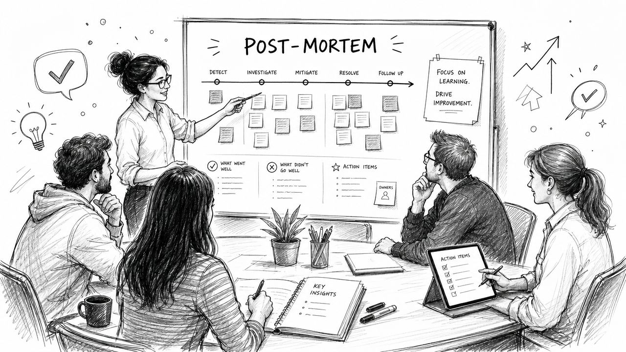
From Questions to Execution
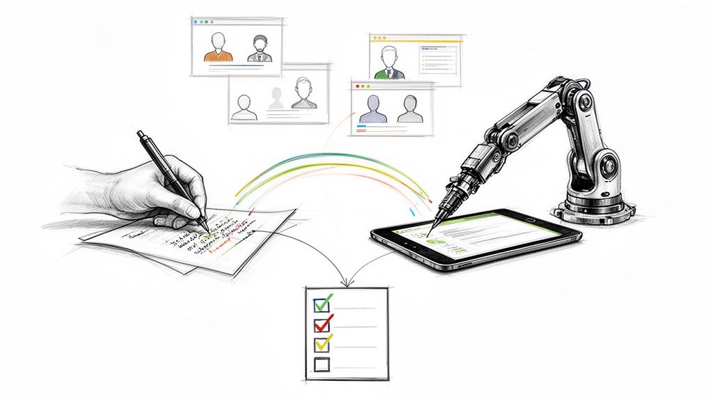
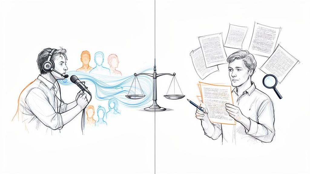
Good usability research questions give you evidence. Good analysis turns that evidence into product decisions.
Start with the session record itself. For each study, tag moments of hesitation, wrong turns, task failure, recovery, delight, and repeated requests for clarification. Then cluster those observations by workflow, user segment, and severity. If journalists struggle with transcript review but students don't, that tells you the issue may sit in workflow expectations rather than general usability. If every segment hesitates at upload, the problem is probably structural.
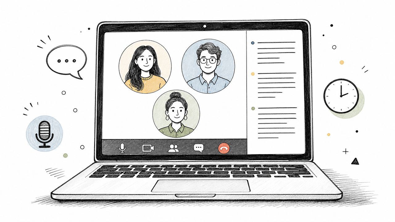
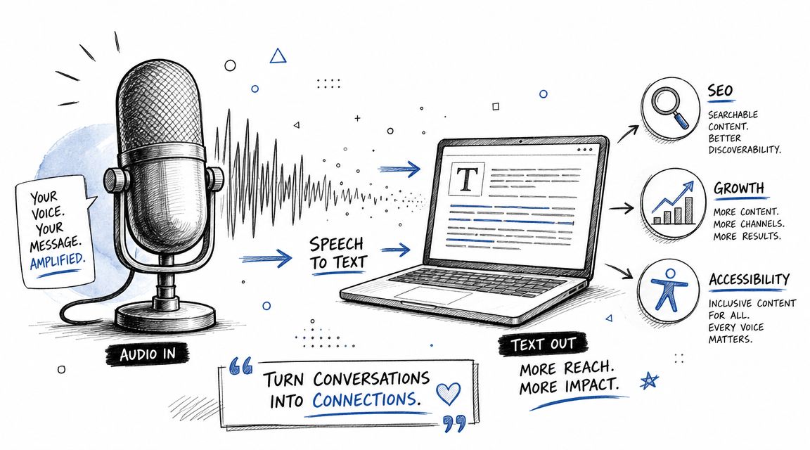
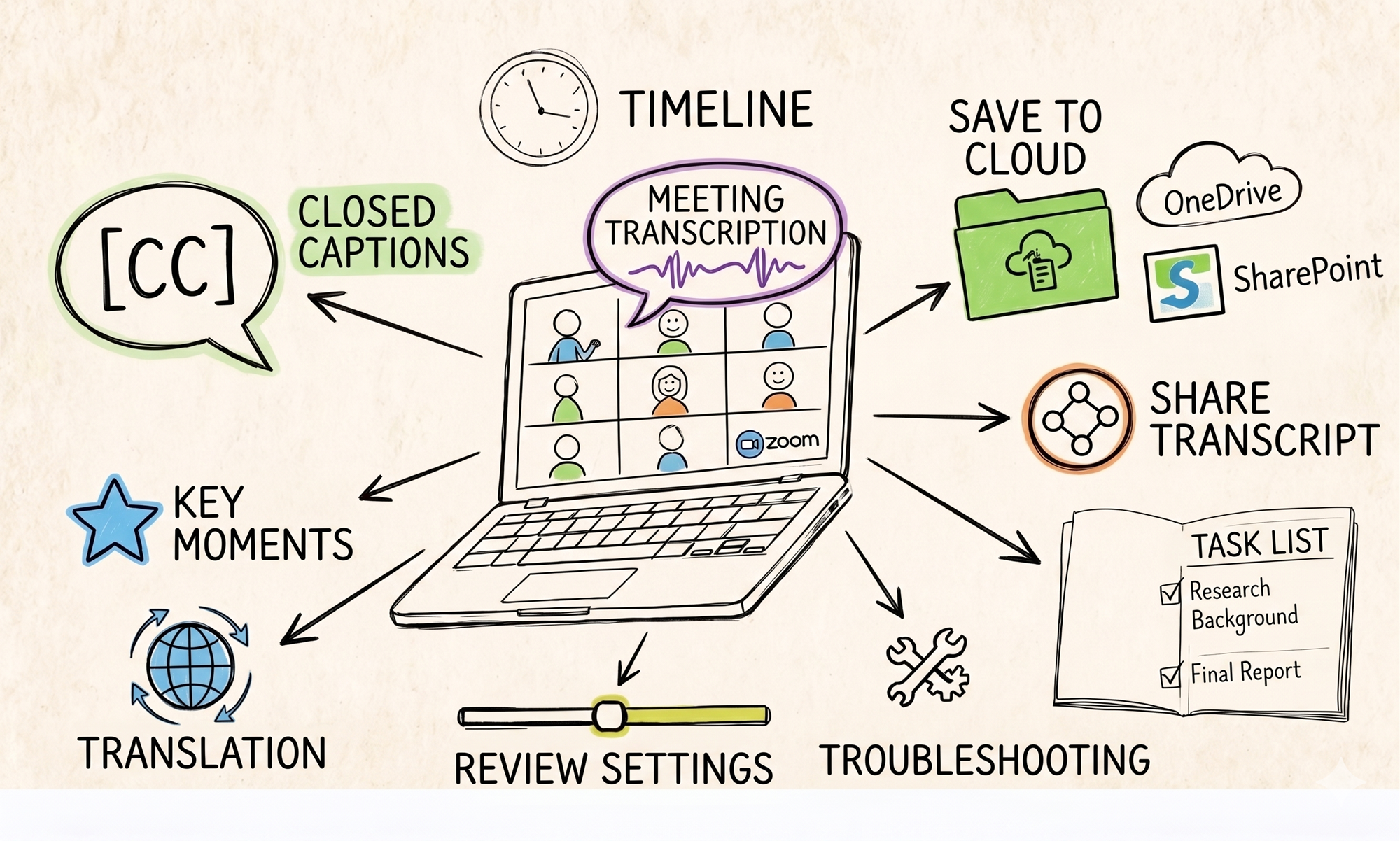
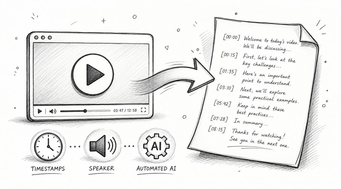
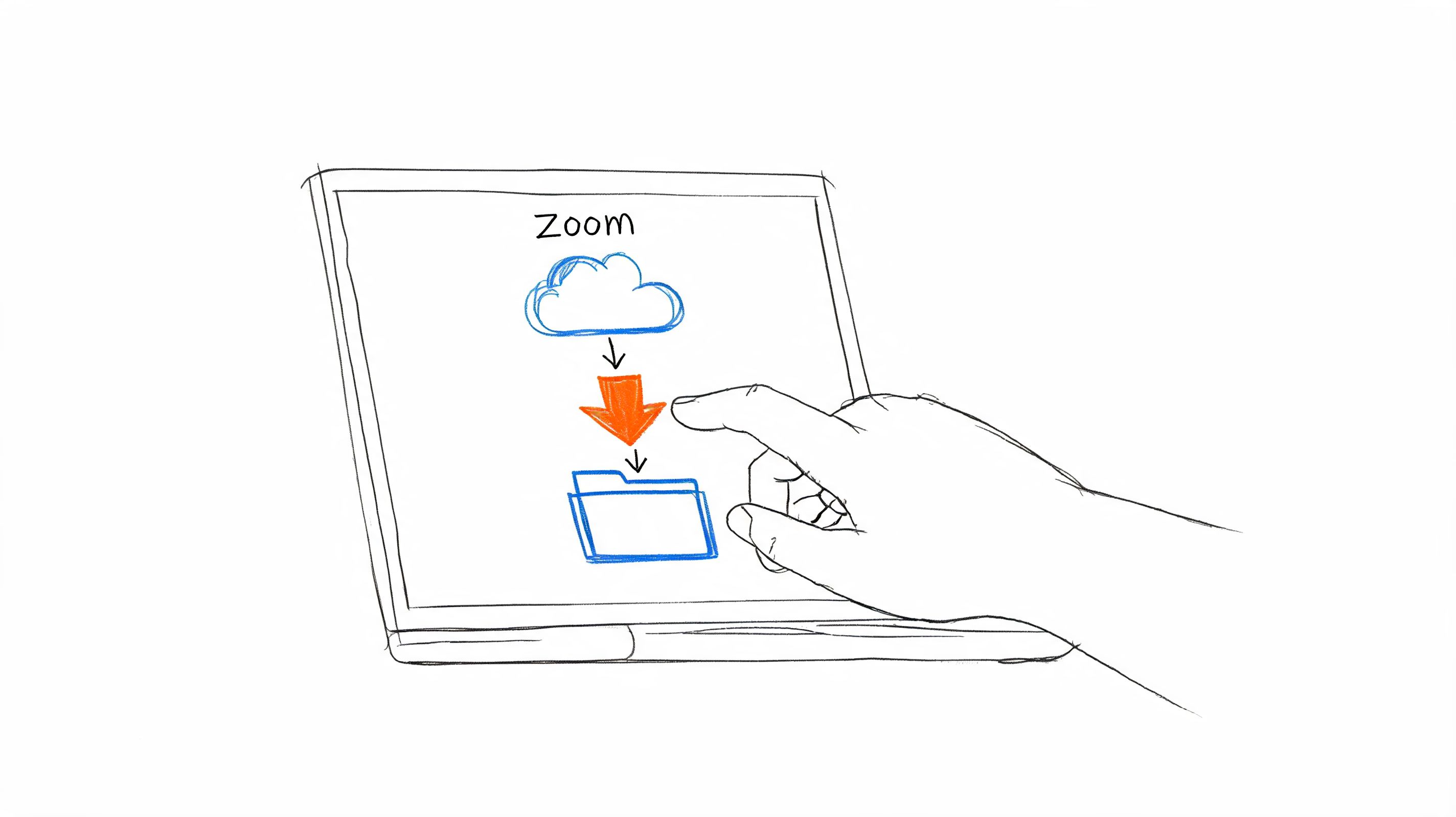
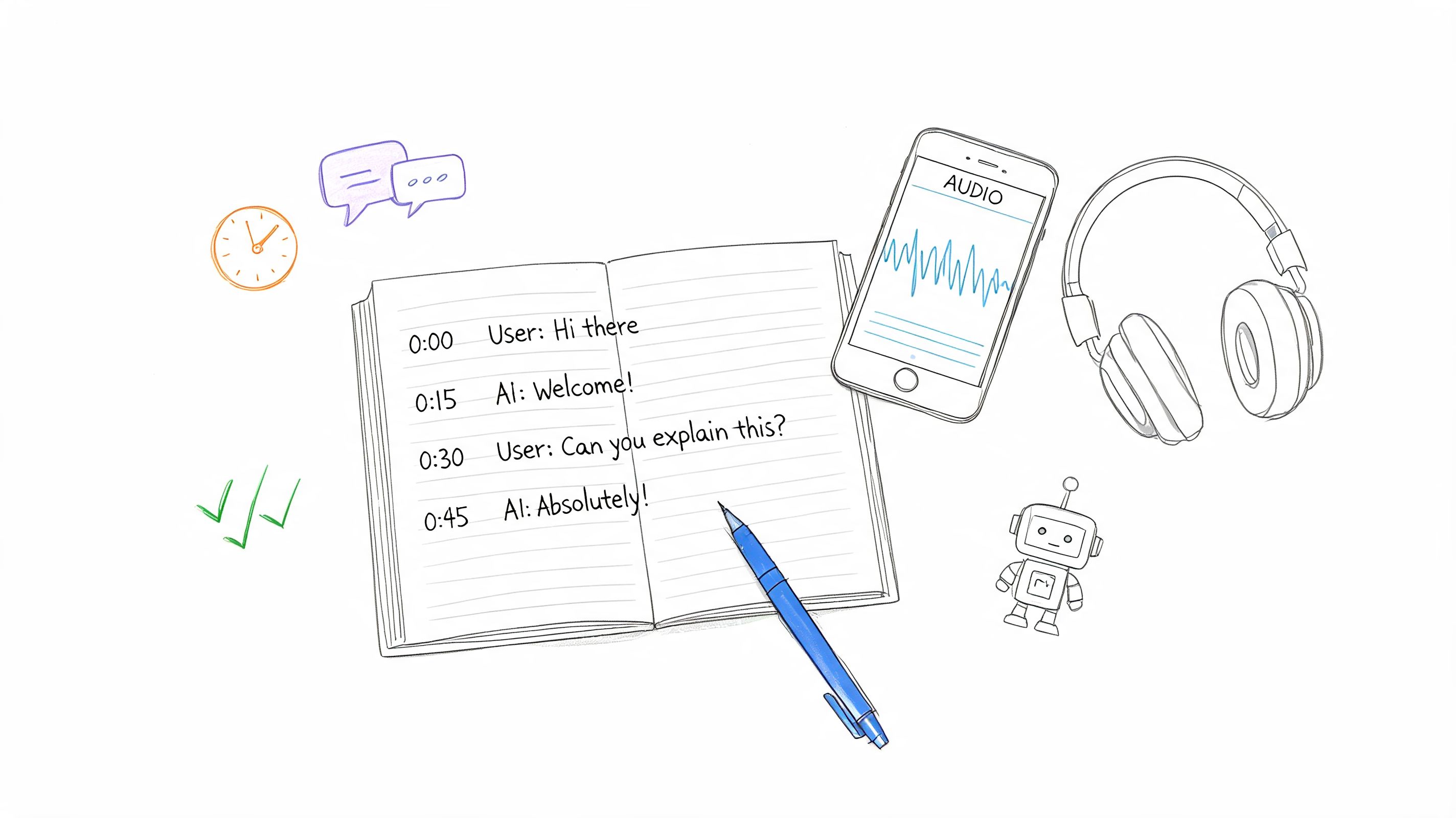
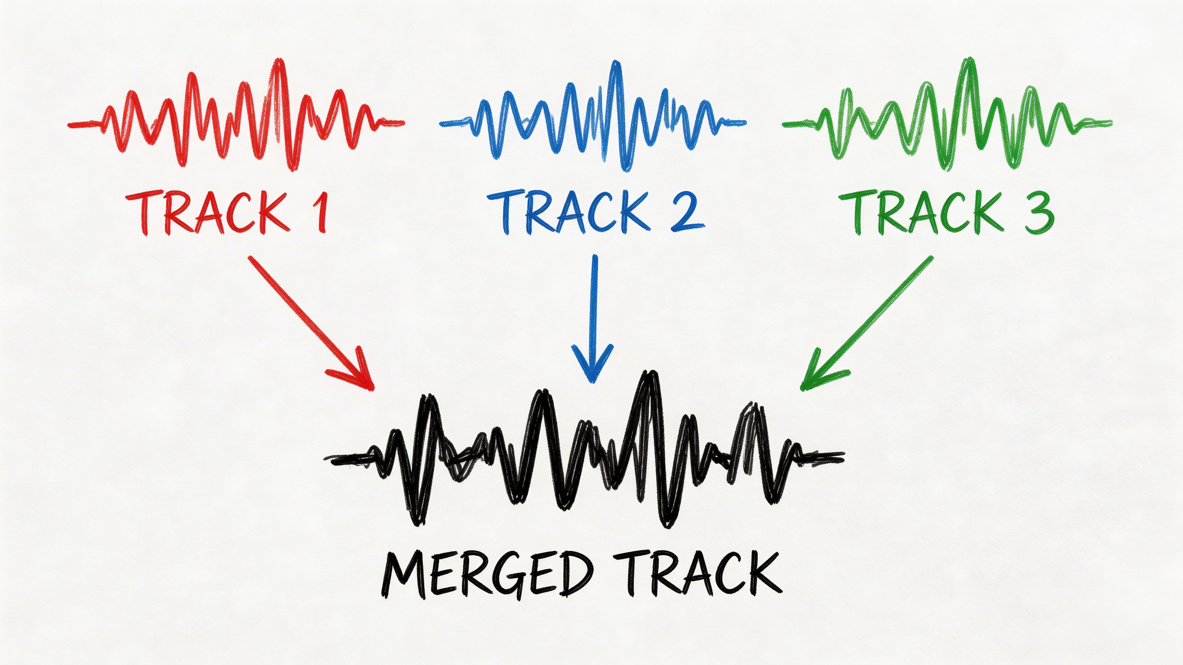
A transcription workflow earns its place. When you run moderated sessions, upload the recordings to HypeScribe and turn them into searchable transcripts. That gives your team one place to review what users said, where they paused, and how they described the problem in their own words. For longer projects, searchable transcripts are much more useful than scattered researcher notes because product managers, designers, and support leads can all inspect the same evidence.
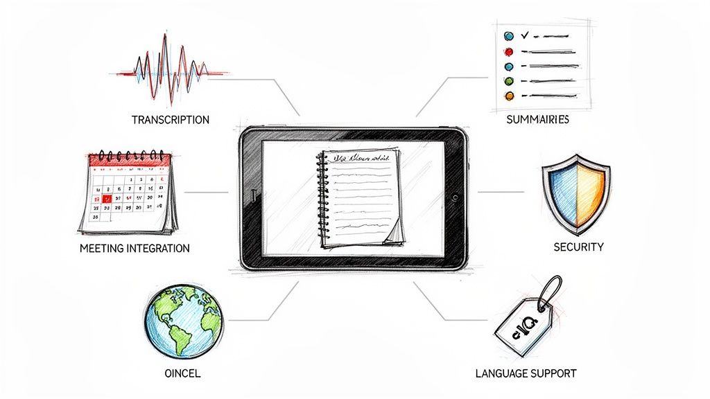
HypeScribe also fits the analysis layer well because it goes beyond raw transcription. Summaries, key takeaways, and action items can help your team move from observation to backlog decisions faster. That doesn't mean you should blindly trust any AI-generated summary. Human review still matters, especially when a subtle hesitation or a half-finished sentence changes the interpretation. But it does mean you can reduce the time spent digging through recordings and increase the time spent deciding what to fix.
For cross-functional teams, analysis needs structure. A practical pattern is to maintain a shared research backlog with issues grouped by journey stage: discovery, onboarding, first transcript, editing, export, and reuse. The problem with many organizations isn't that they never hear usability issues. It's that findings stay trapped inside one product pod. Guidance from UX leaders has highlighted that organizational blind spots often hide important usability issues, and methods like listening labs, journey maps, and cross-team backlogs help expose and prioritize them. That perspective is captured in UX Tigers' discussion of user testing in cross-functional organizations.
Keep your analysis decision-oriented. Don't just write “users found export confusing.” Write “three participants looked under summaries before export, which suggests the action is mislabeled or poorly placed.” That version gives design and product a direct next step. It also makes follow-up testing easier because you can validate a revised hypothesis instead of retesting the same vague complaint.
After launch, keep tracking the behavioral outcomes that matter. If your research focused on onboarding, look at activation. If it focused on navigation, look at task completion and support demand. If it focused on help content, look at self-serve resolution before ticket escalation. Research is strongest when it closes the loop between user behavior in sessions and user behavior in production.
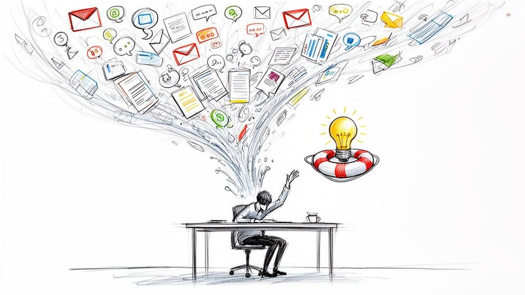
That same discipline also sharpens how teams work internally. Researchers often spend a surprising amount of time just coordinating sessions, reviewing recordings, and converting notes into action. If you want to tighten the operational side of that work, these top automatic Mac time trackers are worth a look for understanding where research time goes.
Payoff comes when your questions stop producing generic feedback and start producing clear product moves. Better onboarding copy. Clearer labels. Stronger recovery states. Better help content. More confidence in what to prioritize next. That's what good usability research questions are for.
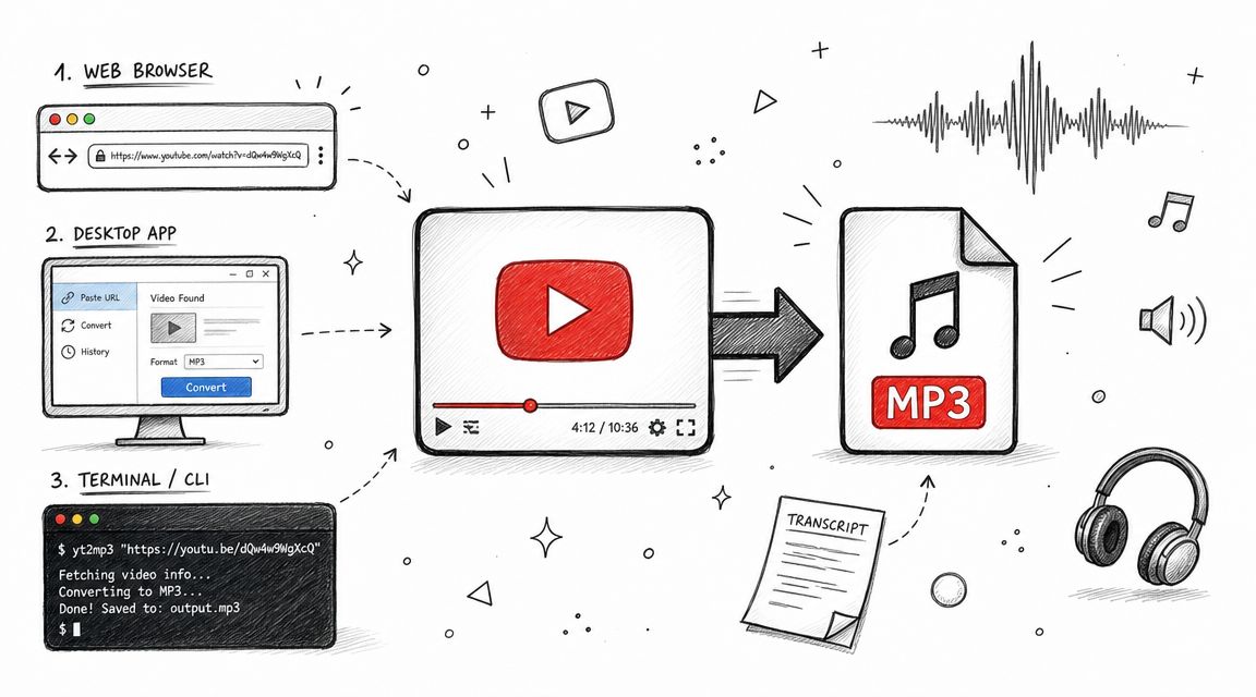
If you're running interviews, moderated usability tests, or cross-team research reviews, HypeScribe can help you turn raw conversations into usable evidence fast. Upload recordings, generate searchable transcripts, pull summaries and action items, and give your team a cleaner path from research sessions to product decisions.